


HarmonyOS 鸿蒙Next用MVVM思想封装自定义TabBar组件
HarmonyOS 鸿蒙Next用MVVM思想封装自定义TabBar组件
<markdown _ngcontent-dnp-c149="" class="markdownPreContainer">
介绍
在使用上次封装好的 Container组件 的基础上,使用MVVM思想封装一个自定义TabBar组件
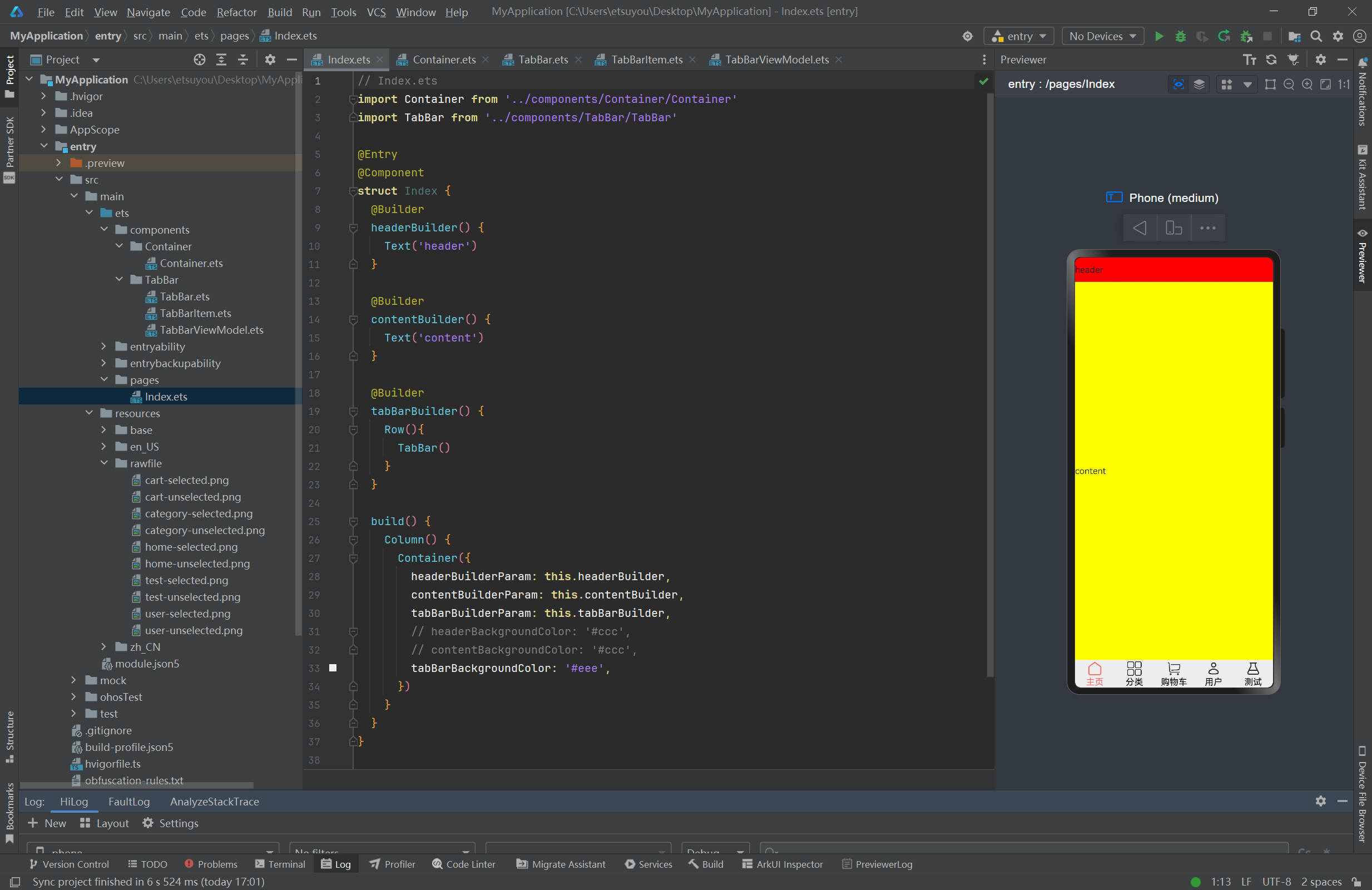
效果图
代码
Index.ets
// Index.ets import Container from '../components/Container/Container' import TabBar from '../components/TabBar/TabBar'@Entry @Component struct Index { @Builder headerBuilder() { Text(‘header’) }
@Builder contentBuilder() { Text(‘content’) }
@Builder tabBarBuilder() { Row(){ TabBar() } }
build() { Column() { Container({ headerBuilderParam: this.headerBuilder, contentBuilderParam: this.contentBuilder, tabBarBuilderParam: this.tabBarBuilder, // headerBackgroundColor: ‘#ccc’, // contentBackgroundColor: ‘#ccc’, tabBarBackgroundColor: ‘#eee’, }) } } }
<button style="position: absolute; padding: 4px 8px 0px; cursor: pointer; top: 4px; right: 8px; font-size: 14px;">复制</button>
Container.ets
// Container.ets [@Component](/user/Component) export default struct Container { [@BuilderParam](/user/BuilderParam) headerBuilderParam: () => void = this.headerBuilder [@BuilderParam](/user/BuilderParam) contentBuilderParam: () => void = this.contentBuilder [@BuilderParam](/user/BuilderParam) tabBarBuilderParam: () => void = this.tabBarBuilder@Builder headerBuilder() { }
@Builder contentBuilder() { }
@Builder tabBarBuilder() { }
headerBackgroundColor: ResourceColor = Color.Red contentBackgroundColor: ResourceColor = Color.Yellow tabBarBackgroundColor: ResourceColor = Color.Green headerHeight: Length = 44 tabBarHeight: Length = 50
build() { Flex({ direction: FlexDirection.Column }) { Row() { this.headerBuilderParam() }.width(‘100%’).backgroundColor(this.headerBackgroundColor).height(this.headerHeight)
Row() { <span class="hljs-keyword">this</span>.contentBuilderParam() }.width(<span class="hljs-string">'100%'</span>).backgroundColor(<span class="hljs-keyword">this</span>.contentBackgroundColor).flexGrow(<span class="hljs-number">1</span>) Row() { <span class="hljs-keyword">this</span>.tabBarBuilderParam() }.width(<span class="hljs-string">'100%'</span>).backgroundColor(<span class="hljs-keyword">this</span>.tabBarBackgroundColor).height(<span class="hljs-keyword">this</span>.tabBarHeight) }
} }<button style="position: absolute; padding: 4px 8px 0px; cursor: pointer; top: 4px; right: 8px; font-size: 14px;">复制</button>
TabBar.ets
// TabBar.ets import TabBarItem from './TabBarItem' import TabBarViewModel from './TabBarViewModel'@Component export default struct TabBar { @State tabBarViewModel: TabBarViewModel = new TabBarViewModel([ new TabBarItem($rawfile(‘home-unselected.png’),$rawfile(‘home-selected.png’),‘主页’), new TabBarItem($rawfile(‘category-unselected.png’),$rawfile(‘category-selected.png’),‘分类’), new TabBarItem($rawfile(‘cart-unselected.png’),$rawfile(‘cart-selected.png’),‘购物车’), new TabBarItem($rawfile(‘user-unselected.png’),$rawfile(‘user-selected.png’),‘用户’), new TabBarItem($rawfile(‘test-unselected.png’),$rawfile(‘test-selected.png’),‘测试’), ]) build() { Row(){ ForEach(this.tabBarViewModel.tabBarItems, (tabBarItem: TabBarItem, index: number)=>{ Column(){ Image(this.tabBarViewModel.selectedIndex !== index ? tabBarItem.imageUrlUnselected : tabBarItem.imageUrlSelected ).width(30).height(30) Text(tabBarItem.title) .fontColor(this.tabBarViewModel.selectedIndex !== index?’#000’:’#f66’) }.width(
<span class="javascript">${<span class="hljs-number">100</span>/<span class="hljs-keyword">this</span>.tabBarViewModel.tabBarItems.length}%</span>) .onClick(()=>{ this.tabBarViewModel.selectedIndex = index })})</span> }.<span class="hljs-title">width</span><span class="hljs-params">(<span class="hljs-string">'100%'</span>)</span>.<span class="hljs-title">height</span><span class="hljs-params">(<span class="hljs-string">'100%'</span>)</span>
} }<button style="position: absolute; padding: 4px 8px 0px; cursor: pointer; top: 4px; right: 8px; font-size: 14px;">复制</button>
TabBarItem.ets
// TabBarItem.ets [@Observed](/user/Observed) export default class TabBarItem{ imageUrlUnselected: Resource imageUrlSelected: Resource title: stringconstructor( imageUrlUnselected: Resource, imageUrlSelected: Resource, title: string, ) { this.imageUrlUnselected = imageUrlUnselected this.imageUrlSelected = imageUrlSelected this.title = title }
}<button style="position: absolute; padding: 4px 8px 0px; cursor: pointer; top: 4px; right: 8px; font-size: 14px;">复制</button>
TabBarViewModel.ets
</markdown>// TabBarViewModel.ets import TabBarItem from './TabBarItem'@Observed export default class TabBarViewModel{ tabBarItems: TabBarItem[] selectedIndex: number
constructor( tabBarItems: TabBarItem[], selectedIndex: number = 0, ) { this.tabBarItems = tabBarItems this.selectedIndex = selectedIndex } }<button style="position: absolute; padding: 4px 8px 0px; cursor: pointer; top: 4px; right: 8px; font-size: 14px;">复制</button>


更多关于HarmonyOS 鸿蒙Next用MVVM思想封装自定义TabBar组件的实战系列教程也可以访问 https://www.itying.com/category-93-b0.html
在HarmonyOS鸿蒙Next系统中,使用MVVM(Model-View-ViewModel)思想封装自定义TabBar组件,可以遵循以下原则:
-
Model层:定义TabBar的数据模型,包括每个Tab的图标、标题、选中状态等。
-
View层:使用HarmonyOS提供的UI组件(如CustomLayout或DirectionalLayout)来布局TabBar,通过数据绑定将Model层的数据展示到UI上。
-
ViewModel层:作为Model和View之间的桥梁,处理业务逻辑和状态管理。可以监听用户点击事件,更新Model层的数据,并通知View层刷新UI。
在封装过程中,需要注意以下几点:
- 确保TabBar的样式和交互符合产品要求。
- 处理好Tab切换时的动画效果,提升用户体验。
- ViewModel层应尽可能独立,减少与View层的直接依赖,便于单元测试和维护。
同时,利用HarmonyOS提供的组件化开发能力,可以将自定义TabBar组件封装成一个独立的模块,方便在多个项目中使用。
如果在实际开发过程中遇到具体的技术问题,如数据绑定失败、组件渲染异常等,可以查阅HarmonyOS的官方文档或开发者社区获取更多帮助。如果问题依旧没法解决请联系官网客服,官网地址是:https://www.itying.com/category-93-b0.html。