


Flutter选择按钮插件chip_radio_button的使用
Flutter选择按钮插件chip_radio_button的使用
特性
以下是chip_radio_button的一些特性:
- 垂直或水平芯片
- 可以未选中或为空
- 简单的API
- MIT许可
使用方法
在本节中,我们将提供一些简短且有用的示例。更长的示例可以添加到/example文件夹中。
ChipsFilter(
  selected: 1, // 默认选中第二个过滤器
  filters: [
    Filter(label: "A - Z", icon: Icons.assessment),
    Filter(label: "H - L", icon: Icons.ac_unit),
    Filter(label: "Reverse", icon: Icons.all_inclusive),
    Filter(label: "A - Z", icon: Icons.assessment),
    Filter(label: "H - L", icon: Icons.ac_unit),
    Filter(label: "Reverse", icon: Icons.all_inclusive),
  ],
  onTap: (index) {
    print('Index ' + index.toString());
  },
),
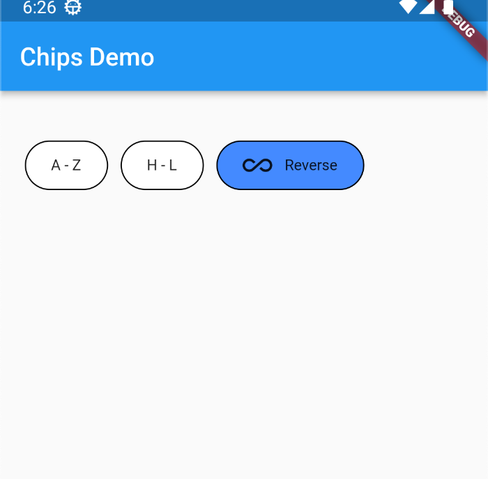
示例截图
完整示例代码
以下是一个完整的示例代码,展示了如何在Flutter应用中使用chip_radio_button插件。
import 'package:chip_radio_button/chip_radio_button.dart';
import 'package:flutter/material.dart';

void main() => runApp(MyApp());

class MyApp extends StatelessWidget {
  // 这个小部件是你的应用的根
  [@override](/user/override)
  Widget build(BuildContext context) {
    return MaterialApp(
      title: 'Flutter Hello World',
      home: MyHomePage(),
    );
  }
}

class MyHomePage extends StatelessWidget {
  [@override](/user/override)
  Widget build(BuildContext context) {
    return Scaffold(
      appBar: AppBar(
        // 应用栏上显示的标题文本
        title: Text("Chips Demo"),
      ),
      body: Container(
        margin: EdgeInsets.symmetric(horizontal: 20, vertical: 40),
        height: double.infinity,
        child: ChipsFilter(
          selected: 1, // 默认选中第二个过滤器
          filters: [
            Filter(label: "A - Z", icon: Icons.assessment),
            Filter(label: "H - L", icon: Icons.ac_unit),
            Filter(label: "Reverse", icon: Icons.all_inclusive),
            Filter(label: "A - Z", icon: Icons.assessment),
            Filter(label: "H - L", icon: Icons.ac_unit),
            Filter(label: "Reverse", icon: Icons.all_inclusive),
          ],
          onTap: (index) {
            print('Index ' + index.toString());
          },
        ),
      ),
    );
  }
}
更多关于Flutter选择按钮插件chip_radio_button的使用的实战系列教程也可以访问 https://www.itying.com/category-92-b0.html


更多关于Flutter选择按钮插件chip_radio_button的使用的实战系列教程也可以访问 https://www.itying.com/category-92-b0.html
当然,以下是一个关于如何在Flutter中使用chip_radio_button插件的示例代码。这个插件提供了一种以Chip形式展示的选择按钮组,非常适合在用户界面中提供一组选项供用户选择。
首先,确保你已经在pubspec.yaml文件中添加了chip_radio_button依赖:
dependencies:
  flutter:
    sdk: flutter
  chip_radio_button: ^latest_version  # 请替换为实际的最新版本号
然后运行flutter pub get来安装依赖。
接下来,在你的Dart文件中使用ChipRadioButton。以下是一个完整的示例:
import 'package:flutter/material.dart';
import 'package:chip_radio_button/chip_radio_button.dart';

void main() {
  runApp(MyApp());
}

class MyApp extends StatelessWidget {
  @override
  Widget build(BuildContext context) {
    return MaterialApp(
      title: 'Chip Radio Button Example',
      theme: ThemeData(
        primarySwatch: Colors.blue,
      ),
      home: ChipRadioButtonExample(),
    );
  }
}

class ChipRadioButtonExample extends StatefulWidget {
  @override
  _ChipRadioButtonExampleState createState() => _ChipRadioButtonExampleState();
}

class _ChipRadioButtonExampleState extends State<ChipRadioButtonExample> {
  String selectedValue = 'Option 1';

  @override
  Widget build(BuildContext context) {
    return Scaffold(
      appBar: AppBar(
        title: Text('Chip Radio Button Example'),
      ),
      body: Padding(
        padding: const EdgeInsets.all(16.0),
        child: Column(
          crossAxisAlignment: CrossAxisAlignment.start,
          children: <Widget>[
            Text(
              'Select an option:',
              style: TextStyle(fontSize: 18, fontWeight: FontWeight.bold),
            ),
            SizedBox(height: 16),
            ChipRadioButton<String>(
              label: 'Option 1',
              value: 'Option 1',
              groupValue: selectedValue,
              onChanged: (value) {
                setState(() {
                  selectedValue = value;
                });
              },
            ),
            ChipRadioButton<String>(
              label: 'Option 2',
              value: 'Option 2',
              groupValue: selectedValue,
              onChanged: (value) {
                setState(() {
                  selectedValue = value;
                });
              },
            ),
            ChipRadioButton<String>(
              label: 'Option 3',
              value: 'Option 3',
              groupValue: selectedValue,
              onChanged: (value) {
                setState(() {
                  selectedValue = value;
                });
              },
            ),
            SizedBox(height: 24),
            Text(
              'Selected Option: $selectedValue',
              style: TextStyle(fontSize: 16),
            ),
          ],
        ),
      ),
    );
  }
}
在这个示例中,我们创建了一个简单的Flutter应用,其中包含一个ChipRadioButton组。每个ChipRadioButton都有一个标签(label)和一个值(value)。groupValue属性用于存储当前选中的值,而onChanged回调用于处理用户选择更改事件。
当用户点击某个ChipRadioButton时,onChanged回调会被触发,并且selectedValue状态会被更新,从而触发UI的重新构建,显示当前选中的选项。
这个示例展示了如何使用chip_radio_button插件来创建一个用户友好的选择界面。你可以根据需要进一步自定义和扩展这个示例。