


Flutter数字选择器插件spflutter_number_picker的使用
Flutter数字选择器插件spflutter_number_picker的使用
本文档描述了该插件。如果您将此插件发布到pub.dev,则此文档的内容将出现在您的插件页面上。
对于如何编写一个好的插件文档,请参阅撰写插件页面的指南。
对于开发插件的一般信息,请参阅Dart开发插件的指南和Flutter开发插件和插件的指南。
特性
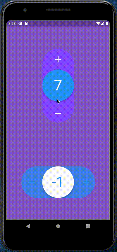
自定义
- 可以通过键盘手动输入值(长按文本)
- 支持双精度值,并自动设置键盘和文本显示
- 更改间隔值
- 添加10倍间隔
- 随文本长度变化字体大小
使用方法
示例代码
import 'package:flutter/material.dart';
import 'package:spflutter_number_picker/spflutter_number_picker.dart';

void main() {
  runApp(MyApp());
}

class MyApp extends StatefulWidget {
  const MyApp({Key? key}) : super(key: key);

  [@override](/user/override)
  State<MyApp> createState() => _MyAppState();
}

class _MyAppState extends State<MyApp> {
  TextEditingController textEditingController = TextEditingController();

  double? _resetValue;

  double? XX;

  late NumberPicker np;

  [@override](/user/override)
  Widget build(BuildContext context) {
    return MaterialApp(
      debugShowCheckedModeBanner: false,
      home: Scaffold(
        backgroundColor: Colors.deepPurple[400],
        body: SafeArea(
          child: SingleChildScrollView(
            child: Column(
              mainAxisAlignment: MainAxisAlignment.spaceAround,
              children: [
                OutlinedButton(onPressed: (){
                  _resetValue = 7;
                  setState(() {});
                }, child: Text("添加")),
                NumberPicker(
                  theme: NumberSelectionTheme(
                      draggableCircleColor: Colors.blue,
                      iconsColor: Colors.white,
                      numberColor: Colors.white,
                      backgroundColor: Colors.deepPurpleAccent,
                      outOfConstraintsColor: Colors.deepOrange),
                  interval: 0.1,
                  initialValue: 0,
                  resetValue: _resetValue,
                  minValue: 15,
                  maxValue: 50.2,
                  direction: Axis.vertical,
                  withSpring: true,
                  onChanged: (double value) {
                    XX = 23;
                    setState(() {});
                    print("value: $value");
                  },
                  enableOnOutOfConstraintsAnimation: true,
                  onOutOfConstraints: () =>
                      print("This value is too high or too low"),
                ),
                Center(
                  child: Padding(
                    padding: const EdgeInsets.all(18.0),
                    child: SizedBox(
                      height: 50,
                      width: 400,
                      child: np = NumberPicker(
                        theme: NumberSelectionTheme(
                            draggableCircleColor: Colors.blue,
                            iconsColor: Colors.white,
                            iconsDisableColor: Colors.grey,
                            numberColor: Colors.white,
                            progressColor: Colors.deepOrangeAccent,
                            backgroundColor: Colors.deepPurpleAccent,
                            outOfConstraintsColor: Colors.deepOrange),
                        interval: 1,
                        minValue: 5,
                        maxValue: 30,
                        resetValue: XX,
                        initialValue: 10,
                        iconRemove: Icons.remove,
                        iconMin: Icons.delete,
                        iconMax: Icons.fullscreen_exit,
                        callBack: (val) async {
                          if (val < 50) {
                            await Future.delayed(const Duration(seconds: 2));
                            return val;
                          } else {
                            return 5;
                          }
                        },
                        direction: Axis.horizontal,
                        withSpring: true,
                        onChanged: (double value) {
                          print(">>value: $value");
                        },
                        dialogShowOnlyLongTouch: false,
                        enableOnOutOfConstraintsAnimation: true,
                        onOutOfConstraints: () =>
                            print("This value is too high or too low"),
                      ),
                    ),
                  ),
                ),
                Padding(
                  padding: const EdgeInsets.all(18.0),
                  child: SizedBox(
                    height: 50,
                    width: 400,
                    child: NumberPicker(
                      theme: NumberSelectionTheme(
                          draggableCircleColor: Colors.blue,
                          iconsColor: Colors.white,
                          iconsDisableColor: Colors.grey,
                          numberColor: Colors.white,
                          progressColor: Colors.deepOrangeAccent,
                          backgroundColor: Colors.deepPurpleAccent,
                          outOfConstraintsColor: Colors.deepOrange),
                      interval: 0.3,
                      minValue: 5,
                      maxValue: 30,
                      initialValue: 0,
                      iconRemove: Icons.remove,
                      iconMin: Icons.delete,
                      iconMax: Icons.fullscreen_exit,
                      callOnSet: (val0) async {
                        NumberPicker ret = NumberPicker();
                        await Future.delayed(const Duration(seconds: 2)).then(
                          (value) => {
                            ret = NumberPicker(
                              initialValue: 3,
                              minValue: 1,
                              maxValue: 20,
                              interval: 1,
                            ),
                          },
                        );
                        return ret;
                      },
                      callBack: (val) async {
                        if (val < 50) {
                          await Future.delayed(const Duration(seconds: 2));
                          return val;
                        } else {
                          return 5;
                        }
                      },
                      direction: Axis.horizontal,
                      withSpring: true,
                      onChanged: (double value) {
                        print("value: $value");
                      },
                      dialogShowOnlyLongTouch: false,
                      enableOnOutOfConstraintsAnimation: true,
                      onOutOfConstraints: () =>
                          print("This value is too high or too low"),
                    ),
                  ),
                )
              ],
            ),
          ),
        ),
      ),
    );
  }
}
更多关于Flutter数字选择器插件spflutter_number_picker的使用的实战系列教程也可以访问 https://www.itying.com/category-92-b0.html

