


Flutter自定义点指示器插件custom_dots_indicator的使用
Flutter自定义点指示器插件custom_dots_indicator的使用
引言
此包提供了一个可以自定义所需任何部分的点指示器。以下是你可以自定义的部分:
- 点的数量
- 提供标签并自定义它
- 自定义每个点/标签的当前滚动索引和点索引
注意:目前,仅支持使用ScrollController来控制可滚动视图。你也可以使用PageController,因为它是一个ScrollController的实例。
要了解有关此包的原理和实现方法,请参阅这篇文章。
使用
你可以通过以下方式开始使用此包:
/// 通用情况下的点指示器
CustomDotsIndicator()

/// 如果你的应用需要标签
CustomDotsIndicator.withLabel()

/// 如果需要完全自定义标签和其他点
CustomDotsIndicator.custom()
参数
必需参数
-
listLength 这是指示器将要使用的列表长度。
/// 帮助计算活动点位置的范围 -
controller 提供给滚动小部件的
ScrollController实例。/// 帮助小部件接收来自ScrollController的更新,并进行进一步的计算
可选参数(适用于所有情况)
-
dotsCount 这是你想要的指示器的点数。
/// 默认为3 -
dotsDistance 这是点之间的间距。
/// 默认为8px -
activeDotRadius 活动点的半径。
/// 默认为4px -
inactiveDotRadius 非活动点的半径。
/// 默认为4px -
activeDotColor 活动点的颜色。
-
inactiveDotColor 非活动点的颜色。
-
customDotSpaceBuilder 帮助自定义点之间的空间。
-
customDotsTransition 构建活动/非活动点时使用的动画。
自定义
CustomDotsIndicator.withLabel提供了两个可选参数:
-
labelStyle 此参数帮助自定义默认标签上的文本。
-
selectedLabelBuilder 此参数帮助自定义并构建你的标签小部件,它接受两个变量:
currentIndex: 当前可见项的计算值。dotIndex: 当前点的位置。
CustomDotsIndicator.custom在上述两个参数的基础上提供了一个额外的可选参数:
- unselectedDotBuilder
此参数帮助定制非活动点。类似于
selectedLabelBuilder,它接受相同的两个变量,但用于渲染非活动点。
示例代码
以下是一个完整的示例,展示了如何使用CustomDotsIndicator。
import 'package:custom_dots_indicator/custom_dots_indicator.dart';
import 'package:flutter/material.dart';
void main() {
runApp(
const MaterialApp(
home: CustomDotsIndicatorExample(),
),
);
}
class CustomDotsIndicatorExample extends StatefulWidget {
const CustomDotsIndicatorExample({super.key});
[@override](/user/override)
State<CustomDotsIndicatorExample> createState() => _CustomDotsIndicatorExampleState();
}
class _CustomDotsIndicatorExampleState extends State<CustomDotsIndicatorExample> {
int itemCount = 20;
final ScrollController _scrollController = ScrollController();
[@override](/user/override)
Widget build(BuildContext context) {
final itemWidth = MediaQuery.of(context).size.width * 0.7;
return Scaffold(
floatingActionButton: FloatingActionButton(
child: const Text("+ 10"),
onPressed: () => setState(() {
itemCount += 10;
}),
),
body: SafeArea(
child: Column(
mainAxisSize: MainAxisSize.min,
crossAxisAlignment: CrossAxisAlignment.start,
children: [
SizedBox(
height: 200,
child: ListView.builder(
itemCount: itemCount,
controller: _scrollController,
scrollDirection: Axis.horizontal,
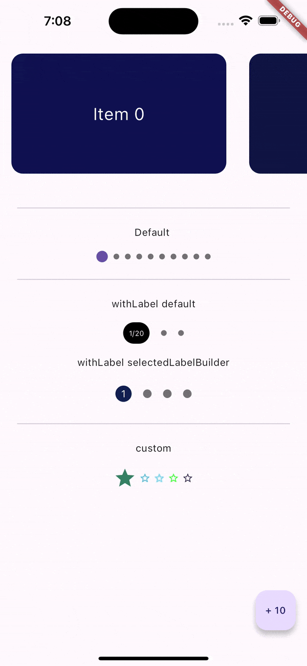
itemBuilder: (context, index) => Container(
width: itemWidth,
height: 60,
margin: const EdgeInsets.all(16),
alignment: Alignment.center,
decoration: BoxDecoration(
color: Color(0xff111151 + index * 10 + index * 1000),
borderRadius: BorderRadius.circular(16),
),
child: Text("Item $index", style: const TextStyle(color: Colors.white, fontSize: 24)),
),
),
),
Padding(
padding: const EdgeInsets.all(16),
child: Column(
children: [
const Divider(),
const Text("Default"),
CustomDotsIndicator(
listLength: itemCount,
controller: _scrollController,
dotsCount: itemCount ~/ 2,
activeDotRadius: 8,
),
const Divider(),
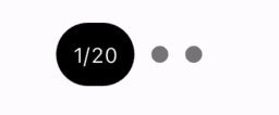
const Text("withLabel default"),
CustomDotsIndicator.withLabel(
listLength: itemCount,
controller: _scrollController,
dotsCount: 3,
customDotsTransition: (child, animation) => AnimatedOpacity(
duration: Duration.zero,
opacity: animation.value,
child: child,
),
),
const Text("withLabel selectedLabelBuilder"),
CustomDotsIndicator.withLabel(
listLength: itemCount,
controller: _scrollController,
dotsCount: 4,
inactiveDotRadius: 6,
selectedLabelBuilder: (currentIndex, dotIndex) => Container(
padding: const EdgeInsets.all(8),
decoration: const BoxDecoration(shape: BoxShape.circle, color: Color(0xff112151)),
child: Text(dotIndex.toString(), style: const TextStyle(color: Colors.white)),
),
animationDuration: const Duration(milliseconds: 200),
customDotsTransition: (child, animation) => Transform.scale(
scaleY: animation.value,
child: child,
),
),
const Divider(),
const Text("custom"),
CustomDotsIndicator.custom(
listLength: itemCount,
controller: _scrollController,
dotsCount: 5,
dotsDistance: 4,
selectedLabelBuilder: (currentIndex, dotIndex) => Icon(Icons.star, size: 32, color: Color(0xff333444 + 20000 * currentIndex)),
unselectedDotBuilder: (currentIndex, dotIndex) => Icon(Icons.star_border, size: 16, color: Color(0xff337282 + 9000 * dotIndex)),
),
]
.map((e) => Padding(
padding: const EdgeInsets.all(8),
child: e,
))
.toList(),
),
)
],
),
),
);
}
}
更多关于Flutter自定义点指示器插件custom_dots_indicator的使用的实战系列教程也可以访问 https://www.itying.com/category-92-b0.html


更多关于Flutter自定义点指示器插件custom_dots_indicator的使用的实战系列教程也可以访问 https://www.itying.com/category-92-b0.html
当然,以下是如何在Flutter项目中使用custom_dots_indicator插件来实现自定义点指示器的代码示例。custom_dots_indicator是一个流行的Flutter插件,用于在轮播图或分页视图中创建自定义的点指示器。
首先,确保你已经在pubspec.yaml文件中添加了custom_dots_indicator依赖:
dependencies:
  flutter:
    sdk: flutter
  carousel_slider: ^4.0.0  # 假设你正在使用carousel_slider,尽管这不是必需的
  custom_dots_indicator: ^2.0.0  # 确保使用最新版本
然后运行flutter pub get来安装依赖。
接下来,创建一个简单的Flutter应用,展示如何使用custom_dots_indicator。
import 'package:flutter/material.dart';
import 'package:carousel_slider/carousel_slider.dart';
import 'package:custom_dots_indicator/custom_dots_indicator.dart';

void main() {
  runApp(MyApp());
}

class MyApp extends StatelessWidget {
  @override
  Widget build(BuildContext context) {
    return MaterialApp(
      title: 'Custom Dots Indicator Example',
      theme: ThemeData(
        primarySwatch: Colors.blue,
      ),
      home: MyHomePage(),
    );
  }
}

class MyHomePage extends StatefulWidget {
  @override
  _MyHomePageState createState() => _MyHomePageState();
}

class _MyHomePageState extends State<MyHomePage> with SingleTickerProviderStateMixin {
  int _current = 0;

  @override
  Widget build(BuildContext context) {
    final List<String> imgList = [
      'https://via.placeholder.com/600x300?text=Slide+1',
      'https://via.placeholder.com/600x300?text=Slide+2',
      'https://via.placeholder.com/600x300?text=Slide+3',
    ];

    return Scaffold(
      appBar: AppBar(
        title: Text('Custom Dots Indicator Example'),
      ),
      body: Column(
        children: <Widget>[
          Expanded(
            child: CarouselSlider.builder(
              itemCount: imgList.length,
              itemBuilder: (BuildContext context, int index, int realIndex) {
                return Container(
                  child: Center(
                    child: Image.network(imgList[index]),
                  ),
                );
              },
              options: CarouselOptions(
                height: 400.0,
                enlargeCenterPage: true,
                autoPlay: true,
                aspectRatio: 16 / 9,
                autoPlayInterval: Duration(seconds: 3),
                autoPlayAnimationDuration: Duration(milliseconds: 800),
                autoPlayCurve: Curves.fastOutSlowIn,
                pauseAutoPlayOnTouch: true,
                onPageChanged: (index, reason) {
                  setState(() {
                    _current = index;
                  });
                },
              ),
            ),
          ),
          SizedBox(height: 20.0),
          CustomDotsIndicator(
            dotsCount: imgList.length,
            position: _current,
            decorator: DotsDecorator(
              size: Size(10.0, 10.0),
              activeSize: Size(20.0, 10.0),
              color: Colors.grey,
              activeColor: Colors.blue,
              spacing: 8.0,
              activeShape: RoundedRectangleBorder(
                borderRadius: BorderRadius.circular(10),
              ),
            ),
          ),
        ],
      ),
    );
  }
}
解释
-
依赖引入:
carousel_slider:用于创建轮播图(尽管这不是custom_dots_indicator的必需依赖,但在这个示例中我们用它来展示轮播效果)。custom_dots_indicator:用于创建自定义点指示器。
-
主应用结构:
MyApp:根Widget,定义应用的主题和主页。MyHomePage:包含轮播图和自定义点指示器的页面。
-
轮播图:
- 使用
CarouselSlider.builder来创建轮播图,每个item是一个包含图片的容器。 CarouselOptions配置了轮播图的各种参数,例如高度、是否放大中心页面、自动播放间隔等。
- 使用
-
自定义点指示器:
CustomDotsIndicator用于显示点指示器。DotsDecorator配置了点的样式,包括大小、颜色、间距以及激活状态的样式。
这段代码展示了如何将custom_dots_indicator与carousel_slider结合使用,创建一个带有自定义点指示器的轮播图。你可以根据需要进一步自定义指示器的样式和行为。