


Flutter进度指示器插件liquid_progress_indicator的使用
Flutter进度指示器插件liquid_progress_indicator的使用
Liquid 进度指示器为 Flutter 提供了多种类型的进度指示器。它支持圆形、线性和自定义形状的进度指示器,并且可以进行各种自定义设置。
特性
- 液态圆形进度指示器。
- 液态线性进度指示器。
- 自定义形状的液态进度指示器。
- 工作方式类似于 Flutter 的 ProgressIndicator。
- 可以自定义颜色、边框、方向等。
使用方法
首先,在项目中引入 liquid_progress_indicator 包:
import 'package:liquid_progress_indicator/liquid_progress_indicator.dart';
液态圆形进度指示器
LiquidCircularProgressIndicator(
  value: 0.25, // 默认值为0.5。
  valueColor: AlwaysStoppedAnimation(Colors.pink), // 默认值为当前主题的强调色。
  backgroundColor: Colors.white, // 默认值为当前主题的背景色。
  borderColor: Colors.red,
  borderWidth: 5.0,
  direction: Axis.horizontal, // 液态移动的方向(Axis.vertical 从下到上,Axis.horizontal 从左到右)。默认为 Axis.vertical。
  center: Text("Loading..."), // 中心文本。
);
液态线性进度指示器
LiquidLinearProgressIndicator(
  value: 0.25, // 默认值为0.5。
  valueColor: AlwaysStoppedAnimation(Colors.pink), // 默认值为当前主题的强调色。
  backgroundColor: Colors.white, // 默认值为当前主题的背景色。
  borderColor: Colors.red,
  borderWidth: 5.0,
  borderRadius: 12.0,
  direction: Axis.vertical, // 液态移动的方向(Axis.vertical 从下到上,Axis.horizontal 从左到右)。默认为 Axis.horizontal。
  center: Text("Loading..."), // 中心文本。
);
自定义形状液态进度指示器
LiquidCustomProgressIndicator(
  value: 0.2, // 默认值为0.5。
  valueColor: AlwaysStoppedAnimation(Colors.pink), // 默认值为当前主题的强调色。
  backgroundColor: Colors.white, // 默认值为当前主题的背景色。
  direction: Axis.vertical, // 液态移动的方向(Axis.vertical 从下到上,Axis.horizontal 从左到右)。
  shapePath: _buildBoatPath(), // 用于绘制进度指示器形状的 Path 对象。进度指示器的大小由该路径的边界创建。
)
其中 _buildBoatPath() 函数需要自行实现,例如:
Path _buildBoatPath() {
  final path = Path();
  path.moveTo(0, 0);
  path.lineTo(100, 0);
  path.quadraticBezierTo(150, 50, 100, 100);
  path.lineTo(0, 100);
  path.close();
  return path;
}
完整示例
以下是一个完整的示例代码,展示了如何在 Flutter 应用程序中使用 liquid_progress_indicator 插件。
import 'package:flutter/material.dart';
import 'liquid_circular_progress_indicator_page.dart';
import 'liquid_custom_progress_indicator_page.dart';
import 'liquid_linear_progress_indicator_page.dart';
void main() => runApp(MaterialApp(home: Example()));
class Example extends StatelessWidget {
[@override](/user/override)
Widget build(BuildContext context) {
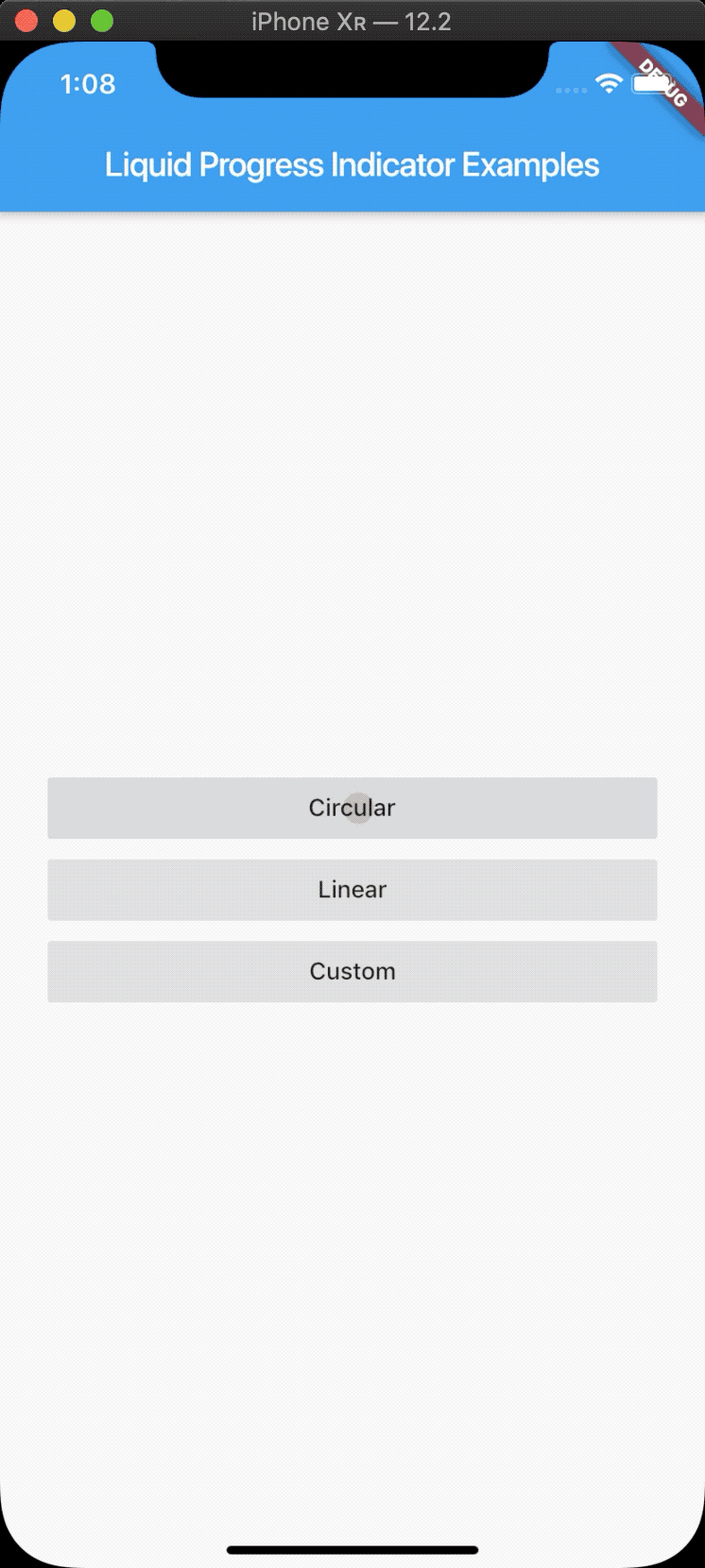
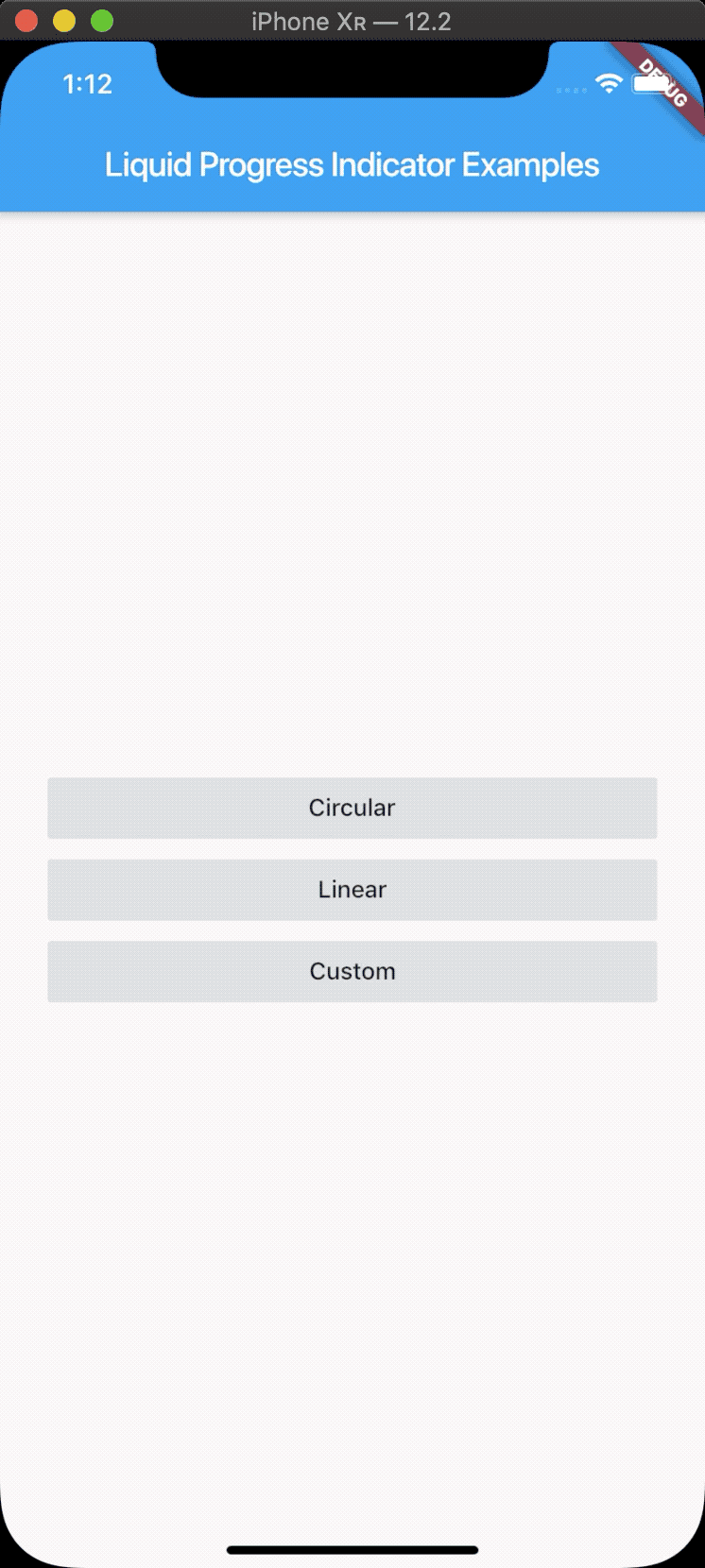
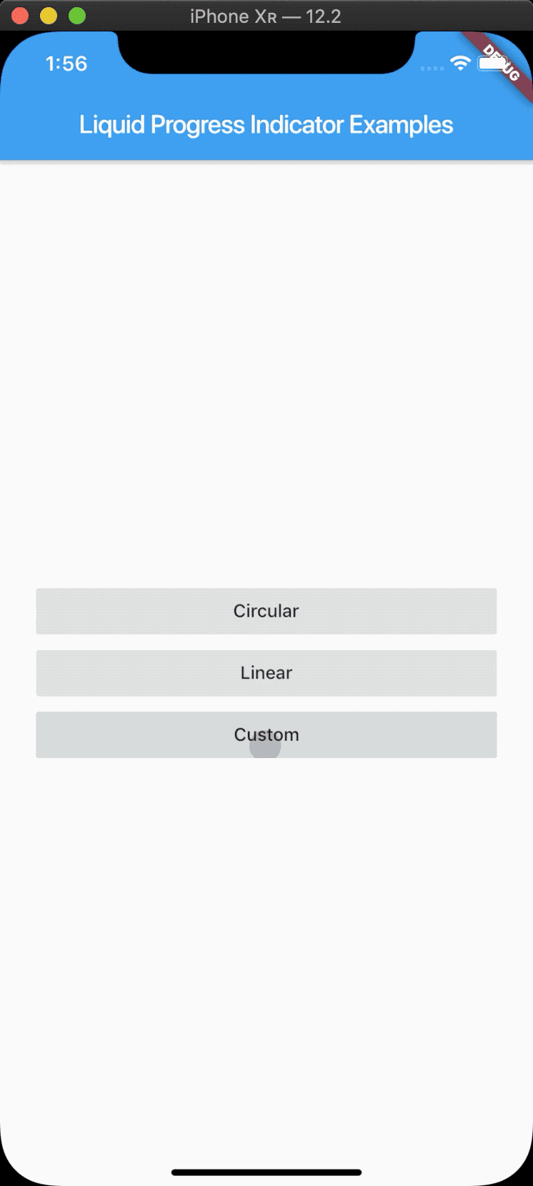
return Scaffold(
appBar: AppBar(
title: Text("Liquid Progress Indicator Examples"),
),
body: Padding(
padding: const EdgeInsets.all(28.0),
child: Column(
mainAxisAlignment: MainAxisAlignment.center,
crossAxisAlignment: CrossAxisAlignment.stretch,
children: [
FlatButton(
child: Text("Circular"),
color: Colors.grey[300],
onPressed: () => Navigator.of(context).push(
MaterialPageRoute(
builder: (_) => LiquidCircularProgressIndicatorPage(),
),
),
),
FlatButton(
child: Text("Linear"),
color: Colors.grey[300],
onPressed: () => Navigator.of(context).push(
MaterialPageRoute(
builder: (_) => LiquidLinearProgressIndicatorPage(),
),
),
),
FlatButton(
child: Text("Custom"),
color: Colors.grey[300],
onPressed: () => Navigator.of(context).push(
MaterialPageRoute(
builder: (_) => LiquidCustomProgressIndicatorPage(),
),
),
),
],
),
),
);
}
}
更多关于Flutter进度指示器插件liquid_progress_indicator的使用的实战教程也可以访问 https://www.itying.com/category-92-b0.html
1 回复

更多关于Flutter进度指示器插件liquid_progress_indicator的使用的实战系列教程也可以访问 https://www.itying.com/category-92-b0.html
当然,下面是一个关于如何在Flutter项目中使用liquid_progress_indicator插件的示例代码。这个插件可以创建一个流畅的液体填充进度条,非常适合用于显示加载进度或者任务完成情况。
首先,你需要在你的pubspec.yaml文件中添加liquid_progress_indicator依赖:
dependencies:
  flutter:
    sdk: flutter
  liquid_progress_indicator: ^3.0.0  # 请注意版本号,这里使用的是3.0.0,你可以根据需要调整
然后运行flutter pub get来安装依赖。
接下来,你可以在你的Flutter应用中使用LiquidProgressIndicator。以下是一个完整的示例代码,展示了如何使用这个插件:
import 'package:flutter/material.dart';
import 'package:liquid_progress_indicator/liquid_progress_indicator.dart';

void main() {
  runApp(MyApp());
}

class MyApp extends StatelessWidget {
  @override
  Widget build(BuildContext context) {
    return MaterialApp(
      title: 'Flutter Demo',
      theme: ThemeData(
        primarySwatch: Colors.blue,
      ),
      home: MyHomePage(),
    );
  }
}

class MyHomePage extends StatefulWidget {
  @override
  _MyHomePageState createState() => _MyHomePageState();
}

class _MyHomePageState extends State<MyHomePage> with SingleTickerProviderStateMixin {
  double _progress = 0.0;

  @override
  void initState() {
    super.initState();
    _startProgress();
  }

  void _startProgress() {
    Timer.periodic(Duration(milliseconds: 100), (Timer timer) {
      setState(() {
        if (_progress < 1.0) {
          _progress += 0.01;
        } else {
          timer.cancel();
        }
      });
    });
  }

  @override
  Widget build(BuildContext context) {
    return Scaffold(
      appBar: AppBar(
        title: Text('Liquid Progress Indicator Demo'),
      ),
      body: Center(
        child: Column(
          mainAxisAlignment: MainAxisAlignment.center,
          children: <Widget>[
            SizedBox(
              height: 200,
              child: LiquidProgressIndicator(
                value: _progress,
                backgroundColor: Colors.grey[200]!,
                borderColor: Colors.blue,
                borderWidth: 4.0,
                direction: Axis.horizontal,
                circleColor: Colors.blueAccent,
              ),
            ),
            SizedBox(height: 20),
            Text(
              'Progress: ${(_progress * 100).toStringAsFixed(2)}%',
              style: TextStyle(fontSize: 20),
            ),
          ],
        ),
      ),
    );
  }
}
在这个示例中:
- 我们创建了一个Flutter应用,并在
pubspec.yaml文件中添加了liquid_progress_indicator依赖。 - 在
MyHomePage类中,我们定义了一个_progress变量来跟踪进度。 - 在
initState方法中,我们使用Timer.periodic来模拟进度增加。每100毫秒,进度增加0.01,直到达到1.0(即100%)。 - 在
build方法中,我们使用LiquidProgressIndicator来显示进度条,并通过value属性绑定到_progress变量。 - 我们还添加了一个文本组件来显示当前的进度百分比。
这样,当你运行这个应用时,你会看到一个流畅的液体填充进度条,随着进度增加而变化。