


Flutter快速按钮操作插件quick_button的使用
Flutter快速按钮操作插件quick_button的使用
QuickButton
一个为Flutter应用设计的可定制按钮小部件,允许你轻松创建具有各种属性和行为的按钮。
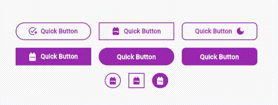
资源
安装
在你的 pubspec.yaml 文件中添加 quick_button 作为依赖项:
dependencies:
  flutter:
    sdk: flutter
  quick_button: ^1.0.0 # 使用最新版本
使用
在Dart代码中导入该包:
import 'package:quick_button/quick_button.dart';
你可以使用 QuickButton 小部件来创建具有不同变化的按钮:
QuickButton(
  labelText: '提交',
  onPressed: () {
    // 按钮被按下时执行的操作
  },
)

QuickButton.icon(
  icon: Icons.star,
  onPressed: () {
    // 按钮被按下时执行的操作
  },
)

QuickButton.prefixIcon(
  labelText: '开始',
  prefixIcon: Icons.play_arrow,
  onPressed: () {
    // 按钮被按下时执行的操作
  },
)

QuickButton.suffixIcon(
  labelText: '结束',
  suffixIcon: Icons.stop,
  onPressed: () {
    // 按钮被按下时执行的操作
  },
)
属性
labelText: 显示在按钮上的标签文本。labelColor: 标签文本的颜色。labelSize: 标签文本的字体大小。labelWeight: 标签文本的字体粗细。labelSpacing: 标签文本中字符之间的间距。icon: 放置在按钮内的图标。prefixIcon: 放置在标签文本前的图标。suffixIcon: 放置在标签文本后的图标。iconSize: 所有图标的大小。默认值为15.0。buttonWidth: 按钮的宽度。默认值为150.0。buttonHeight: 按钮的高度。borderRadius: 按钮角的圆角程度。borderColor: 包围按钮的边框颜色。borderSize: 包围按钮的边框宽度。默认值为1.0。backgroundColor: 按钮的背景颜色。hoverIn: 鼠标移入时标签文本的颜色。backgroundHoverIn: 鼠标移入时按钮的背景颜色。hoverOut: 鼠标移出时标签文本的颜色。backgroundHoverOut: 鼠标移出时按钮的背景颜色。onPressed: 按钮被按下时触发的回调函数。
回调
所有 QuickButton 小部件的变化都需要一个 onPressed 回调函数,当按钮被按下时触发。
许可证
此包以 MIT许可证 发布。
贡献
欢迎贡献!如果你发现任何问题或想增强此包,请在此处提交拉取请求:GitHub。
完整示例代码
import 'package:flutter/material.dart';
import 'package:quick_button/quick_button.dart';

void main() {
  runApp(const MyApp());
}

class MyApp extends StatelessWidget {
  const MyApp({super.key});

  [@override](/user/override)
  Widget build(BuildContext context) {
    return MaterialApp(
      home: Scaffold(
        appBar: AppBar(
          title: const Text('快速按钮'),
          backgroundColor: Colors.purple,
        ),
        body: Center(
          child: Column(
            mainAxisAlignment: MainAxisAlignment.center,
            crossAxisAlignment: CrossAxisAlignment.center,
            children: [
              QuickButton(
                labelText: '提交',
                labelColor: Colors.purple,
                labelSize: 13.0,
                labelWeight: FontWeight.bold,
                labelSpacing: 0.3,
                borderColor: Colors.purple,
                borderSize: 1.5,
                backgroundColor: Colors.transparent,
                hoverIn: Colors.white,
                hoverOut: Colors.purple,
                backgroundHoverIn: Colors.purple,
                backgroundHoverOut: Colors.transparent,
                onPressed: () {
                  // 按钮被按下时执行的操作
                },
              ),
              const SizedBox(
                height: 15,
              ),
              QuickButton.icon(
                icon: Icons.star,
                labelColor: Colors.purple,
                buttonHeight: 30.0,
                buttonWidth: 30.0,
                borderColor: Colors.purple,
                borderSize: 1.5,
                backgroundColor: Colors.transparent,
                hoverIn: Colors.white,
                hoverOut: Colors.purple,
                backgroundHoverIn: Colors.purple,
                backgroundHoverOut: Colors.transparent,
                onPressed: () {
                  // 按钮被按下时执行的操作
                },
              ),
              const SizedBox(
                height: 15,
              ),
              QuickButton.prefixIcon(
                labelText: '快速按钮',
                labelColor: Colors.white,
                prefixIcon: Icons.play_arrow,
                borderRadius: 25.0,
                borderColor: Colors.transparent,
                borderSize: 1.5,
                labelWeight: FontWeight.w700,
                backgroundColor: Colors.purple,
                hoverIn: Colors.purple[800],
                hoverOut: Colors.white,
                backgroundHoverIn: const Color.fromARGB(162, 155, 39, 176),
                backgroundHoverOut: Colors.purple,
                onPressed: () {
                  // 按钮被按下时执行的操作
                },
              ),
              const SizedBox(
                height: 15,
              ),
              QuickButton.suffixIcon(
                labelText: '结束',
                labelColor: Colors.purple,
                suffixIcon: Icons.stop,
                borderRadius: 5.0,
                borderColor: Colors.purple,
                borderSize: 1.5,
                backgroundColor: Colors.transparent,
                hoverIn: Colors.white,
                hoverOut: Colors.purple,
                backgroundHoverIn: Colors.purple,
                backgroundHoverOut: Colors.transparent,
                onPressed: () {
                  // 按钮被按下时执行的操作
                },
              ),
              const SizedBox(
                height: 15,
              ),
              QuickButton.icon(
                icon: Icons.book,
                labelColor: Colors.white,
                buttonHeight: 30.0,
                buttonWidth: 30.0,
                borderRadius: 25.0,
                borderColor: Colors.purple,
                borderSize: 1.5,
                backgroundColor: Colors.purple,
                hoverIn: Colors.purple,
                hoverOut: Colors.white,
                backgroundHoverIn: Colors.white,
                backgroundHoverOut: Colors.purple,
                onPressed: () {
                  // 按钮被按下时执行的操作
                },
              ),
              const SizedBox(
                height: 15,
              ),
              QuickButton(
                labelText: '链接',
                labelColor: Colors.purple,
                hoverIn: Colors.black,
                hoverOut: Colors.purple,
                backgroundColor: Colors.white,
                onPressed: () {
                  // 按钮被按下时执行的操作
                },
              ),
            ],
          ),
        ),
      ),
    );
  }
}
更多关于Flutter快速按钮操作插件quick_button的使用的实战教程也可以访问 https://www.itying.com/category-92-b0.html

更多关于Flutter快速按钮操作插件quick_button的使用的实战系列教程也可以访问 https://www.itying.com/category-92-b0.html
当然,以下是如何在Flutter项目中使用quick_button插件的一个示例。quick_button插件通常用于创建快速操作按钮,比如悬浮按钮(FAB)或其他快速访问功能。不过请注意,quick_button这个具体名称的插件在Flutter的官方插件库中可能并不存在,所以我将基于一个类似的插件概念来提供一个示例代码。如果quick_button是某个特定第三方插件,你可能需要查看其官方文档以获得确切的用法。
假设我们有一个类似的插件叫做fast_action_buttons,它允许我们快速创建和操作按钮。以下是一个示例代码,展示如何在Flutter中使用这样的插件:
1. 添加依赖
首先,在你的pubspec.yaml文件中添加插件依赖:
dependencies:
  flutter:
    sdk: flutter
  fast_action_buttons: ^x.y.z  # 替换为实际版本号
然后运行flutter pub get来安装依赖。
2. 使用插件
接下来,在你的Flutter应用中导入并使用这个插件。以下是一个完整的示例代码:
import 'package:flutter/material.dart';
import 'package:fast_action_buttons/fast_action_buttons.dart';  // 假设插件名为fast_action_buttons

void main() {
  runApp(MyApp());
}

class MyApp extends StatelessWidget {
  @override
  Widget build(BuildContext context) {
    return MaterialApp(
      title: 'Flutter Quick Button Demo',
      theme: ThemeData(
        primarySwatch: Colors.blue,
      ),
      home: MyHomePage(),
    );
  }
}

class MyHomePage extends StatefulWidget {
  @override
  _MyHomePageState createState() => _MyHomePageState();
}

class _MyHomePageState extends State<MyHomePage> {
  @override
  Widget build(BuildContext context) {
    return Scaffold(
      appBar: AppBar(
        title: Text('Flutter Quick Button Demo'),
      ),
      body: Center(
        child: Column(
          mainAxisAlignment: MainAxisAlignment.center,
          children: <Widget>[
            Text(
              'Press the floating action button below to see quick actions',
            ),
            SizedBox(height: 20),
            // 使用假设的FastActionButton插件来创建快速操作按钮
            FastActionButton(
              onPressed: () {
                // 这里可以定义点击主按钮时的动作
                print('Main button pressed');
              },
              child: Icon(Icons.add),
              buttons: [
                FastActionButtonItem(
                  icon: Icons.edit,
                  label: 'Edit',
                  onPressed: () {
                    print('Edit button pressed');
                  },
                ),
                FastActionButtonItem(
                  icon: Icons.delete,
                  label: 'Delete',
                  onPressed: () {
                    print('Delete button pressed');
                  },
                ),
                FastActionButtonItem(
                  icon: Icons.share,
                  label: 'Share',
                  onPressed: () {
                    print('Share button pressed');
                  },
                ),
              ],
            ),
          ],
        ),
      ),
    );
  }
}

// 假设的FastActionButton和FastActionButtonItem类定义(实际使用中应参考插件文档)
class FastActionButton extends StatelessWidget {
  final VoidCallback onPressed;
  final Widget child;
  final List<FastActionButtonItem> buttons;

  FastActionButton({required this.onPressed, required this.child, required this.buttons});

  @override
  Widget build(BuildContext context) {
    // 这里是FastActionButton的简化实现,实际插件可能有更复杂的布局和动画
    return FloatingActionButton(
      onPressed: onPressed,
      child: child,
    );
  }
}

class FastActionButtonItem {
  final IconData icon;
  final String label;
  final VoidCallback onPressed;

  FastActionButtonItem({required this.icon, required this.label, required this.onPressed});
}
注意
- 上面的代码是基于假设的
FastActionButton和FastActionButtonItem类。在实际使用中,你应该参考quick_button或类似插件的官方文档来获取正确的类和方法名。 - 插件可能会提供更多的配置选项,比如按钮的动画效果、布局方式等,这些都需要参考插件的文档来具体实现。
- 如果
quick_button确实是一个存在的插件,但名称与我假设的不同,或者它有特定的使用方法,请参考其官方GitHub页面或pub.dev页面上的文档。