


Flutter可视化插件at_viz的使用
Flutter可视化插件at_viz的使用
概述
at_viz 包是为希望构建美观且可定制图表和仪表盘的 Flutter 开发者设计的。
此开源包用 Dart 编写,并支持以下小部件:
SimpleRadialGauge
ScaleRadialGauge
SimpleLinearGauge
AtTimeSeriesLineChart

AtTimeSeriesBarChart

我们欢迎你提出建议来创建更多的图表或仪表,或者对已有的图表或仪表添加功能。
如何工作
设置
该包需要按如下方式导入:
import 'package:at_viz/at_charts/at_time_series_chart/lib/at_time_series_chart.dart';

import 'package:at_viz/at_gauges/linear_gauges/simple_linear_gauge.dart';
import 'package:at_viz/at_gauges/radial_gauges/scale_radial_gauge.dart';
import 'package:at_viz/at_gauges/radial_gauges/simple_radial_gauge.dart';
使用
确保你的源代码注释清晰且全面。
简单折线图示例
AtTimeSeriesChart.line(
  data: lineData,
  style: lineChartStyle,
  backgroundColor: Colors.white,
),
简单柱状图示例
AtTimeSeriesChart.bar(
  data: barData,
  style: barChartStyle,
  backgroundColor: Colors.white,
),
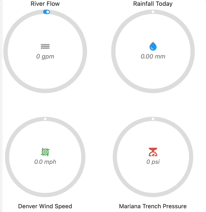
简单径向仪表示例
下面的代码片段展示了带有必需的 actualValue 和 maxValue 以及可选属性的简单仪表小部件。
SimpleRadialGauge(
  actualValue: 50,
  maxValue: 100,
  // 可选参数
  minValue: 0,
  title: Text('简单径向仪表'),
  titlePosition: TitlePosition.top,
  unit: 'L',
  icon: Icon(Icons.water),
  pointerColor: Colors.blue,
  decimalPlaces: 0,
  isAnimate: true,
  animationDuration: 2000,
  size: 400,
),
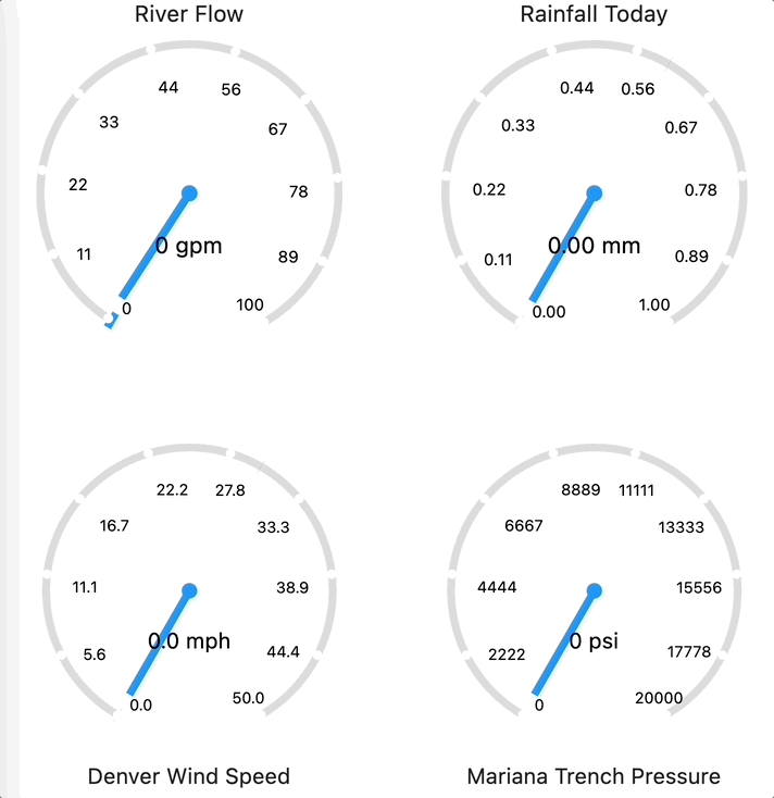
刻度径向仪表示例
下面的代码片段展示了带有必需的 actualValue 和 maxValue 以及可选属性的刻度仪表小部件。
ScaleRadialGauge(
  maxValue: 100,
  actualValue: 70,
  // 可选参数
  minValue: 0,
  size: 400,
  title: Text('刻度径向仪表'),
  titlePosition: TitlePosition.top,
  pointerColor: Colors.blue,
  needleColor: Colors.blue,
  decimalPlaces: 0,
  isAnimate: true,
  animationDuration: 2000,
  unit: TextSpan(text: 'Km/h', style: TextStyle(fontSize: 10)),
)
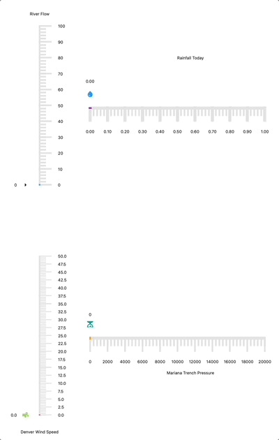
简单线性仪表示例
下面的代码片段展示了带有必需的 actualValue 和 maxValue 以及可选属性的简单线性仪表小部件。
SimpleLinearGauge(
  maxValue: 100,
  actualValue: 76,
  // 可选参数
  minValue: 0,
  divisions: 10,
  title: const Text('简单线性仪表'),
  titlePosition: TitlePosition.top,
  pointerColor: Colors.blue,
  pointerIcon: const Icon(Icons.water_drop, color: Colors.blue),
  decimalPlaces: 0,
  isAnimate: true,
  animationDuration: 2000,
  gaugeOrientation: GaugeOrientation.vertical,
  gaugeStrokeWidth: 5,
  rangeStrokeWidth: 5,
  majorTickStrokeWidth: 3,
  minorTickStrokeWidth: 3,
  actualValueTextStyle: const TextStyle(color: Colors.black, fontSize: 15),
  majorTickValueTextStyle: const TextStyle(color: Colors.black),
),
有关更多信息,请参阅示例标签或在 pub.dev 上列出的 API 文档。
开源使用和贡献
这是开源代码,所以你可以自由地使用它,提出更改或增强建议,或创建自己的版本。有关如何设置工具、测试并提交拉取请求的详细指导,请参阅 CONTRIBUTING.md。
维护人员
创建者:
示例代码
import 'package:at_viz_example/screens/gauges.dart';
import 'package:at_viz_example/screens/time_series.dart';
import 'package:flutter/material.dart';

void main() {
  runApp(const MyApp());
}

class MyApp extends StatelessWidget {
  const MyApp({super.key});

  [@override](/user/override)
  Widget build(BuildContext context) {
    return const ExampleBody();
  }
}

class ExampleBody extends StatefulWidget {
  const ExampleBody({super.key});

  [@override](/user/override)
  State<ExampleBody> createState() => _ExampleBodyState();
}

class _ExampleBodyState extends State<ExampleBody> {
  var _selectedIndex = 0;

  void _onItemTapped(int index) {
    setState(() {
      _selectedIndex = index;
    });
  }

  final List<Widget> _navigationBarBody = [
    const TimeSeriesChartExample(
      title: 'Charts example',
    ),
    const GaugesExample()
  ];

  [@override](/user/override)
  Widget build(BuildContext context) {
    return MaterialApp(
      title: 'Flutter Demo',
      theme: ThemeData(
        primarySwatch: Colors.blue,
      ),
      home: Scaffold(
        bottomNavigationBar: BottomNavigationBar(
          items: const [
            BottomNavigationBarItem(
              icon: Icon(Icons.show_chart_sharp),
              label: 'Charts',
            ),
            BottomNavigationBarItem(
              icon: Icon(Icons.radio_button_off_outlined),
              label: 'Gauges',
            ),
          ],
          currentIndex: _selectedIndex,
          selectedItemColor: Colors.amber[800],
          onTap: _onItemTapped,
        ),
        body: _navigationBarBody[_selectedIndex],
      ),
    );
  }
}
更多关于Flutter可视化插件at_viz的使用的实战教程也可以访问 https://www.itying.com/category-92-b0.html

更多关于Flutter可视化插件at_viz的使用的实战系列教程也可以访问 https://www.itying.com/category-92-b0.html
当然,以下是如何在Flutter项目中集成和使用at_viz插件的示例代码。at_viz是一个假设的Flutter可视化插件,用于展示数据和图表。由于at_viz并非一个实际存在的广泛认可的插件(在编写此回答时),我将以一个通用的可视化插件的使用方式为例,并假设at_viz提供了类似的功能接口。
步骤 1: 添加依赖
首先,你需要在pubspec.yaml文件中添加at_viz插件的依赖。
dependencies:
  flutter:
    sdk: flutter
  at_viz: ^x.y.z  # 假设的版本号,请替换为实际版本号
然后运行flutter pub get来安装依赖。
步骤 2: 导入插件
在你的Dart文件中导入at_viz插件。
import 'package:at_viz/at_viz.dart';
步骤 3: 使用插件
下面是一个简单的示例,展示如何在Flutter应用中使用at_viz插件来显示一个图表。
import 'package:flutter/material.dart';
import 'package:at_viz/at_viz.dart';

void main() {
  runApp(MyApp());
}

class MyApp extends StatelessWidget {
  @override
  Widget build(BuildContext context) {
    return MaterialApp(
      title: 'Flutter Demo',
      theme: ThemeData(
        primarySwatch: Colors.blue,
      ),
      home: MyHomePage(),
    );
  }
}

class MyHomePage extends StatefulWidget {
  @override
  _MyHomePageState createState() => _MyHomePageState();
}

class _MyHomePageState extends State<MyHomePage> {
  // 假设的数据
  List<Map<String, dynamic>> data = [
    {'label': 'A', 'value': 10},
    {'label': 'B', 'value': 20},
    {'label': 'C', 'value': 30},
    {'label': 'D', 'value': 40},
  ];

  @override
  Widget build(BuildContext context) {
    return Scaffold(
      appBar: AppBar(
        title: Text('Flutter at_viz Demo'),
      ),
      body: Center(
        child: AtVizChart(
          data: data,
          type: 'bar', // 假设的图表类型,如'bar'表示柱状图
          options: AtVizOptions(
            title: 'Sample Chart',
            xAxisLabel: 'Labels',
            yAxisLabel: 'Values',
          ),
        ),
      ),
    );
  }
}

// 假设的AtVizChart和AtVizOptions类定义
class AtVizChart extends StatelessWidget {
  final List<Map<String, dynamic>> data;
  final String type;
  final AtVizOptions options;

  AtVizChart({required this.data, required this.type, required this.options});

  @override
  Widget build(BuildContext context) {
    // 这里应该是插件的渲染逻辑,但由于是假设的,我们仅返回一个占位容器
    return Container(
      height: 300,
      width: 300,
      color: Colors.grey[200],
      child: Center(
        child: Text('AtVizChart Placeholder'),
      ),
    );
  }
}

class AtVizOptions {
  final String title;
  final String xAxisLabel;
  final String yAxisLabel;

  AtVizOptions({required this.title, required this.xAxisLabel, required this.yAxisLabel});
}
注意事项
- 实际插件API:上面的代码是基于假设的
AtVizChart和AtVizOptions类。你需要根据at_viz插件的实际API文档来调整代码。 - 图表类型:
type: 'bar'是一个假设的参数,用于指定图表类型。你需要查看插件文档来确定如何指定图表类型。 - 数据格式:数据格式和选项可能需要根据插件的实际要求进行调整。
由于at_viz是一个假设的插件,上述代码提供了一个框架性的示例,展示了如何在Flutter应用中集成和使用一个假设的可视化插件。请确保查阅at_viz插件的官方文档以获取准确的API和使用指南。