


Flutter自适应按钮插件adaptive_button的使用
Flutter自适应按钮插件adaptive_button的使用
AdaptiveButton 是一个与平台兼容的按钮插件。它在执行异步操作时禁用按钮的点击功能,并在等待期间显示一个加载指示器。
开始使用
首先,导入 adaptive_button 包:
import 'package:adaptive_button/adaptive_button.dart';
平台兼容性展示
iOS
Android
Web
必需的选项
AdaptiveButton 需要以下两个必需参数:
Widget child: 按钮上显示的文本或图标。Future<void> Function() onPressed: 按钮点击后的回调函数。
示例代码:
[@override](/user/override)
Widget build(BuildContext context) {
  return Scaffold(
      body: Container(
        child: AdaptiveButton(
            child: Text("AdaptiveButton"),
            onPressed: () async {}
        ),
      ));
}
不带加载指示器的使用
默认情况下,当 loadingWidget 属性为空时,会显示一个默认的加载指示器。
示例代码:
[@override](/user/override)
Widget build(BuildContext context) {
  return Scaffold(
      body: Container(
        child: AdaptiveButton(
          height: 50,
          width: MediaQuery.of(context).size.width,
          enabledLoading: true,
          child: const Text("AdaptiveButton - Without Loading Widget"),
          onPressed: () async {
            await Future.delayed(const Duration(seconds: 2));
            showDialog(
              context: context,
              builder: (context) {
                return const AlertDialog(
                  content: Text("Merhaba ben AdaptiveButton bulunduğum platforma göre şekillenirim:)"),
                );
              },
            );
          },
        ),
      ));
}
不带异步操作的使用
当 enableLoading 属性为空时,可以不使用异步操作。
示例代码:
[@override](/user/override)
Widget build(BuildContext context) {
  return Scaffold(
      body: Container(
        child: AdaptiveButton(
          color: Colors.amber,
          child: const Text(
            "AdaptiveButton",
            style: TextStyle(color: Colors.black54),
          ),
          onPressed: () async {
            showDialog(
              context: context,
              builder: (context) {
                return const AlertDialog(
                  content: Text("Merhaba ben AdaptiveButton bulunduğum platforma göre şekillenirim:)"),
                );
              },
            );
            debugPrint("AdaptiveButton Test Message");
          },
        ),
      ));
}
自定义大小属性
可以通过 width 和 height 属性来自定义按钮的大小。
示例代码:
[@override](/user/override)
Widget build(BuildContext context) {
  return Scaffold(
    body: AdaptiveButton(
      height: 50,
      width: MediaQuery.of(context).size.width,
      enabledLoading: true,
      loadingWidget: const SizedBox(
          width: 20,
          height: 20,
          child: CircularProgressIndicator(
            color: Colors.amber,
          )),
      child: const Text("AdaptiveButton - Loading"),
      onPressed: () async {
        await Future.delayed(const Duration(seconds: 2));
        showDialog(
          context: context,
          builder: (context) {
            return const AlertDialog(
              content: Text("Merhaba ben AdaptiveButton bulunduğum platforma göre şekillenirim:)"),
            );
          },
        );
      },
    ),);
}
特性
double? width: 改变按钮的宽度。double? height: 改变按钮的高度。Widget child: 确定按钮上显示的文本或图标。(必填)Future<void> Function() onPressed: 当按钮被点击时运行的操作。(必填)bool? enabledLoading: 设置为true时,在异步操作期间显示一个加载指示器,默认为false。Widget? loadingWidget: 设置按钮加载时显示的子组件。Color? color: 设置按钮的背景颜色。BorderRadius? borderRadius: 允许按钮的角落圆角化,默认为BorderRadius.circular(8)。EdgeInsetsGeometry? padding: 允许设置内边距,默认为EdgeInsets.symmetric(horizontal: 16)。EdgeInsetsGeometry? margin: 允许设置外边距,默认为EdgeInsets.zero。
完整示例
import 'package:flutter/material.dart';
import 'dart:async';
import 'package:adaptive_button/adaptive_button.dart';
void main() {
runApp(const MyApp());
}
class MyApp extends StatefulWidget {
const MyApp({super.key});
[@override](/user/override)
State<MyApp> createState() => _MyAppState();
}
class _MyAppState extends State<MyApp> {
[@override](/user/override)
void initState() {
super.initState();
}
[@override](/user/override)
Widget build(BuildContext context) {
return const MaterialApp(
debugShowCheckedModeBanner: false, home: AdaptiveButtonView());
}
}
class AdaptiveButtonView extends StatefulWidget {
const AdaptiveButtonView({Key? key}) : super(key: key);
[@override](/user/override)
State<AdaptiveButtonView> createState() => _AdaptiveButtonViewState();
}
class _AdaptiveButtonViewState extends State<AdaptiveButtonView> {
[@override](/user/override)
Widget build(BuildContext context) {
return Scaffold(
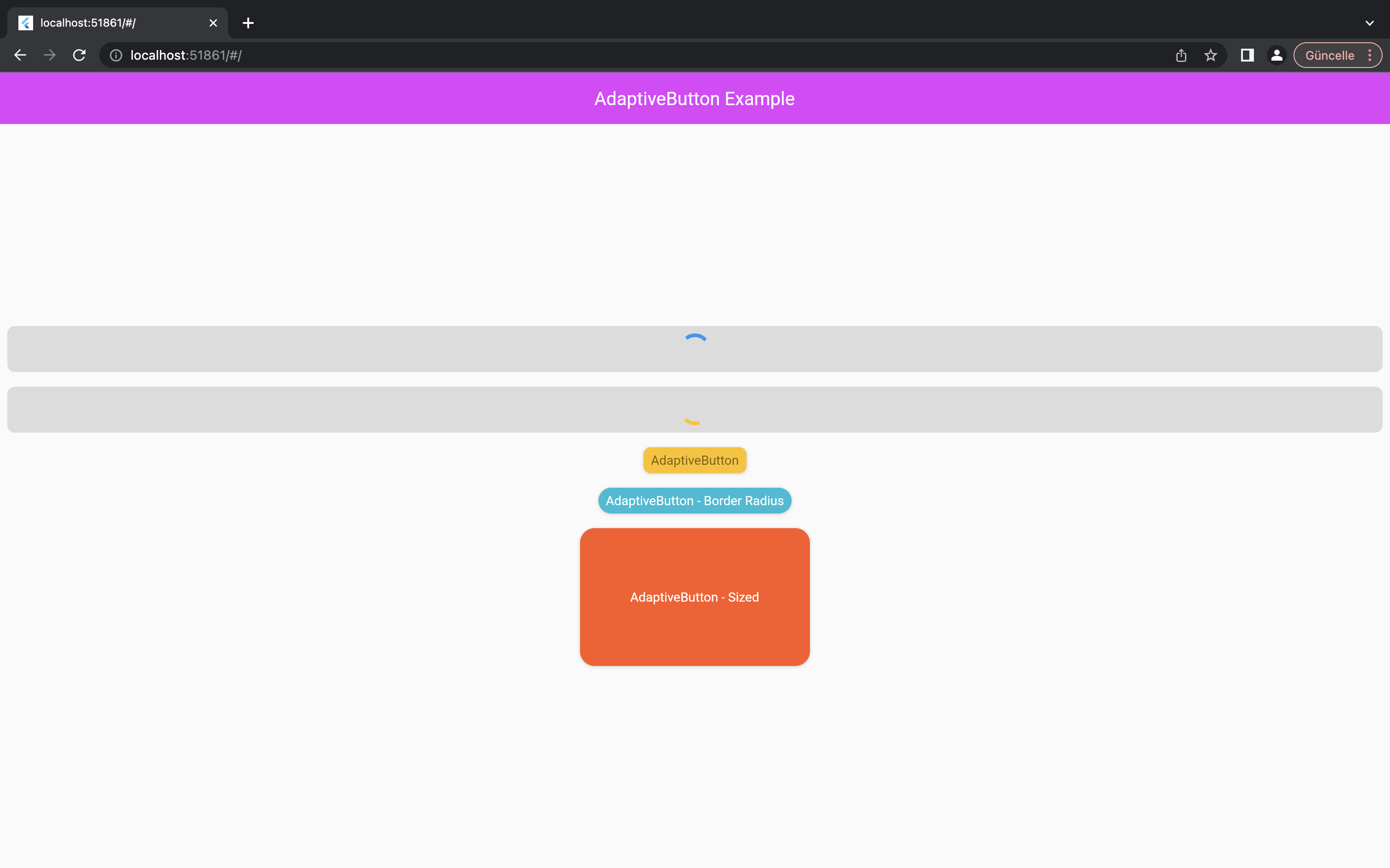
appBar: AppBar(
elevation: 0,
backgroundColor: Colors.purpleAccent,
title: const Text('AdaptiveButton Example'),
),
body: Center(
child: Column(
mainAxisAlignment: MainAxisAlignment.center,
children: [
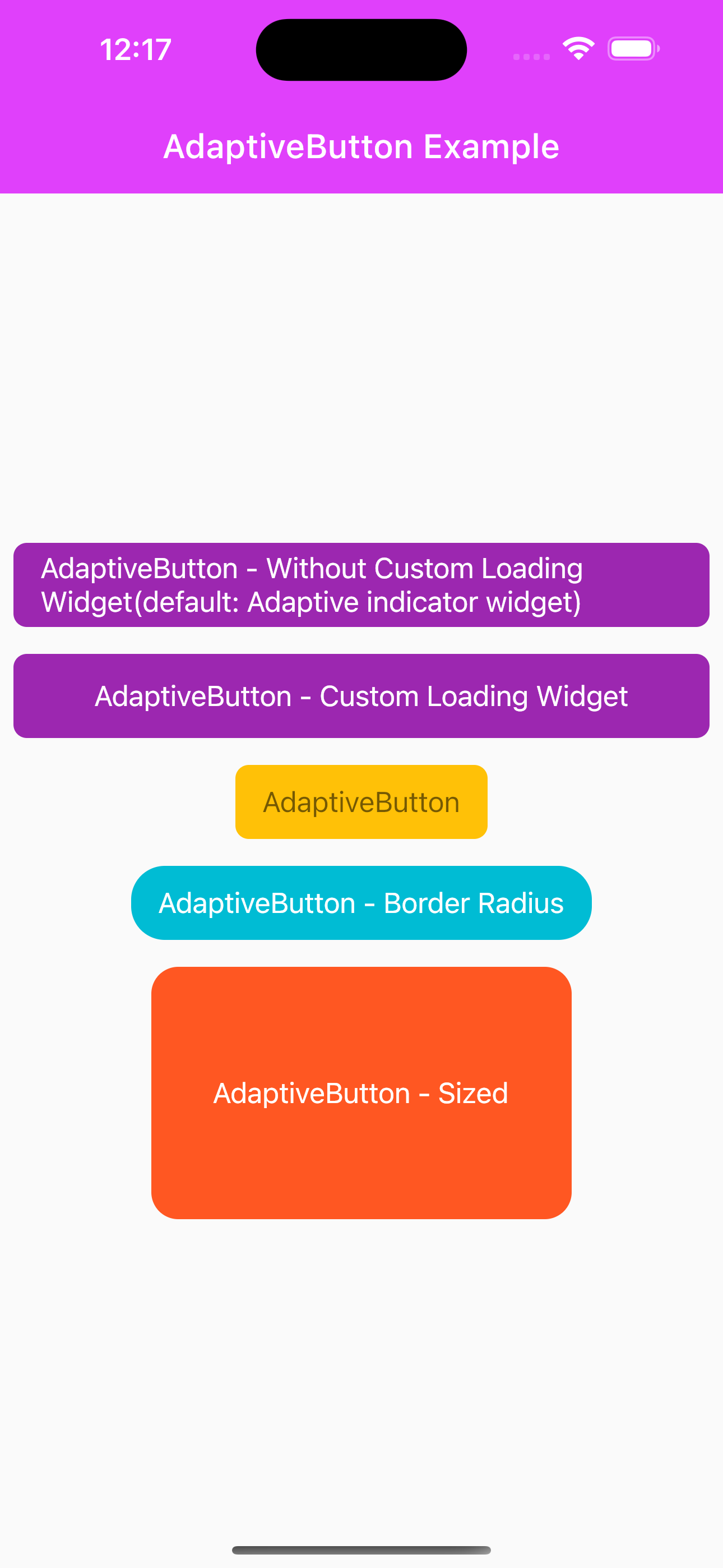
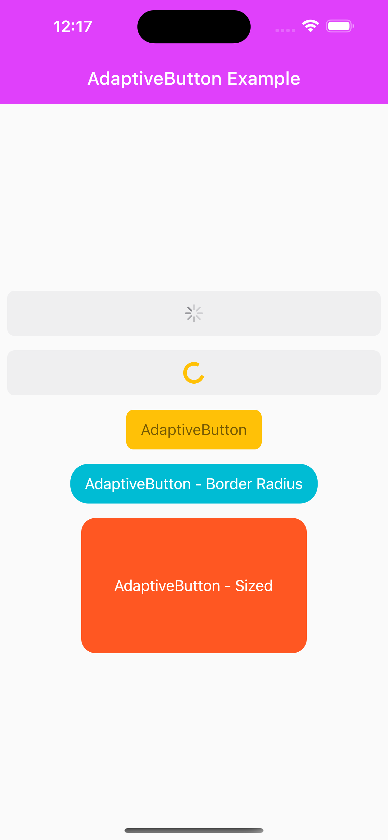
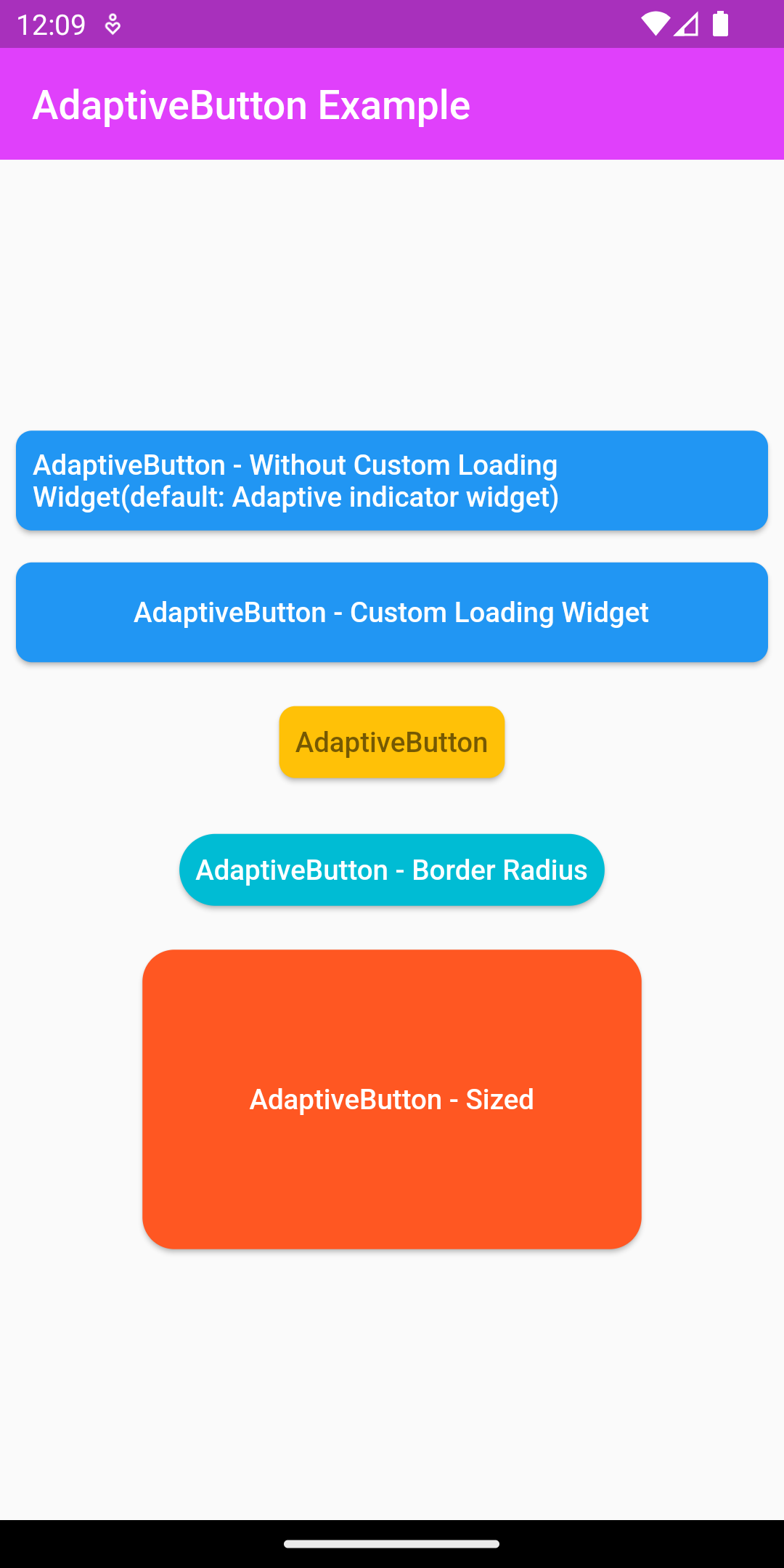
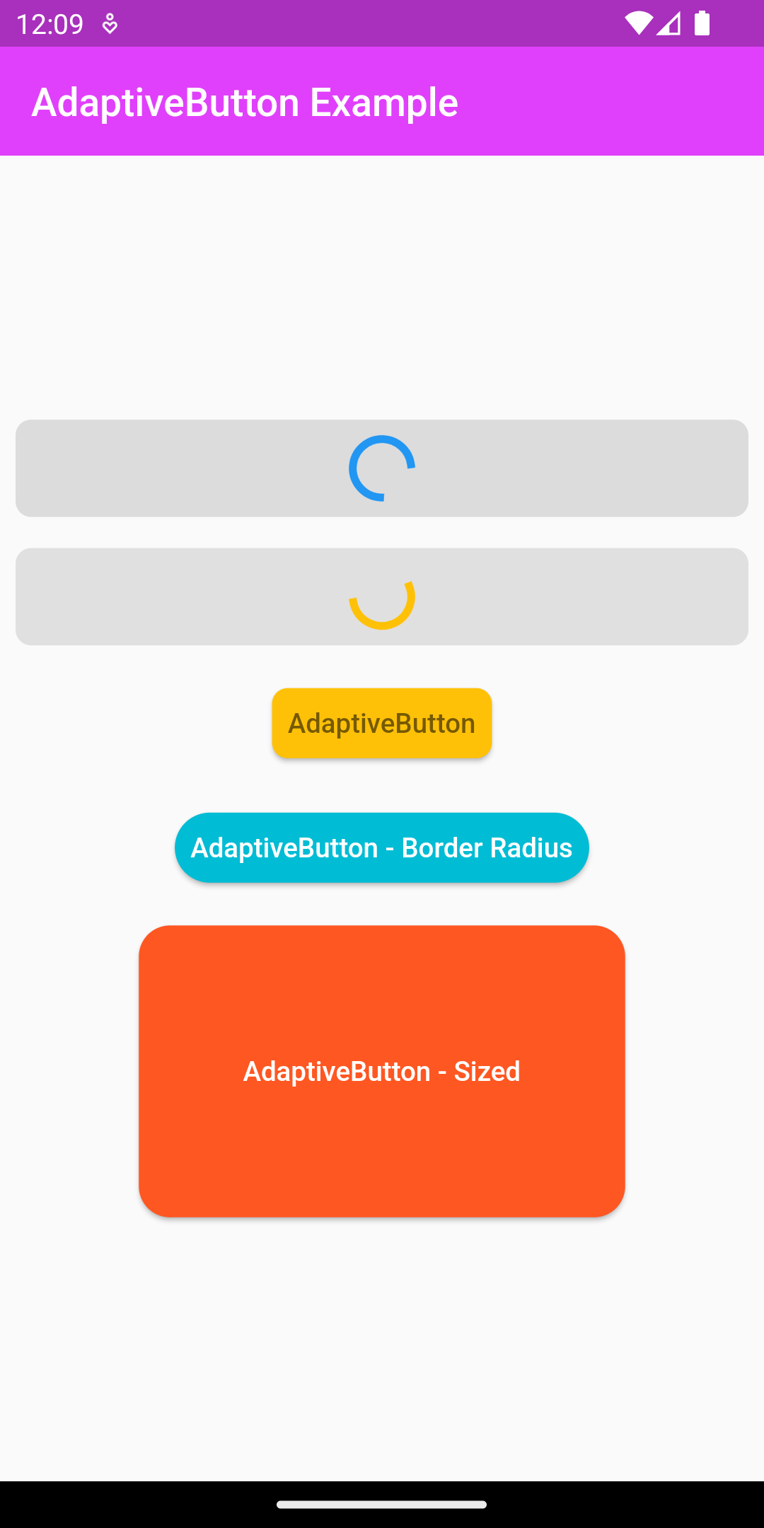
/// Without [loadingWidget] property example and async function.
AdaptiveButton(
height: 50,
width: MediaQuery.of(context).size.width,
enabledLoading: true,
child: const Center(
child: Text("AdaptiveButton - Without Custom Loading Widget(default: Adaptive indicator widget)")),
onPressed: () async {
await Future.delayed(const Duration(seconds: 5));
await showDialog(
context: context,
builder: (context) {
return const AlertDialog(
content: Text("Merhaba ben AdaptiveButton bulunduğum platforma göre şekillenirim:)"),
);
},
);
},
),
/// With [loadingWidget] property example and async function.
AdaptiveButton(
height: 50,
width: MediaQuery.of(context).size.width,
enabledLoading: true,
loadingWidget: const SizedBox(
width: 20,
height: 20,
child: CircularProgressIndicator(
color: Colors.amber,
)),
child: const Text("AdaptiveButton - Custom Loading Widget"),
onPressed: () async {
await Future.delayed(const Duration(seconds: 5));
showDialog(
context: context,
builder: (context) {
return const AlertDialog(
content: Text("Merhaba ben AdaptiveButton bulunduğum platforma göre şekillenirim:)"),
);
},
);
},
),
/// Without [loadingWidget] and [enabledLoading] property example and without async function.
AdaptiveButton(
color: Colors.amber,
child: const Text(
"AdaptiveButton",
style: TextStyle(color: Colors.black54),
),
onPressed: () async {
showDialog(
context: context,
builder: (context) {
return const AlertDialog(
content: Text("Merhaba ben AdaptiveButton bulunduğum platforma göre şekillenirim:)"),
);
},
);
debugPrint("AdaptiveButton Test Message");
},
),
/// Usage with [borderRadius] property.
AdaptiveButton(
borderRadius: BorderRadius.circular(20),
color: Colors.cyan,
child: const Text("AdaptiveButton - Border Radius"),
onPressed: () async {
debugPrint("AdaptiveButton Test Message");
},
),
/// Usage with [width] and [height] property.
AdaptiveButton(
width: 250,
height: 150,
borderRadius: BorderRadius.circular(16),
color: Colors.deepOrange,
child: const Text("AdaptiveButton - Sized"),
onPressed: () async {
debugPrint("AdaptiveButton Test Message");
},
),
],
),
),
);
}
}
更多关于Flutter自适应按钮插件adaptive_button的使用的实战教程也可以访问 https://www.itying.com/category-92-b0.html

更多关于Flutter自适应按钮插件adaptive_button的使用的实战系列教程也可以访问 https://www.itying.com/category-92-b0.html
当然,下面是一个关于如何在Flutter中使用adaptive_button插件的示例代码。adaptive_button是一个可以根据屏幕大小和不同设备自适应调整大小的按钮插件。
首先,确保你已经在pubspec.yaml文件中添加了adaptive_button依赖:
dependencies:
  flutter:
    sdk: flutter
  adaptive_button: ^最新版本号  # 请替换为实际最新版本号
然后运行flutter pub get来安装依赖。
接下来,你可以在你的Flutter项目中使用AdaptiveButton。以下是一个完整的示例代码,展示了如何在一个简单的Flutter应用中使用adaptive_button:
import 'package:flutter/material.dart';
import 'package:adaptive_button/adaptive_button.dart';

void main() {
  runApp(MyApp());
}

class MyApp extends StatelessWidget {
  @override
  Widget build(BuildContext context) {
    return MaterialApp(
      title: 'Adaptive Button Demo',
      theme: ThemeData(
        primarySwatch: Colors.blue,
      ),
      home: Scaffold(
        appBar: AppBar(
          title: Text('Adaptive Button Demo'),
        ),
        body: Center(
          child: Column(
            mainAxisAlignment: MainAxisAlignment.center,
            children: <Widget>[
              AdaptiveButton(
                text: 'Small Screen Button',
                onPressed: () {
                  // 按钮点击事件处理
                  print('Small Screen Button clicked');
                },
                textStyle: TextStyle(fontSize: 16),
                padding: EdgeInsets.all(10),
                buttonColor: Colors.blue,
                textColor: Colors.white,
                borderRadius: BorderRadius.circular(10),
                minWidth: 100,  // 最小宽度
                minHeight: 50,  // 最小高度
              ),
              SizedBox(height: 20),
              AdaptiveButton(
                text: 'Large Screen Button',
                onPressed: () {
                  // 按钮点击事件处理
                  print('Large Screen Button clicked');
                },
                textStyle: TextStyle(fontSize: 24),
                padding: EdgeInsets.all(20),
                buttonColor: Colors.green,
                textColor: Colors.white,
                borderRadius: BorderRadius.circular(20),
                minWidth: 200,  // 最小宽度
                minHeight: 100, // 最小高度
                maxAspectRatio: 2.0,  // 最大宽高比
              ),
            ],
          ),
        ),
      ),
    );
  }
}
在这个示例中,我们展示了两个AdaptiveButton,每个按钮都有不同的样式和大小设置。你可以根据需求调整minWidth、minHeight、padding、textStyle等参数来自定义按钮的外观。
AdaptiveButton的text属性用于设置按钮的文本。onPressed属性用于设置按钮点击事件的处理函数。textStyle属性用于设置按钮文本的样式。padding属性用于设置按钮的内边距。buttonColor和textColor属性分别用于设置按钮的背景色和文本颜色。borderRadius属性用于设置按钮的圆角半径。minWidth和minHeight属性用于设置按钮的最小宽度和高度。maxAspectRatio属性用于设置按钮的最大宽高比,以确保按钮在不同屏幕尺寸上保持合适的比例。
这个插件通过调整按钮的尺寸和样式,使得在不同设备和屏幕尺寸上都能保持良好的用户体验。希望这个示例能帮助你理解如何在Flutter中使用adaptive_button插件。