


Flutter空安全支持插件fsuper_nullsafety的使用
FSuper
FSuper 可以帮助开发者快速舒适地构建复杂的视图。
它支持丰富的文本、圆角、边框、图片、小红点,并且可以同时设置两个子组件,并控制它们的相对位置,高质量的Neumorphism风格。
作者:Newton(coorchice.cb@alibaba-inc.com)
English | 简体中文
喜欢吗?请投个 Star 🥰!
✨ 特性 #
- 丰富的 圆角 效果
- 精致的 边框 装饰
- 自然支持美妙的 富文本
- 渐变效果
- 更具有空间感的 阴影
- 不简单的 红点
- 灵活强大的 相对布局
- 高质量的 Neumorphism 风格
🛠 指导 #
⚙️ 参数 #
🔩 基础参数 #
| 参数名 | 类型 | 必要性 | 默认值 | 描述 |
|---|---|---|---|---|
| width | double | 否 | null | 宽度 |
| height | double | 否 | null | 高度。不能为 double.infinity |
| maxWidth | double | 否 | null | 最大宽度。如果宽度大于最大宽度,则宽度被覆盖。如果没有宽度,则最大扩展宽度为 maxWidth |
| maxHeight | double | 否 | null | 最大高度。如果高度大于最大高度,则高度被覆盖。如果没有高度,则最大扩展高度为 maxHeight |
| backgroundColor | Color | 否 | null | 背景颜色 |
| backgroundImage | ImageProvider | 否 | null | 背景图。覆盖 backgroundColor 和 gradient |
| gradient | Gradient | 否 | null | 渐变。将覆盖 backgroundColor |
| padding | EdgeInsetsGeometry | 否 | null | 文本和各边的间距。这在为 FSuper 子组件预留空间时非常有用 |
| margin | EdgeInsets | 否 | null | FSuper 在父容器中的间距 |
| corner | FCorner | 否 | null | 圆角大小 |
| cornerStyle | FCornerStyle | 否 | FCornerStyle.round | 圆角样式。默认为圆角,设置 FCornerStyle.bevel 为斜角 |
| text | String | 否 | null | 文本内容 |
| style | TextStyle | 否 | null | 文本样式 |
| textAlign | TextAlign | 否 | TextAlign.center | 文本对齐方式 |
| spans | List | 否 | null | 富文本。接收文本后,默认继承文本配置。可以通过 TextStyle 单独设置 |
| onClick | GestureTapCallback | 否 | null | 设置 FSuper 点击监听器 |
🧸 子组件参数 #
| 参数名 | 类型 | 必要性 | 默认值 | 描述 |
|---|---|---|---|---|
| child1 | Widget | 否 | null | 子组件 1 |
| child1Alignment | Alignment | 否 | null | 子组件 1 在 FSuper 中的相对位置 |
| child1Margin | EdgeInsets | 否 | null | 子组件 1 的相对位置偏移量 |
| onChild1Click | GestureTapCallback | 否 | null | 子组件 1 的点击监听器 |
| child2 | Widget | 否 | null | 子组件 2 |
| child2Alignment | Alignment | 否 | null | 子组件 2 在 FSuper 中的相对位置 |
| child2Margin | EdgeInsets | 否 | null | 子组件 2 的相对位置偏移量 |
| onChi2d1Click | GestureTapCallback | 否 | null | 子组件 2 的点击监听器 |
🎈 红点参数 #
| 参数名 | 类型 | 必要性 | 默认值 | 描述 |
|---|---|---|---|---|
| redPoint | bool | 否 | false | 是否显示红点 |
| redPointColor | Color | 否 | Colors.redAccent | 红点颜色 |
| redPointSize | double | 否 | 20 | 红点大小 |
| redPointText | String | 否 | null | 红点上的文本 |
| redPointTextStyle | TextStyle | 否 | null | 红点文本样式 |
| redPointOffset | Offset | 否 | null | 红点向右上偏移。红点的 (0,0) 位置在 FSuper 的右上角。默认情况下,红点向右上偏移 1/4 |
🖼 边框参数 #
| 参数名 | 类型 | 必要性 | 默认值 | 描述 |
|---|---|---|---|---|
| strokeWidth | double | 否 | null | 边框宽度。> 0 边框会显示 |
| strokeColor | Color | 否 | null | 边框颜色 |
🔳 阴影参数 #
| 参数名 | 类型 | 必要性 | 默认值 | 描述 |
|---|---|---|---|---|
| shadowColor | Color | 否 | null | 阴影颜色 |
| shadowOffset | Offset | 否 | null | 阴影偏移 |
| shadowBlur | double | 否 | null | 值越大,阴影越大 |
🍭 Neumorphism 风格 #
| 参数名 | 类型 | 必要性 | 默认值 | 描述 |
|---|---|---|---|---|
| isSupportNeumorphism | bool | 否 | false | 是否支持 Neumorphism 风格。开启此功能后 [highlightColor] 将无效 |
| lightOrientation | FLightOrientation | 否 | FLightOrientation.LeftTop | 当 [isSupportNeumorphism] 为真时有效。光源方向分为四个方向:左上、左下、右上、右下。用于控制光源的照射方向,这会影响高光方向和阴影方向 |
| highlightShadowColor | Color | 否 | null | Neumorphism 风格开启后,高光阴影颜色 |
| float | bool | 否 | false | 是否开启 Neumorphism 风格,是否为浮起效果,否则为凹陷效果,默认为 true |
📺 示例 #
🔩 基本示例 #
FSuper(
  margin: EdgeInsets.fromLTRB(12, 0, 12, 0),
  width: double.infinity,
  text: "This is FSuper!",
  backgroundColor: Color(0xffffc900),
),
FSuper(
text: "En… ",
spans: [
TextSpan(
text: “FWidget”,
style: TextStyle(
color: Color(0xffffc900),
backgroundColor: Colors.black38,
fontSize: 20,
)),
],
)
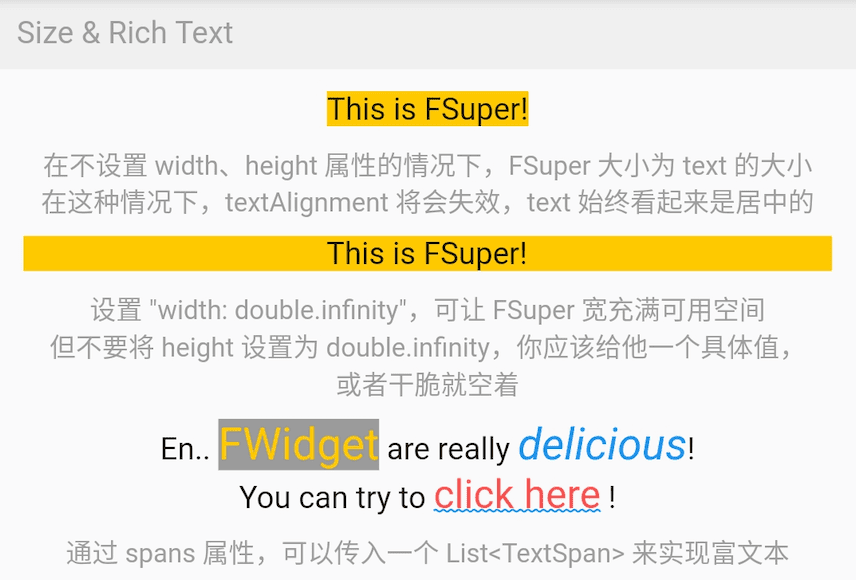
FSuper 的文本部分通过 text 属性设置,相关的文本样式属性也可以设置。如果要实现富文本效果,可以通过 spans 属性传递一个 TextSpan 数组。
当然,默认情况下,未设置的 TextSpan 属性会自动继承 FSuper 的文本样式配置。
默认情况下,FSuper 能够适应文本内容的大小。
但是,你仍然可以通过 width 和 height 属性指定特定大小。如果想要父容器充满组件,可以将它们的值设置为 double.infinity。
⚠️ 不要在无限大的父容器中将 FSuper 的大小设置为 double.infinity,因为它真的不知道应该有多大!
此外,FSuper 还提供了 maxWidth 和 maxHeight 来辅助布局,在不确定组件大小的情况下很有用。你的组件永远不会超过它们的限制。
🖼 圆角 & 边框示例 #
FSuper(
  width: 130,
  padding: EdgeInsets.only(top: 16, bottom: 16),
  text: 'Corner FSuper',
  backgroundColor: Color(0xffFF7043),
  corner: FCorner.all(12),
  cornerStyle: FCornerStyle.bevel,
),
FSuper(
text: ‘音乐类型:流行音乐’,
padding: EdgeInsets.all(2),
corner: FCorner.all(3),
strokeColor: Color(0xffc2bfc2),
strokeWidth: 1,
),
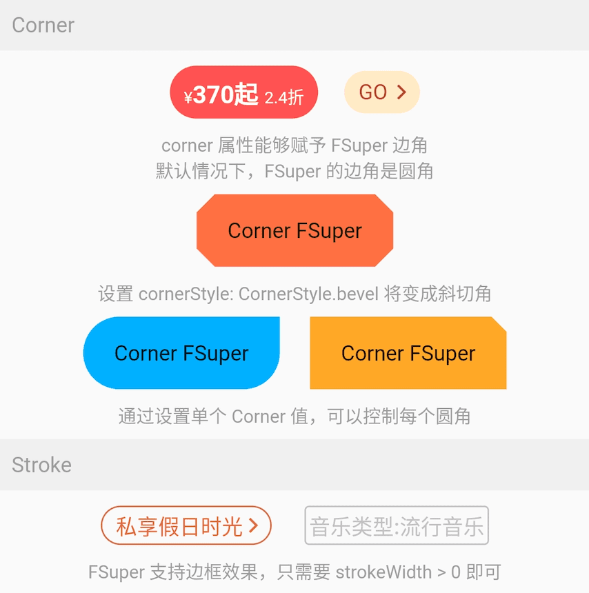
使用 FSuper 声明一个圆角和边框组件非常简单。
只需通过 corner 属性声明圆角。一个 Corner 对象将描述组件的圆角。你可以单独控制每个圆角。
FSuper 支持两种类型的圆角:
- FCornerStyle.round:圆角。这是我们最常用的情况。
- FCornerStyle.bevel:斜角。
如果你想要边框,只需要让 FSuper 的 StrokeWidth > 0。另外,strokeColor 属性允许你描述边框的颜色。
🔳 渐变 & 阴影示例 #
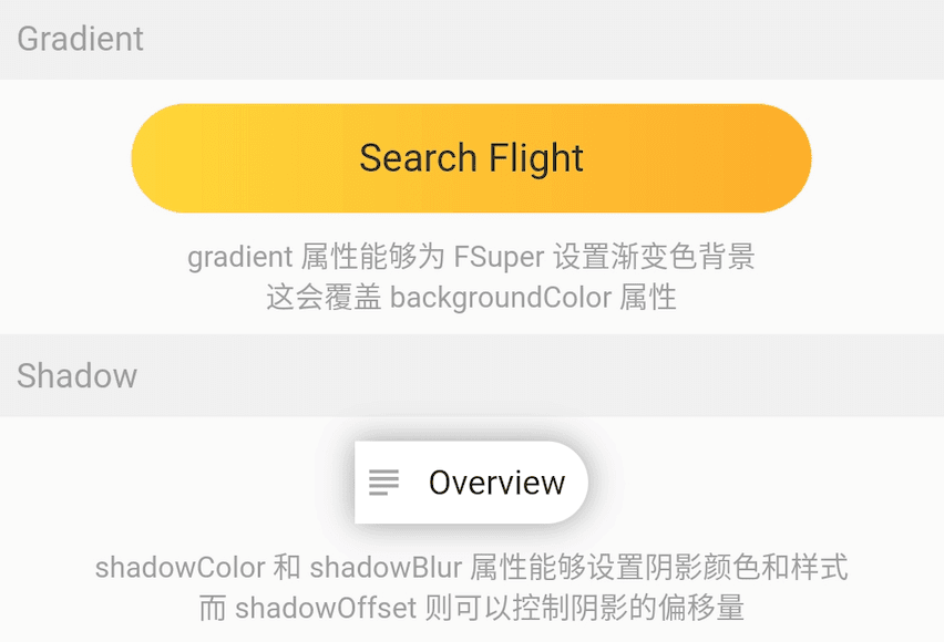
FSuper(
  width: 280,
  height: 45,
  text: 'Search Flight',
  textAlignment: Alignment.center,
  corner: FCorner.all(23),
  gradient: LinearGradient(colors: [
    Color(0xfffed83a),
    Color(0xfffcad2c),
  ]),
),
gradient 属性允许你使用一个渐变对象为 FSuper 声明一个渐变背景。
渐变背景将覆盖由 backgroundColor 设置的纯色背景。
⚠️ 背景优先级:backgroundImage > gradient > backgroundColor。
FSuper(
  text: 'Overview',
  backgroundColor: Colors.white,
  padding: EdgeInsets.fromLTRB(6.0 + 18.0 + 6.0, 9, 9, 9),
  corner: Corner(rightTopCorner: 20, rightBottomCorner: 20),
  child1: Icon(
    Icons.subject,
    size: 18,
    color: Color(0xffa6a4a7),
  ),
  child1Alignment: Alignment.centerLeft,
  child1Margin: EdgeInsets.only(left: 3),
  shadowColor: Colors.black38,
  shadowBlur: 10,
  onClick: () {
    _showDialog(context, "Disco");
  },
),
如果你考虑给组件添加阴影效果,使用 FSuper 是一个很好的选择。
🎈 红点示例 #
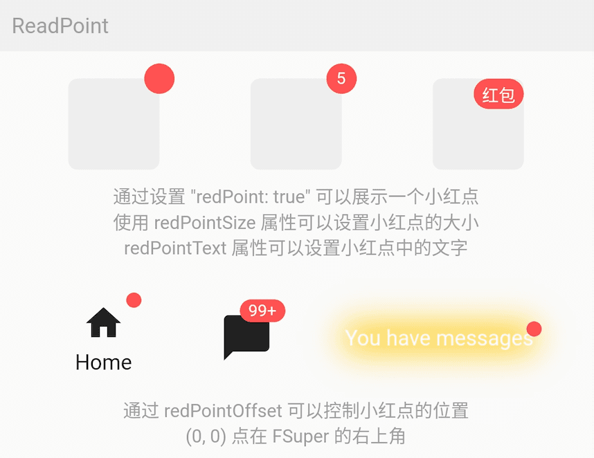
FSuper(
  width: 60,
  height: 60,
  backgroundColor: Color(0xffeeeeee),
  corner: FCorner.all(6),
  redPoint: true,
  readPointTextStyle: TextStyle(fontSize: 20.0),
  redPointText: "红包",
),
使用 FSuper 可以非常简单地实现常见的红点效果。只需配置 redPoint: true。
此外,你还可以向红点添加任意文本内容(确实很方便)并设置其位置。
⚠️ 红点的 (0,0) 位置在 FSuper 的右上角。
一站式服务满足所有需求。
🧸 子组件 #
FSuper(
    width: double.infinity,
    padding: EdgeInsets.fromLTRB(
        (16.0 + 25.0 + 12), 8, (0.0 + 8.0), 8),
    margin: EdgeInsets.fromLTRB(10, 10, 10, 0),
    corner: FCorner.all(6),
    backgroundColor: Color(0xfffff0e7),
    strokeColor: Color(0xfffee0cd),
    strokeWidth: 1,
    text: '警告提示的文案',
    textAlignment: Alignment.centerLeft,
    textAlign: TextAlign.left,
    spans: [
      //...
    ],
    child1: Transform.rotate(
      angle: pi,
      child: Icon(
        Icons.info,
        size: 25,
        color: Color(0xfffd6721),
      ),
    ),
    child1Alignment: Alignment.centerLeft,
    child1Margin: EdgeInsets.fromLTRB(16, 0, 0, 0),
    child2: Icon(
      Icons.close,
      size: 15,
      color: Colors.black38,
    ),
    child2Alignment: Alignment.topRight,
    child2Margin: EdgeInsets.fromLTRB(0, 8, 12, 0),
    onChild2Click: () {
      _showDialog(context, "关闭警告⚠️");
    },
  ),
在 FSuper 中,可以通过 child1, child2 声明两个子组件。你可以指定它们的位置并声明点击事件。
这将大大增加一些常见和复杂布局的开发速度。特别是在一个组件的大小较小且不确定的情况下,另一个组件根据其大小确定位置时,FSuper 可以处理一切。
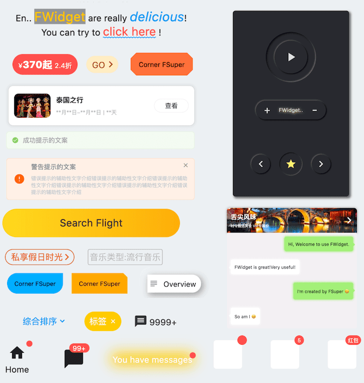
这些组件的效果在图中只需要一个 FSuper 组件即可完成。
🍭 Neumorphism 风格 #
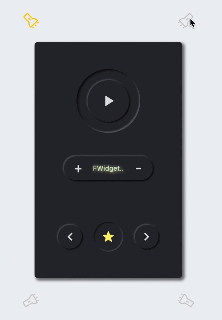
FSuper(
  /// 开启 Neumorphism 支持
  ///
  /// Turn on Neumorphism support
  isSupportNeumorphism: true,
/// 配置光源方向
///
/// Configure light source direction
lightOrientation: lightOrientation,
/// 配置暗部阴影
///
/// Configure dark shadows
shadowColor: Colors.black87,
/// 配置亮部阴影
///
/// Configure highlight shadow
highlightShadowColor: Colors.white24,
/// 是否呈浮起视效
///
/// Whether it is floating visual effect
float: false,
shadowOffset: Offset(0.0, 1.0),
width: 50,
height: 50,
backgroundColor: Color(0xff28292f),
corner: FCorner.all(40),
child1: Icon(
Icons.star,
color: Color(0xfffff176),
size: 23,
),
),
FButton 为开发者带来了令人难以置信的超高质量的 Neumorphism 风格。
开发者只需要配置 isSupportNeumorphism 参数来启用或禁用 Neumorphism 风格。
如果你想调整 Neumorphism 的样式,可以通过几个与阴影相关的属性进行细微调整,其中包括:
- shadowColor: 配置阴影的颜色
- highlightShadowColor: 配置高光阴影
FButton 还提供了 lightOrientation 参数,甚至允许开发者调整光线角度,从而获得不同的 Neumorphism 效果。
通过 float 参数,开发者可以轻松地在 浮起视觉效果 和 凹陷视觉效果 之间切换。
🎞 更多示例 #
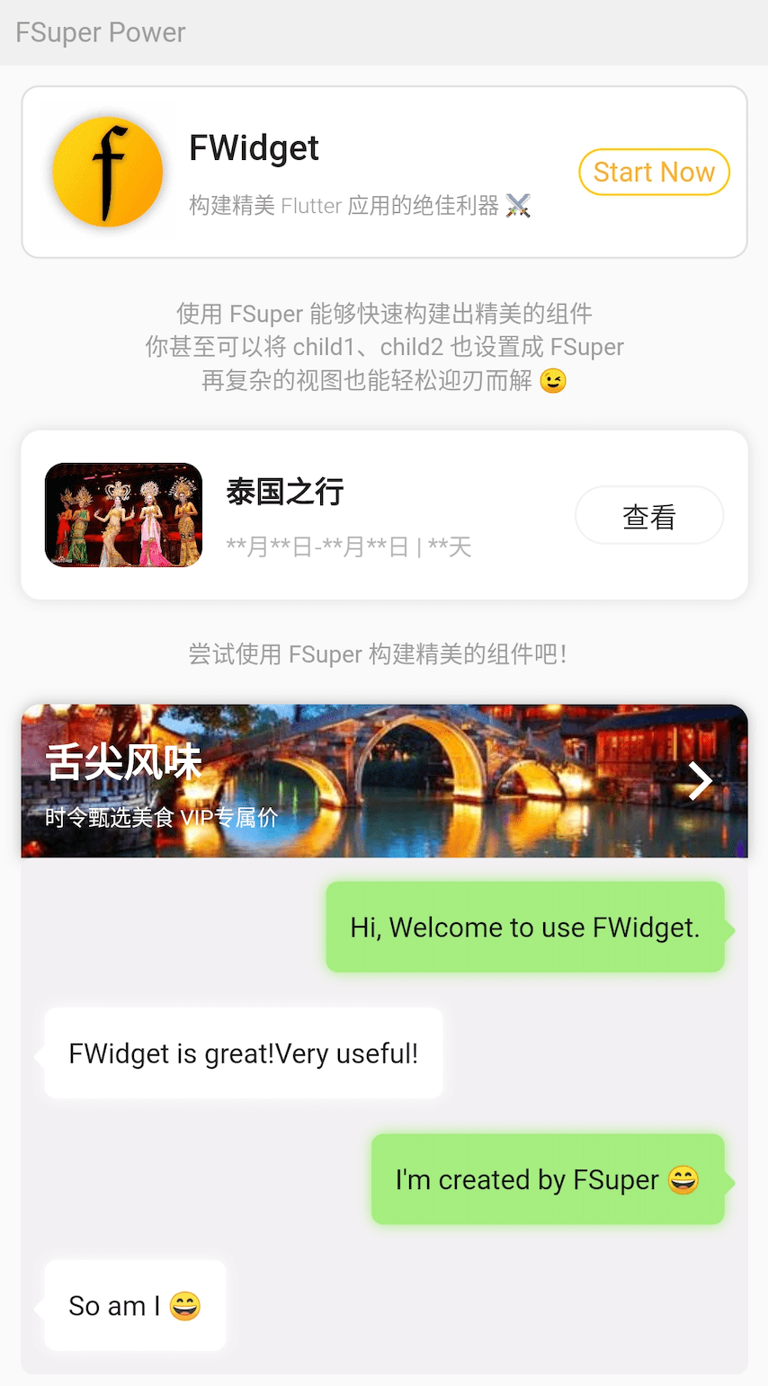
别惊讶,图中的效果都是使用 FSuper 实现的。
子组件的设计使 FSuper 在灵活性方面有了质的飞跃,大多数复杂的视图都可以实现。
例如,图中的聊天泡泡不需要使用背景图片,只需要使用 FSuper 即可实现。这使得这样的组件极其灵活且易于修改。
FSuper(
  maxWidth: 220,
  textAlign: TextAlign.left,
  text: "I'm created by FSuper 😄",
  padding: EdgeInsets.only(
      left: 12, right: 12, top: 15, bottom: 15),
  backgroundColor: Color(0xffa5ed7e),
  corner: FCorner.all(6),
  child1: Transform.rotate(
    angle: pi / 4,
    child: FSuper(
      width: 10,
      height: 10,
      backgroundColor: Color(0xffa5ed7e),
      corner: FCorner.all(1.5),
    ),
  ),
  child1Alignment: Alignment.topRight,
  child1Margin: EdgeInsets.only(right: -4, top: 20),
  shadowColor: Color(0xffa5ed7e),
  shadowBlur: 5,
),
😃 如何使用? #
在项目 pubspec.yaml 文件中添加依赖:
🌐 pub 依赖 #
dependencies:
  fsuper: ^<version number>
⚠️ 注意,前往 pub 获取 FSuper 的最新版本号。
🖥 git 依赖 #
dependencies:
  fsuper:
    git:
      url: 'git@github.com:Fliggy-Mobile/fsuper.git'
      ref: '<Branch number or tag number>'
⚠️ 注意,请参阅 FSuper 的官方项目获取分支号或标签号。
💡 许可证 #
Copyright 2020-present Fliggy Android Team <alitrip_android@list.alibaba-inc.com>.
Licensed under the Apache License, Version 2.0 (the “License”);
you may not use this file except in compliance with the License.
You may obtain a copy of the License at following link.
http://www.apache.org/licenses/LICENSE-2.0
Unless required by applicable law or agreed to in writing, software
distributed under the License is distributed on an “AS IS” BASIS,
WITHOUT WARRANTIES OR CONDITIONS OF ANY KIND, either express or implied.
See the License for the specific language governing permissions and
limitations under the License.
喜欢吗?请投个 Star 🥰! #
如何运行示例项目? #
-
克隆 项目到本地
-
进入项目
example目录并运行以下命令
flutter create .
- 运行
example中的示例
更多关于Flutter空安全支持插件fsuper_nullsafety的使用的实战教程也可以访问 https://www.itying.com/category-92-b0.html

更多关于Flutter空安全支持插件fsuper_nullsafety的使用的实战系列教程也可以访问 https://www.itying.com/category-92-b0.html
在Flutter中,空安全(Null Safety)是一种重要的特性,它可以帮助开发者避免空指针异常,提高代码的健壮性。如果你正在使用一个名为 fsuper_nullsafety 的插件,并且该插件已经支持空安全,那么你可以按照以下步骤来使用它。
1. 添加依赖
首先,你需要在 pubspec.yaml 文件中添加 fsuper_nullsafety 插件的依赖。确保你使用的是支持空安全的版本。
dependencies:
  flutter:
    sdk: flutter
  fsuper_nullsafety: ^1.0.0  # 请根据实际情况填写版本号
然后运行 flutter pub get 来获取依赖。
2. 导入插件
在你的 Dart 文件中导入 fsuper_nullsafety 插件。
import 'package:fsuper_nullsafety/fsuper_nullsafety.dart';
3. 使用插件
根据插件的文档或示例代码,使用 fsuper_nullsafety 提供的功能。由于插件已经支持空安全,你可以放心地使用它,而不必担心空指针异常。
例如,假设 fsuper_nullsafety 提供了一个 FSuper 组件,你可以这样使用它:
class MyWidget extends StatelessWidget {
  @override
  Widget build(BuildContext context) {
    return Scaffold(
      appBar: AppBar(
        title: Text('FSuper Null Safety Example'),
      ),
      body: Center(
        child: FSuper(
          text: 'Hello, FSuper!',
          onTap: () {
            print('FSuper tapped!');
          },
        ),
      ),
    );
  }
}
4. 处理空值
由于空安全已经启用,你可以使用 Dart 的空安全特性来处理可能为空的变量。例如,使用 ? 和 ! 操作符来明确变量的可空性。
String? nullableString = 'This can be null';

void printLength() {
  if (nullableString != null) {
    print(nullableString!.length); // 使用 ! 操作符断言非空
  } else {
    print('String is null');
  }
}