


Flutter日期选择器插件jalali_flutter_datepicker的使用
Flutter日期选择器插件jalali_flutter_datepicker的使用
简介
Jalali Flutter Date Picker 是一个用于 Flutter 应用程序的可定制的 Persian(Jalali)日期选择器。此包允许您轻松地将一个 Jalali 日期选择器集成到您的 Flutter 应用程序中,并提供多种自定义选项,包括不同日期状态的颜色。(支持 Dari 语言)
功能
- 可选日期范围:使用
firstDateRange和lastDateRange属性定义可选日期范围。 - 自定义颜色:使用各种属性设置启用、禁用、选中和今天的日期的不同颜色。
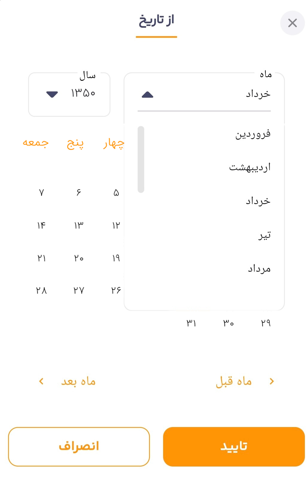
- 年份选择:使用内置的下拉菜单在年份之间导航。
- 动态月份和年份:根据可选日期范围动态生成月份和年份。
- 完全可定制:调整日期选择器的外观以匹配应用程序的设计。
安装
要将 Jalali Flutter Date Picker 添加到项目中,请在 pubspec.yaml 文件中添加以下依赖:
dependencies:
  jalali_flutter_datepicker: ^latest_version
然后运行 flutter pub get 来安装该包。
使用方法
在 Flutter 代码中导入该包:
import 'package:jalali_flutter_datepicker/jalali_flutter_datepicker.dart';
示例代码
void main() => runApp(const MyApp());
class MyApp extends StatelessWidget {
const MyApp({super.key});
[@override](/user/override)
Widget build(BuildContext context) {
return MaterialApp(
theme: ThemeData(
fontFamily: 'iransans',
primaryColor: const Color(0xff007AFF), // 使用现代蓝色
textTheme: const TextTheme(
bodyLarge: TextStyle(color: Colors.black87),
bodyMedium: TextStyle(color: Colors.black54),
),
),
debugShowCheckedModeBanner: false,
home: const JalaliHomePage(),
);
}
}
class JalaliHomePage extends StatelessWidget {
const JalaliHomePage({super.key});
[@override](/user/override)
Widget build(BuildContext context) {
return Scaffold(
backgroundColor: Colors.white, // 浅灰色背景
appBar: AppBar(
title: const Text(
'Jalali Flutter Date Picker',
style: TextStyle(
fontSize: 22,
fontWeight: FontWeight.bold,
color: Colors.white,
),
),
backgroundColor: const Color(0xffFF6D00), // 鲜艳的橙色
elevation: 5,
),
body: Center(
child: Padding(
padding: const EdgeInsets.all(16.0),
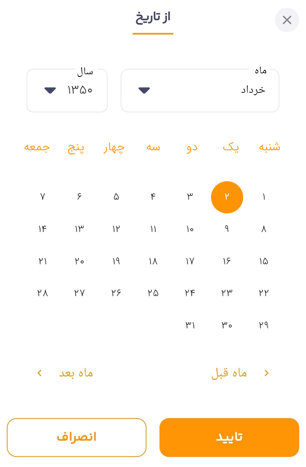
child: JalaliFlutterDatePicker(
onDateChanged: (value) {
// 处理日期改变的回调
},
language: "dari",
initialDate: Jalali(1350, 5, 2),
firstDateRange: Jalali(1340, 3, 1),
lastDateRange: Jalali(1360, 8, 29),
disabledDayColor: Colors.grey.shade300,
enabledDayColor: Colors.black,
selectedDayBackground: const Color(0xffFF6D00), // 选中日期的背景色
selectedDayColor: Colors.white,
todayColor: const Color(0xffFFA726), // 今天日期的背景色
footerIconColor: const Color(0xffFF6D00), // 底部图标颜色
footerTextStyle: const TextStyle(
color: Color(0xffFF6D00),
fontSize: 16,
fontWeight: FontWeight.w600,
),
headerTextStyle: const TextStyle(
color: Color(0xffFF6D00),
fontSize: 20,
fontWeight: FontWeight.bold,
),
selectedMonthTextStyle: const TextStyle(
fontSize: 16,
fontWeight: FontWeight.bold,
color: Colors.black87,
),
monthDropDownItemTextStyle: const TextStyle(
fontSize: 15,
color: Colors.black54,
),
selectedYearTextStyle: const TextStyle(
fontSize: 16,
fontWeight: FontWeight.bold,
color: Colors.black87,
),
yearsDropDownItemTextStyle: const TextStyle(
fontSize: 15,
color: Colors.black54,
),
customArrowWidget: const Icon(
Icons.arrow_drop_down,
size: 30,
color: Color(0xffFF6D00), // 下拉箭头颜色
),
),
),
),
);
}
}
更多关于Flutter日期选择器插件jalali_flutter_datepicker的使用的实战教程也可以访问 https://www.itying.com/category-92-b0.html

更多关于Flutter日期选择器插件jalali_flutter_datepicker的使用的实战系列教程也可以访问 https://www.itying.com/category-92-b0.html
jalali_flutter_datepicker 是一个用于 Flutter 的日期选择器插件,它支持波斯历(Jalali)和格里高利历(Gregorian)两种日历系统。这个插件非常适合在需要支持波斯历的应用中使用。
安装插件
首先,你需要在 pubspec.yaml 文件中添加 jalali_flutter_datepicker 依赖:
dependencies:
  flutter:
    sdk: flutter
  jalali_flutter_datepicker: ^1.0.0  # 请检查最新版本
然后运行 flutter pub get 来安装依赖。
使用插件
接下来,你可以在你的 Flutter 应用中使用 jalali_flutter_datepicker 来选择日期。
基本用法
import 'package:flutter/material.dart';
import 'package:jalali_flutter_datepicker/jalali_flutter_datepicker.dart';

void main() {
  runApp(MyApp());
}

class MyApp extends StatelessWidget {
  @override
  Widget build(BuildContext context) {
    return MaterialApp(
      home: DatePickerExample(),
    );
  }
}

class DatePickerExample extends StatefulWidget {
  @override
  _DatePickerExampleState createState() => _DatePickerExampleState();
}

class _DatePickerExampleState extends State<DatePickerExample> {
  DateTime? _selectedDate;

  Future<void> _selectDate(BuildContext context) async {
    final DateTime? picked = await showModalBottomSheet<DateTime>(
      context: context,
      builder: (BuildContext context) {
        return JalaliFlutterDatePicker(
          initialDate: _selectedDate ?? DateTime.now(),
          firstDate: DateTime(2000),
          lastDate: DateTime(2100),
          calendarType: CalendarType.jalali, // 使用波斯历
        );
      },
    );

    if (picked != null && picked != _selectedDate) {
      setState(() {
        _selectedDate = picked;
      });
    }
  }

  @override
  Widget build(BuildContext context) {
    return Scaffold(
      appBar: AppBar(
        title: Text('Jalali Date Picker Example'),
      ),
      body: Center(
        child: Column(
          mainAxisAlignment: MainAxisAlignment.center,
          children: <Widget>[
            Text(
              _selectedDate == null
                  ? 'No date selected'
                  : 'Selected Date: ${_selectedDate!.toString()}',
            ),
            SizedBox(height: 20),
            ElevatedButton(
              onPressed: () => _selectDate(context),
              child: Text('Select Date'),
            ),
          ],
        ),
      ),
    );
  }
}
参数说明
initialDate: 初始日期,默认为当前日期。firstDate: 可选的最早日期。lastDate: 可选的最晚日期。calendarType: 日历类型,可以是CalendarType.jalali(波斯历)或CalendarType.gregorian(格里高利历)。
自定义外观
你可以通过 datePickerTheme 参数来自定义日期选择器的外观。例如:
JalaliFlutterDatePicker(
  initialDate: _selectedDate ?? DateTime.now(),
  firstDate: DateTime(2000),
  lastDate: DateTime(2100),
  calendarType: CalendarType.jalali,
  datePickerTheme: DatePickerTheme(
    backgroundColor: Colors.white,
    headerColor: Colors.blue,
    headerTextStyle: TextStyle(color: Colors.white, fontSize: 20),
    weekdayLabelTextStyle: TextStyle(color: Colors.black, fontSize: 14),
    dayTextStyle: TextStyle(color: Colors.black, fontSize: 16),
    selectedDayTextStyle: TextStyle(color: Colors.white, fontSize: 16),
    selectedDayBackgroundColor: Colors.blue,
    todayTextStyle: TextStyle(color: Colors.blue, fontSize: 16),
    todayBackgroundColor: Colors.transparent,
  ),
);