


HarmonyOS 鸿蒙Next 底部导航栏可以自定义吗
HarmonyOS 鸿蒙Next 底部导航栏可以自定义吗 比如说实现中间凸起或者凹陷的导航栏,有相关api 吗,我使用相对布局写了当前的布局,但是不知道怎么去显示界面
更多关于HarmonyOS 鸿蒙Next 底部导航栏可以自定义吗的实战教程也可以访问 https://www.itying.com/category-93-b0.html
5 回复

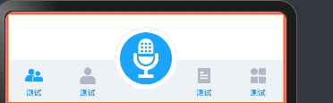
可以。
TabBarModel.ets:
export interface TabBarData {
id: TabBarType;
title: ResourceStr;
activeIcon: ResourceStr;
defaultIcon: ResourceStr;
}
export enum TabBarType {
ONE = 0,
TWO,
THREE,
FOUR,
FIVE
}
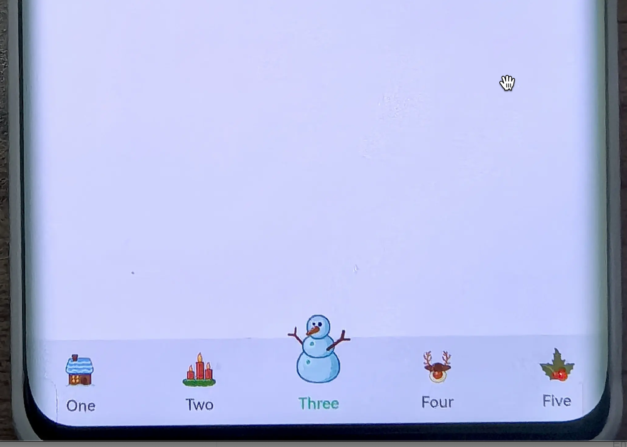
export const TabsInfo: TabBarData[] = [
{
id: TabBarType.ONE,
title: 'One',
activeIcon: $r('app.media.snow'),
defaultIcon: $r('app.media.room')
},
{
id: TabBarType.TWO,
title: 'Two',
activeIcon: $r('app.media.snow'),
defaultIcon: $r('app.media.lazhu')
},
{
id: TabBarType.THREE,
title: 'Three',
activeIcon: $r('app.media.snow'),
defaultIcon: $r('app.media.tree')
},
{
id: TabBarType.FOUR,
title: 'Four',
activeIcon: $r('app.media.snow'),
defaultIcon: $r('app.media.xiaoniu')
},
{
id: TabBarType.FIVE,
title: 'Five',
activeIcon: $r('app.media.snow'),
defaultIcon: $r('app.media.yezi')
}
]
CustomTabBar.ets:
CustomTabBar.ets:
import { TabBarData, TabBarType, TabsInfo } from './TabBarModel';

@Component
export struct CustomTabBar {
  @Link currentIndex: TabBarType;

  build() {
    Row() {
      ForEach(TabsInfo, (item: TabBarData) => {
        this.TabItem(item.id)
      })
    }
    .backgroundColor('#F1F3F5')
    .border({
      width: { top: 0.5 },
      color: '#0D182431'
    })
    .margin({ top: -56 })
    .clip(false)
    .height(56)
    .width('100%')
  }

  @Builder
  TabItem(index: TabBarType) {

    Column() {
      Image(this.currentIndex === index ? TabsInfo[index].activeIcon : TabsInfo[index].defaultIcon)
        .size(this.currentIndex === index ?
          { width: 50, height: 50 } :
          { width: 25, height: 25 })
        .margin({ top: this.currentIndex === index ? -25 : 0 })

      Text(TabsInfo[index].title)
        .fontSize(10)
        .margin({ top: 5 })
        .fontWeight(600)
        .fontColor(index === this.currentIndex ? '#09d57e' : '#99000000')
    }
    .clip(false)
    .width('20%')
    .height('100%')
    .justifyContent(FlexAlign.Center)
    .onClick(() => {
      this.currentIndex = index;
    })

  }
}
Index.ets:
import { CustomTabBar } from '../components/CustomTabBar';
import { TabBarType } from '../components/TabBarModel';

@Entry
@Component
struct Index {
  @State message: string = 'Hello World';
  @State currentIndex: TabBarType = TabBarType.ONE;

  build() {
    Column() {
      Tabs({ index: this.currentIndex }) {
        TabContent() {}

        TabContent() {}

        TabContent() {}

        TabContent() {}

        TabContent() {}
      }
      .backgroundColor('#FFFFFF')
      .barHeight(56)
      .height('100%')
      .barPosition(BarPosition.End)
      .scrollable(false)
      .onChange((index) => {
        this.currentIndex = index;
      })

      CustomTabBar({ currentIndex: $currentIndex })
    }
    .width('100%')
    .height('100%')
  }
}
更多关于HarmonyOS 鸿蒙Next 底部导航栏可以自定义吗的实战系列教程也可以访问 https://www.itying.com/category-93-b0.html

点击下面菜单,页面不切换啊,
- 复制
- 深色代码主题
基本信息
<div>
    <p>点击下面菜单,页面不切换啊,</p>
    <ul>
        <li>复制</li>
        <li>深色代码主题</li>
    </ul>
    <div>基本信息</div>
    <img src="" alt="图片">
</div>


HarmonyOS 鸿蒙Next的底部导航栏支持自定义。开发者可以通过ArkUI框架中的Tabs组件实现底部导航栏的定制。Tabs组件允许设置多个标签页,每个标签页可以关联不同的内容页面。开发者可以根据应用需求调整导航栏的样式、图标、文字等属性,并通过事件处理机制实现页面切换功能。具体实现可以参考HarmonyOS官方文档中关于Tabs组件的使用说明。