


Flutter自定义表单字段插件customformfield_an的使用
Flutter自定义表单字段插件customformfield_an的使用
CustomFormField_an
包用于建立表单字段的标准并准备一些视觉调整。
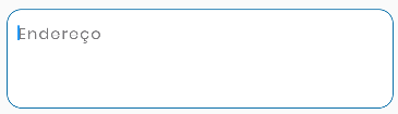
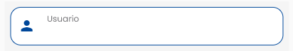
特性
以下是一些图像示例:
开始使用
简单的使用方法,仅需一个类。
使用方法
CustomFormField(
    radius: 15, // 圆角半径
    hinttxt: 'Detalhes', // 提示文本
    ctrl: textController, // 文本控制器
    fcs: focusNode, // 聚焦节点
    decorationColor: Colors.white, // 背景颜色
    txtInputAction: TextInputAction.next, // 下一个输入动作
    decorationBorderColor: Colors.Blue, // 边框颜色
    hasBorder: true, // 是否有边框
    fontColor: Colors.black, // 字体颜色
    textStyle : TextStyle(), // 文本样式
)
额外信息
这些可以帮助为包做出贡献。目标是一个具有样式和定制可能性的表单字段。
完整示例
以下是一个完整的示例代码,展示了如何在Flutter应用中使用CustomFormField_an插件。
import 'package:flutter/material.dart';
import 'package:customformfield_an/customformfield.dart';

class ExampleCustomFormField extends StatelessWidget {
  const ExampleCustomFormField({Key? key}) : super(key: key);

  [@override](/user/override)
  Widget build(BuildContext context) {
    // 创建焦点节点和文本控制器
    FocusNode fcs = FocusNode();
    TextEditingController ctrl = TextEditingController();

    return Scaffold(
      appBar: AppBar(
        title: Text('Custom Form Field Example'),
      ),
      body: Padding(
        padding: const EdgeInsets.all(16.0),
        child: Column(
          children: [
            // 第一个自定义表单字段
            CustomFormField(
              fcs: fcs,
              ctrl: ctrl,
              hintTxt: 'Example 1',
              radius: 10,
              decorationColor: Colors.white,
              decorationBorderColor: Colors.blue.shade800,
              fontColor: Colors.black,
            ),
            SizedBox(height: 20), // 添加间距
            // 第二个自定义表单字段
            CustomFormField(
              fcs: fcs,
              ctrl: ctrl,
              labelText: 'Example 2',
              radius: 15,
              decorationColor: Colors.white,
              decorationBorderColor: Colors.blue.shade800,
              fontColor: Colors.black,
            ),
          ],
        ),
      ),
    );
  }
}
更多关于Flutter自定义表单字段插件customformfield_an的使用的实战教程也可以访问 https://www.itying.com/category-92-b0.html
1 回复

更多关于Flutter自定义表单字段插件customformfield_an的使用的实战系列教程也可以访问 https://www.itying.com/category-92-b0.html
在Flutter中,如果你想创建一个自定义的表单字段插件,你可以按照以下步骤来实现。假设你已经创建了一个名为customformfield_an的插件,下面是如何使用它的基本步骤。
1. 创建自定义表单字段插件
首先,你需要创建一个自定义的表单字段插件。假设你已经创建了一个名为CustomFormField的插件,它可能看起来像这样:
import 'package:flutter/material.dart';

class CustomFormField extends FormField<String> {
  CustomFormField({
    Key? key,
    FormFieldSetter<String>? onSaved,
    FormFieldValidator<String>? validator,
    String? initialValue,
    bool autovalidate = false,
  }) : super(
          key: key,
          onSaved: onSaved,
          validator: validator,
          initialValue: initialValue,
          autovalidateMode: autovalidate
              ? AutovalidateMode.always
              : AutovalidateMode.disabled,
          builder: (FormFieldState<String> state) {
            return Column(
              crossAxisAlignment: CrossAxisAlignment.start,
              children: [
                TextFormField(
                  decoration: InputDecoration(
                    labelText: 'Custom Field',
                    errorText: state.errorText,
                  ),
                  onChanged: (value) {
                    state.didChange(value);
                  },
                ),
                if (state.hasError)
                  Text(
                    state.errorText!,
                    style: TextStyle(color: Colors.red),
                  ),
              ],
            );
          },
        );
}
2. 在项目中使用自定义表单字段插件
在你的Flutter项目中,你可以像使用其他FormField一样使用这个自定义表单字段。
import 'package:flutter/material.dart';
import 'customformfield_an.dart'; // 导入你的自定义插件

void main() {
  runApp(MyApp());
}

class MyApp extends StatelessWidget {
  [@override](/user/override)
  Widget build(BuildContext context) {
    return MaterialApp(
      home: Scaffold(
        appBar: AppBar(
          title: Text('Custom Form Field Example'),
        ),
        body: MyCustomForm(),
      ),
    );
  }
}

class MyCustomForm extends StatefulWidget {
  [@override](/user/override)
  _MyCustomFormState createState() => _MyCustomFormState();
}

class _MyCustomFormState extends State<MyCustomForm> {
  final _formKey = GlobalKey<FormState>();

  [@override](/user/override)
  Widget build(BuildContext context) {
    return Form(
      key: _formKey,
      child: Padding(
        padding: const EdgeInsets.all(16.0),
        child: Column(
          children: [
            CustomFormField(
              validator: (value) {
                if (value == null || value.isEmpty) {
                  return 'Please enter some text';
                }
                return null;
              },
            ),
            SizedBox(height: 20),
            ElevatedButton(
              onPressed: () {
                if (_formKey.currentState!.validate()) {
                  // 如果表单验证通过,处理表单数据
                  ScaffoldMessenger.of(context).showSnackBar(
                    SnackBar(content: Text('Processing Data')),
                  );
                }
              },
              child: Text('Submit'),
            ),
          ],
        ),
      ),
    );
  }
}