


Flutter自定义下拉选择插件modular_customizable_dropdown的使用
Flutter自定义下拉选择插件modular_customizable_dropdown的使用
概述
modular_customizable_dropdown 是一个模块化且可定制的下拉菜单包,可以与任何小部件兼容。此下拉菜单不绑定特定的小部件,您可以将其附加到任何您能想到的小部件上。
(请忽略丑陋的颜色调色板,我只是想展示它可以实现渐变效果…)
注意事项(版本 >= 2.0.0)
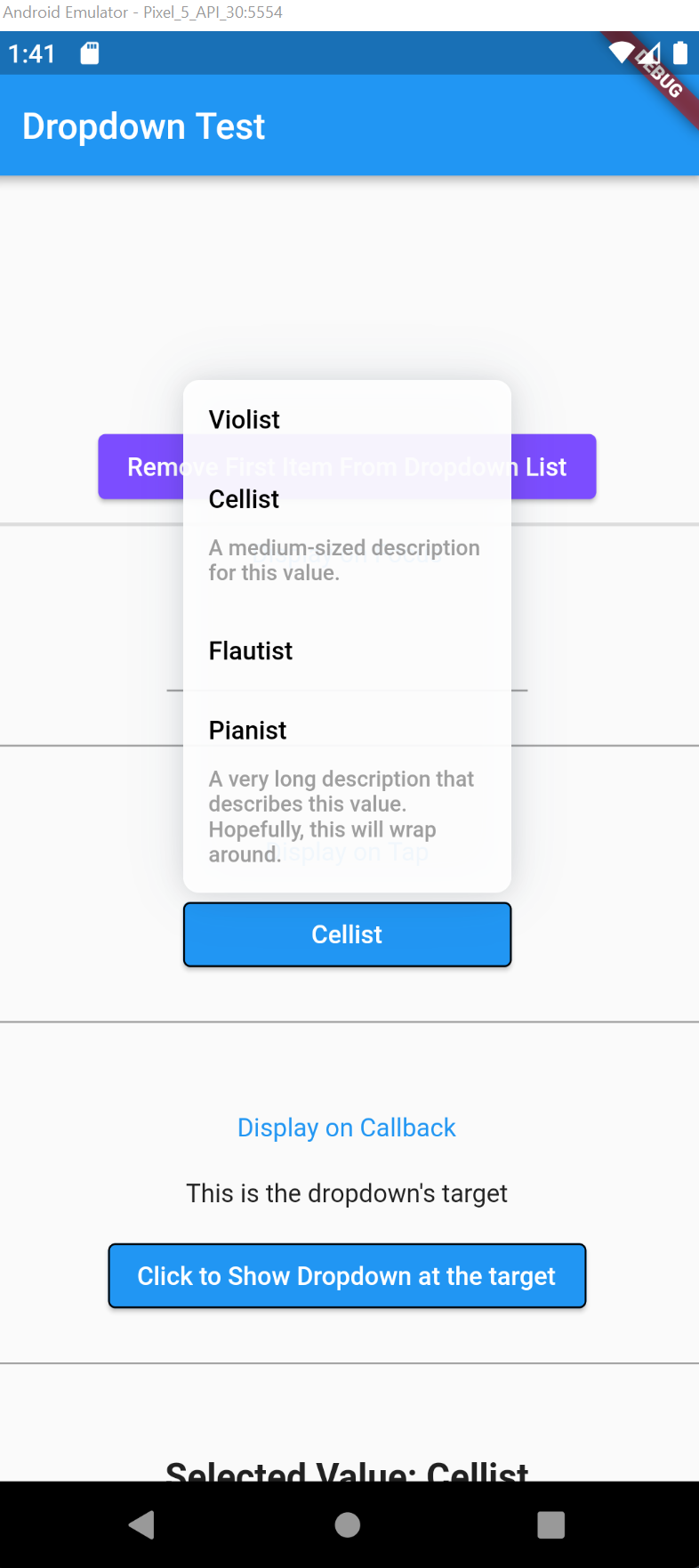
从版本 2.0.0 开始,下拉菜单现在支持每个值的描述。
简要说明 (TL;DR)
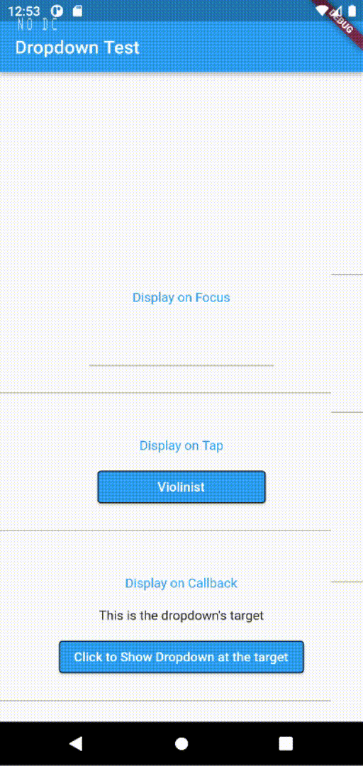
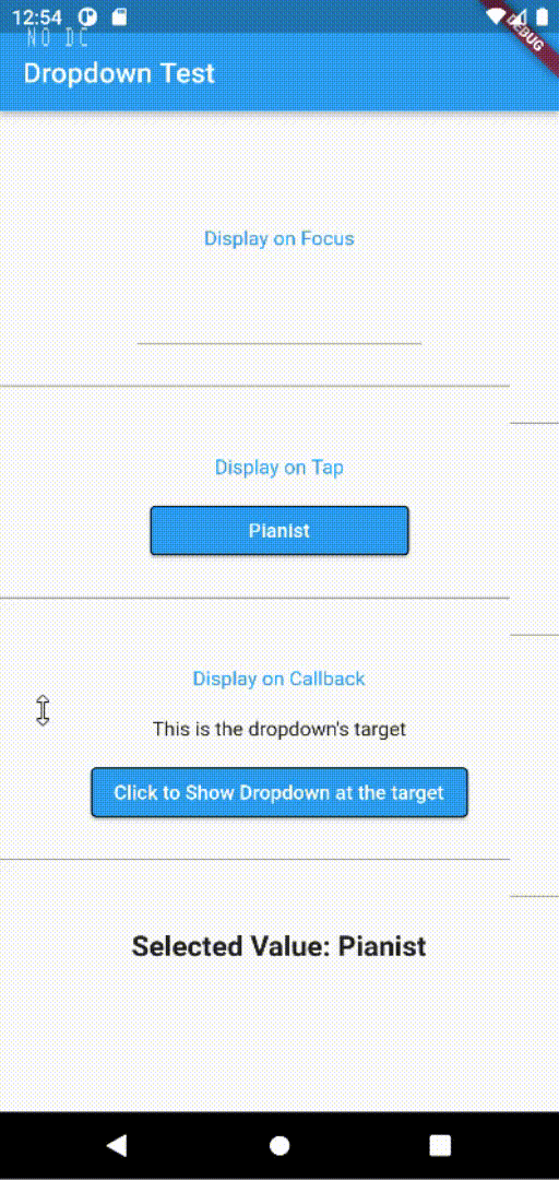
将您希望附加下拉菜单的小部件包装在 ModularCustomizableDropdown 中即可。默认情况下,下拉菜单会直接出现在目标小部件的正下方。
ModularCustomizableDropdown.displayOnTap(
    target: const SizedBox(width: 100, child: Text("I'm the target widget")),
    onValueSelect: (DropdownValue _selectedVal) => debugPrint(_selectedVal.toString()),
    allDropdownValues: _values,
)
上述几行代码就足以让下拉菜单正常工作。当目标小部件被点击时,下拉菜单会直接出现在其下方。
下拉菜单接受类型为 DropdownValue 的值。该类包含以下三个属性:
- value: 将在下拉菜单行中显示的标题。
- description: 可选属性。这将在标题正下方渲染。标题和描述之间的间距可以通过
DropdownStyle类进行自定义。 - meta: 您希望与此值关联的任何其他数据。
// 查看完整文件 https://github.com/Khongchai/modular_customizable_dropdown/blob/main/lib/classes_and_enums/dropdown_value.dart
class DropdownValue {
  final String value;
  final String? description;
  final dynamic metadata;

  const DropdownValue({
    required this.value,
    this.description,
    this.metadata,
  });

  static fromListOfStrings(List<String> values) {
    return values.map((e) => DropdownValue(value: e)).toList();
  }
}
完整示例
以下是一个完整的示例,展示了如何使用 modular_customizable_dropdown 插件。
import 'package:flutter/material.dart';
import 'package:modular_customizable_dropdown/modular_customizable_dropdown.dart';

void main() => runApp(const MyApp());

class MyApp extends StatelessWidget {
  const MyApp({Key? key}) : super(key: key);

  @override
  Widget build(BuildContext context) {
    return MaterialApp(
      home: Scaffold(
        appBar: AppBar(
          title: const Text('自定义下拉菜单示例'),
        ),
        body: Center(
          child: ExampleDropdown(),
        ),
      ),
    );
  }
}

class ExampleDropdown extends StatefulWidget {
  @override
  _ExampleDropdownState createState() => _ExampleDropdownState();
}

class _ExampleDropdownState extends State<ExampleDropdown> {
  final List<DropdownValue> _dropdownValues = [
    DropdownValue(value: "选项1", description: "这是选项1的描述"),
    DropdownValue(value: "选项2", description: "这是选项2的描述"),
    DropdownValue(value: "选项3", description: "这是选项3的描述"),
  ];

  String _selectedValue = "";

  void _onValueSelect(DropdownValue selectedValue) {
    setState(() {
      _selectedValue = selectedValue.value;
    });
  }

  @override
  Widget build(BuildContext context) {
    return ModularCustomizableDropdown.displayOnTap(
      target: Container(
        padding: const EdgeInsets.all(8),
        decoration: BoxDecoration(
          border: Border.all(color: Colors.grey),
          borderRadius: BorderRadius.circular(8),
        ),
        child: Text(_selectedValue.isNotEmpty ? _selectedValue : "请选择"),
      ),
      onValueSelect: _onValueSelect,
      allDropdownValues: _dropdownValues,
      style: const DropdownStyle(
        dropdownWidth: DropdownWidth(scale: 1.5), // 设置下拉菜单宽度为目标宽度的1.5倍
        dropdownMaxHeight: DropdownMaxHeight(byRows: 4), // 最大高度为4行
        dropdownAlignment: Alignment.topCenter, // 对齐方式为顶部居中
        defaultItemColor: Colors.grey[200], // 默认项背景颜色
        onTapItemColor: Colors.blue[100], // 点击项背景颜色
        transitionInDuration: Duration(milliseconds: 300), // 展开动画持续时间
      ),
    );
  }
}
自定义下拉菜单
通过 DropdownStyle 类可以配置下拉菜单的外观。以下是它的部分功能示例:
ModularCustomizableDropdown.displayOnTap(
    target: const SizedBox(width: 100, child: Text("I'm the target widget")),
    onValueSelect: (DropdownValue _selectedVal) => debugPrint(_selectedVal.toString()),
    allDropdownValues: _values,
    style: const DropdownStyle(
        dropdownWidth: DropdownWidth(scale: 1.2), // 下拉菜单宽度为目标宽度的1.2倍
        dropdownMaxHeight: DropdownMaxHeight(byRows: 4), // 最大高度为4行
        dropdownAlignment: Alignment.topLeft, // 对齐方式为左上角
        defaultItemColor: LinearGradient(colors: [Colors.white, Colors.blue]), // 默认项背景渐变
        onTapItemColor: LinearGradient(colors: [Colors.black, Colors.black]), // 点击项背景渐变
        transitionInDuration: Duration(milliseconds: 160), // 动画持续时间
    ),
)
更多关于Flutter自定义下拉选择插件modular_customizable_dropdown的使用的实战教程也可以访问 https://www.itying.com/category-92-b0.html

更多关于Flutter自定义下拉选择插件modular_customizable_dropdown的使用的实战系列教程也可以访问 https://www.itying.com/category-92-b0.html
modular_customizable_dropdown 是一个 Flutter 插件,用于创建高度自定义的下拉选择框。它允许开发者根据需要自定义下拉框的外观和行为,提供了灵活的选项来满足不同的设计需求。
安装
首先,你需要在 pubspec.yaml 文件中添加依赖:
dependencies:
  flutter:
    sdk: flutter
  modular_customizable_dropdown: ^1.0.0  # 请使用最新版本
然后运行 flutter pub get 来安装依赖。
基本用法
以下是一个简单的示例,展示如何使用 modular_customizable_dropdown:
import 'package:flutter/material.dart';
import 'package:modular_customizable_dropdown/modular_customizable_dropdown.dart';

void main() {
  runApp(MyApp());
}

class MyApp extends StatelessWidget {
  [@override](/user/override)
  Widget build(BuildContext context) {
    return MaterialApp(
      home: Scaffold(
        appBar: AppBar(
          title: Text('Modular Customizable Dropdown Example'),
        ),
        body: Center(
          child: ModularCustomizableDropdown(
            items: ['Option 1', 'Option 2', 'Option 3'],
            onChanged: (value) {
              print('Selected: $value');
            },
            dropdownBuilder: (context, selectedItem, isExpanded) {
              return Container(
                padding: EdgeInsets.symmetric(horizontal: 16, vertical: 8),
                decoration: BoxDecoration(
                  border: Border.all(color: Colors.grey),
                  borderRadius: BorderRadius.circular(4),
                ),
                child: Row(
                  mainAxisAlignment: MainAxisAlignment.spaceBetween,
                  children: [
                    Text(selectedItem ?? 'Select an option'),
                    Icon(isExpanded ? Icons.arrow_drop_up : Icons.arrow_drop_down),
                  ],
                ),
              );
            },
            dropdownItemBuilder: (context, item, isSelected, onItemSelect) {
              return ListTile(
                title: Text(item),
                tileColor: isSelected ? Colors.blue.withOpacity(0.3) : null,
                onTap: onItemSelect,
              );
            },
          ),
        ),
      ),
    );
  }
}