


HarmonyOS鸿蒙Next原生沉浸式界面
HarmonyOS鸿蒙Next原生沉浸式界面
背景
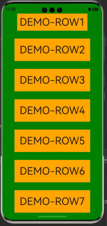
在实际项目中,为了软件使用整体色调看起来统一,一般顶部和底部的颜色需要铺满整个手机屏幕。因此,这篇帖子是介绍设置的方法,也是应用沉浸式效果。如下图:底部的绿色延伸到上面的状态栏和下面的导航栏
UI
在鸿蒙应用中,全屏UI元素分为状态栏、应用界面和导航栏。

一般实现应用沉浸式效果由两种方式:
- 窗口全屏布局方案:调整布局系统为全屏布局,界面元素延伸到状态栏和导航条区域实现沉浸式效果。
- 组件延伸方案:组件布局在应用界面区域,通过接口方法延伸到状态栏和导航栏。
窗口全屏布局方案
- 新建展示页面,并使用@StorageProp定义页面内容的顶部偏移和底部偏移属性
@Entry
@Component
struct Index {
  [@StorageProp](/user/StorageProp)('bottomRectHeight')
  bottomRectHeight: number = 0;
  [@StorageProp](/user/StorageProp)('topRectHeight')
  topRectHeight: number = 0;

  build() {
    Row() {
      Column() {
        Row() {
          Text('DEMO-ROW1').fontSize(40)
        }.backgroundColor(Color.Orange).padding(20)

        Row() {
          Text('DEMO-ROW2').fontSize(40)
        }.backgroundColor(Color.Orange).padding(20)

        Row() {
          Text('DEMO-ROW3').fontSize(40)
        }.backgroundColor(Color.Orange).padding(20)

        Row() {
          Text('DEMO-ROW4').fontSize(40)
        }.backgroundColor(Color.Orange).padding(20)

        Row() {
          Text('DEMO-ROW5').fontSize(40)
        }.backgroundColor(Color.Orange).padding(20)

        Row() {
          Text('DEMO-ROW6').fontSize(40)
        }.backgroundColor(Color.Orange).padding(20)
      }
      .width('100%')
      .height('100%')
      .alignItems(HorizontalAlign.Center)
      .justifyContent(FlexAlign.SpaceBetween)
      .backgroundColor('#008000')
      // top数值与状态栏区域高度保持一致;bottom数值与导航条区域高度保持一致
      .padding({ top: px2vp(this.topRectHeight), bottom: px2vp(this.bottomRectHeight) })
    }
  }
}
- 在EntryAbility的onWindowStageCreate方法中,调用window.Window.setWindowLayoutFullScreen方法设置窗口全屏。
let windowClass: window.Window = windowStage.getMainWindowSync();
let isLayoutFullScreen = true;
windowClass.setWindowLayoutFullScreen(isLayoutFullScreen).then(() => {
  console.info('Succeeded in setting the window layout to full-screen mode.');
}).catch((err: BusinessError) => {
  console.error('Failed to set the window layout to full-screen mode. Cause:' + JSON.stringify(err));
});
- 为了避免构件被挡住,根据导航条和状态栏的高度,修改bottomRectHeight和topRectHeight的数值。
//获取导航栏高度
let bottomRectHeight = windowClass
  .getWindowAvoidArea(window.AvoidAreaType.TYPE_NAVIGATION_INDICATOR)
  .bottomRect
  .height;
AppStorage.setOrCreate('bottomRectHeight', bottomRectHeight);
// 获取状态栏区域高度
let topRectHeight = windowClass
  .getWindowAvoidArea(window.AvoidAreaType.TYPE_SYSTEM)
  .topRect
  .height;
AppStorage.setOrCreate('topRectHeight', topRectHeight);
- 再设置页面监听,动态修改bottomRectHeight和topRectHeight的数值。
windowClass.on('avoidAreaChange', (data) => {
  if (data.type === window.AvoidAreaType.TYPE_SYSTEM) {
    let topRectHeight = data.area.topRect.height;
    AppStorage.setOrCreate('topRectHeight', topRectHeight);
  } else if (data.type == window.AvoidAreaType.TYPE_NAVIGATION_INDICATOR) {
    let bottomRectHeight = data.area.bottomRect.height;
    AppStorage.setOrCreate('bottomRectHeight', bottomRectHeight);
  }
});
EntryAbility完整代码
仅需要修改onWindowStageCreate方法
onWindowStageCreate(windowStage: window.WindowStage): void {
  // Main window is created, set main page for this ability
  hilog.info(0x0000, 'testTag', '%{public}s', 'Ability onWindowStageCreate');

  windowStage.loadContent('pages/Index', (err) => {
    if (err.code) {
      hilog.error(0x0000, 'testTag', 'Failed to load the content. Cause: %{public}s', JSON.stringify(err) ?? '');
      return;
    }
    hilog.info(0x0000, 'testTag', 'Succeeded in loading the content.');
  });
  // 获取应用主窗口
  let windowClass: window.Window = windowStage.getMainWindowSync();
  // 设置窗口全屏
  let isLayoutFullScreen = true;
  windowClass.setWindowLayoutFullScreen(isLayoutFullScreen).then(() => {
    console.info('Succeeded in setting the window layout to full-screen mode.');
  }).catch((err: BusinessError) => {
    console.error('Failed to set the window layout to full-screen mode. Cause:' + JSON.stringify(err));
  });
  //获取导航栏高度
  let bottomRectHeight = windowClass
    .getWindowAvoidArea(window.AvoidAreaType.TYPE_NAVIGATION_INDICATOR)
    .bottomRect
    .height;
  AppStorage.setOrCreate('bottomRectHeight', bottomRectHeight);
  // 获取状态栏区域高度
  let topRectHeight = windowClass
    .getWindowAvoidArea(window.AvoidAreaType.TYPE_SYSTEM)
    .topRect
    .height;
  AppStorage.setOrCreate('topRectHeight', topRectHeight);

  // 注册监听函数,动态获取避让区域数据
  windowClass.on('avoidAreaChange', (data) => {
    if (data.type === window.AvoidAreaType.TYPE_SYSTEM) {
      let topRectHeight = data.area.topRect.height;
      AppStorage.setOrCreate('topRectHeight', topRectHeight);
    } else if (data.type == window.AvoidAreaType.TYPE_NAVIGATION_INDICATOR) {
      let bottomRectHeight = data.area.bottomRect.height;
      AppStorage.setOrCreate('bottomRectHeight', bottomRectHeight);
    }
  });

}
组件延伸方案
使用expandSafeArea方法来实现。
expandSafeArea(types?: Array<SafeAreaType>, edges?: Array<SafeAreaEdge>): T;
- types:配置扩展安全区域的类型。SafeAreaType枚举类型,SYSTEM是系统默认非安全区域,包括状态栏、导航栏;CUTOUT是设备的非安全区域,例如刘海屏或挖孔屏区域;KEYBOARD是软键盘区域,组件不避让键盘。
- edges:扩展安全区域的方向。
代码
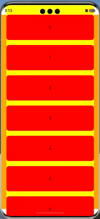
通过颜色对比,可以看出组件延伸效果。
- column:背景颜色设置为橘色,从图片可以看出只能在安全区域内显示。
- list:背景颜色设置为黄色,从图片可以看出已经延伸至导航条和状态栏了。
- Text:背景颜色设置成红色,就可以看到整个组件的滑动过程.
@Entry
@Component
struct ExamplePage {
  private arr: number[] = [0, 1, 2, 3, 4, 5, 6, 7, 8, 9]

  build() {
    Column() {
      List({ space: 20, initialIndex: 0 }) {
        ForEach(this.arr, (item: number) => {
          ListItem() {
            Text('' + item)
              .width('100%')
              .height(100)
              .fontSize(16)
              .textAlign(TextAlign.Center)
              .borderRadius(10)
              .backgroundColor(Color.Red)
          }

        }, (item: number) => item.toString())
      }
      .listDirection(Axis.Vertical) // 排列方向
      .scrollBar(BarState.Off)
      .friction(0.6)
      .divider({
        strokeWidth: 2,
        color: 0xFFFFFF,
        startMargin: 20,
        endMargin: 20
      }) // 每行之间的分界线
      .edgeEffect(EdgeEffect.Spring) // 边缘效果设置为Spring
      .width('90%')
      .backgroundColor(Color.Yellow)
      // List组件的视窗范围扩展至导航条。
      .expandSafeArea([SafeAreaType.SYSTEM], [SafeAreaEdge.TOP, SafeAreaEdge.BOTTOM])
    }
    .width('100%')
    .height('100%')
    .backgroundColor(Color.Orange)
  }
}
总结
如果不是全部界面都需要实现沉浸式布局时,可以通过组件延伸方案去实现部分组件的沉浸式布局。
更多关于HarmonyOS鸿蒙Next原生沉浸式界面的实战教程也可以访问 https://www.itying.com/category-93-b0.html

HarmonyOS鸿蒙Next的原生沉浸式界面主要采用了全新的UI设计理念,强调简洁、流畅和沉浸式体验。界面设计上,鸿蒙Next通过减少视觉干扰,优化了用户与设备的交互方式。系统界面采用了大量的动态效果和过渡动画,使得操作更加自然和流畅。
在沉浸式体验方面,鸿蒙Next通过全屏显示、隐藏状态栏和导航栏等方式,让用户能够更专注于当前的内容或应用。此外,系统还支持多窗口操作和分屏显示,用户可以在同一屏幕内同时进行多项任务,提升了多任务处理的效率。
鸿蒙Next的沉浸式界面还引入了智能化的布局调整功能,根据用户的使用习惯和场景自动优化界面布局。例如,在阅读、游戏或视频播放等场景下,系统会自动调整界面元素的大小和位置,以提供更好的视觉体验。
在交互设计上,鸿蒙Next采用了更加直观的触控手势和操作逻辑,减少了用户的学习成本。系统还支持语音控制和智能助手功能,用户可以通过语音指令快速完成操作,进一步提升了使用的便捷性。
总体而言,鸿蒙Next的原生沉浸式界面在视觉设计、交互体验和多任务处理等方面进行了全面优化,旨在为用户提供更加高效、流畅和沉浸式的使用体验。
更多关于HarmonyOS鸿蒙Next原生沉浸式界面的实战系列教程也可以访问 https://www.itying.com/category-93-b0.html
