


Flutter加载状态按钮插件state_loading_button的使用
Flutter加载状态按钮插件state_loading_button的使用
一个简单的带进度动画的按钮,可自定义各种状态样式以及动态改变进度动画样式。
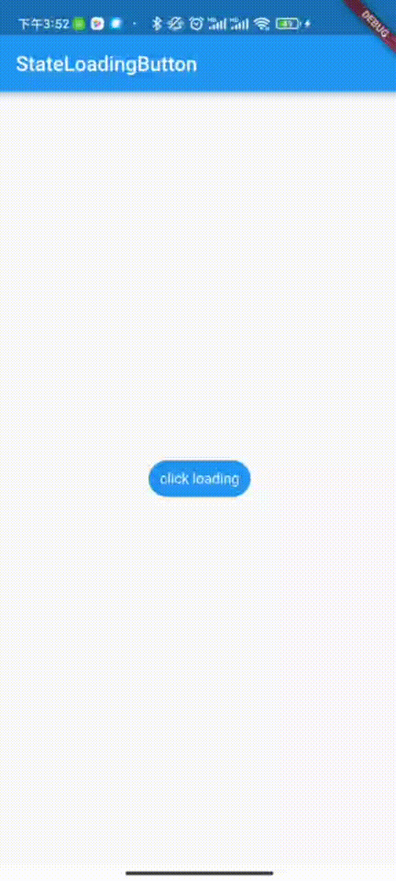
效果图
构造
AnimatedButton({
    Key? key,
    required this.buttonBuilder,        // 构建按钮各个状态样式
    this.width,                         // 所有状态统一宽高
    this.height,
    this.borderRadius,                  // 所有状态统一圆角
    this.borderSide,                    // 所有状态统一边框
    this.progressBuilder,               // 当按钮点击时,根据状态构建进度样式
    this.statusChangeDuration = const Duration(milliseconds: 500), // 按钮和进度转换动画时长
    this.loadingDuration = const Duration(milliseconds: 1000), // 无进度值时,进度条一次动画的时长
    this.onTap, // 点击事件
    this.stateNotifier, // 控制状态切换
    this.buttonProgressNotifier, // 控制进度值以及样式变化
  })
使用
以下是一个完整的示例,展示如何使用 state_loading_button 插件来实现带有不同状态的加载按钮。
完整代码示例
import 'dart:async';
import 'dart:math';
import 'package:flutter/material.dart';
import 'package:state_loading_button/state_loading_button.dart';
void main() {
runApp(const MyApp());
}
class MyApp extends StatefulWidget {
const MyApp({Key? key}) : super(key: key);
[@override](/user/override)
State<MyApp> createState() => _MyAppState();
}
class _MyAppState extends State<MyApp> {
final ButtonStateNotifier _statusNotifier = ButtonStateNotifier();
final ButtonProgressNotifier _progressNotifier = ButtonProgressNotifier();
bool isReverse = false;
[@override](/user/override)
Widget build(BuildContext context) {
return MaterialApp(
home: Scaffold(
appBar: AppBar(
title: const Text('StateLoadingButton'),
),
body: Center(
child: Column(
mainAxisSize: MainAxisSize.min,
children: [
AnimatedButton(
buttonBuilder: (state) {
switch (state) {
case 'loading':
return ButtonStatus.loading;
case 'normal':
return _normal;
case 'paused':
return _paused;
case 'cancel':
return _canceled;
case 'complete':
return _complete;
case 'error':
return _error;
case 'polygon':
return _polygon;
}
return _normal;
},
progressBuilder: (button, progress) {
switch (button.state) {
case 'normal':
return LinearProgress(
height: 20,
width: 250,
reverse: isReverse,
background: Colors.blue,
foreground: Colors.orangeAccent,
foregroundGradient: const LinearGradient(colors: [Colors.orangeAccent, Colors.pink]),
backgroundGradient: const LinearGradient(colors: [Colors.blue, Colors.amber]),
shadows: [const BoxShadow(color: Colors.purpleAccent, offset: Offset(0, 4), blurRadius: 5)],
prefix: '前缀',
prefixStyle: const TextStyle(color: Colors.blueGrey, fontSize: 10),
suffix: '后缀',
suffixStyle: const TextStyle(color: Colors.blueAccent, fontSize: 10),
textStyle: const TextStyle(color: Colors.white, fontSize: 15),
borderRadius: BorderRadius.circular(5),
progressType: ProgressType.determinate);
case 'paused':
return CircularProgress(
reverse: isReverse,
textStyle: const TextStyle(color: Colors.redAccent, fontSize: 8),
prefix: '前缀很长很长\n',
prefixStyle: const TextStyle(color: Colors.white, fontSize: 8),
suffix: '\n后缀很长很长',
suffixStyle: const TextStyle(color: Colors.orangeAccent, fontSize: 8),
progressType: ProgressType.determinate,
foregroundGradient: const SweepGradient(colors: [Colors.yellow, Colors.pink]),
circularBackground: Colors.blue,
size: 10,
radius: 50,
startAngle: -0.2 * pi,
ratio: 0.8,
background: Theme.of(context).scaffoldBackgroundColor);
case 'cancel':
return RectangleProgress(
width: 100,
height: 50,
reverse: isReverse,
progressType: ProgressType.determinate,
borderRadius: BorderRadius.circular(10),
indeterminateText: '无进度值',
textStyle: const TextStyle(color: Colors.white, fontSize: 12),
size: 7,
progressBackground: Colors.purpleAccent,
);
case 'complete':
return LinearProgress(
reverse: isReverse,
progressType: ProgressType.indeterminate,
shadows: [const BoxShadow(color: Colors.black, offset: Offset(0, 2), blurRadius: 5)],
foregroundGradient: const LinearGradient(colors: [Colors.red, Colors.yellow]),
height: 10);
case 'error':
return CircularProgress(
reverse: isReverse,
progressType: ProgressType.indeterminate,
foregroundGradient: const SweepGradient(colors: [Colors.orange, Colors.purpleAccent]),
shadows: [const BoxShadow(color: Colors.yellow, offset: Offset(0, 2), blurRadius: 5)],
size: 8,
borderRadius: BorderRadius.circular(5),
radius: 40);
case 'polygon':
return PolygonProgress(
reverse: isReverse,
width: 150,
progressType: ProgressType.determinate,
borderRadius: 15,
textStyle: const TextStyle(color: Colors.white, fontSize: 12),
size: 10,
side: 6,
shadows: [const BoxShadow(color: Colors.black, offset: Offset(0, 2), blurRadius: 5)],
borderSide: const BorderSide(width: 3, color: Colors.greenAccent),
progressBackground: Colors.purpleAccent,
);
default:
return progress;
}
},
stateNotifier: _statusNotifier,
buttonProgressNotifier: _progressNotifier,
loadingDuration: const Duration(milliseconds: 2000),
onTap: (button) {
switch (button.state) {
case 'normal':
_statusNotifier.value = 'loading';
double progress = 0;
Timer.periodic(const Duration(milliseconds: 3), (timer) {
progress += 0.1;
_progressNotifier.linear(
progress: progress,
foreground: Color.lerp(
Colors.white, Colors.red, progress / 100),
background: Color.lerp(
Colors.green, Colors.yellow, progress / 100)
);
if (progress > 100) {
_statusNotifier.value = 'paused';
timer.cancel();
}
});
break;
case 'paused':
_statusNotifier.value = 'loading';
double progress = 0;
Timer.periodic(const Duration(milliseconds: 30), (timer) {
_progressNotifier.circular(
progress: progress,
radius: 50.0 + progress / 100 * 20,
size: 10.0 + progress / 100 * 10,
textStyle: TextStyle.lerp(
const TextStyle(color: Colors.black, fontSize: 8),
const TextStyle(color: Colors.white, fontSize: 20),
progress / 100),
foreground: Color.lerp(
Colors.yellow, Colors.white, progress / 100),
background: Color.lerp(
Colors.redAccent, Colors.blue, progress / 100),
circularBackground: Color.lerp(Colors.pink, Colors.purple, progress / 100),
);
progress++;
if (progress > 100) {
_statusNotifier.value = 'cancel';
timer.cancel();
}
});
break;
case 'cancel':
_statusNotifier.value = 'loading';
double progress = 0;
Timer.periodic(const Duration(milliseconds: 15), (timer) {
progress += 0.5;
_progressNotifier.rectangle(
progress: progress
);
if (progress > 100) {
_statusNotifier.value = 'polygon';
timer.cancel();
}
});
break;
case 'complete':
_statusNotifier.value = 'loading';
Future.delayed(const Duration(milliseconds: 4000), () {
_statusNotifier.value = 'normal';
});
break;
case 'error':
_statusNotifier.value = 'loading';
Future.delayed(const Duration(milliseconds: 4000), () {
_statusNotifier.value = 'polygon';
});
break;
case 'polygon':
_statusNotifier.value = 'loading';
double progress = 0;
Timer.periodic(const Duration(milliseconds: 40), (timer) {
progress += 0.5;
_progressNotifier.polygon(
progress: progress
);
if (progress > 100) {
_statusNotifier.value = 'complete';
timer.cancel();
}
});
break;
}
},
),
const SizedBox(height: 20,),
Switch(value: isReverse, onChanged: (value){
setState(() {
isReverse = value;
});
})
],
),
),
),
);
}
/// 默认
static const ButtonStatus _normal = ButtonStatus(
state: 'normal',
status: AnimatedButtonStatus.button,
text: 'click loading',
textStyle: TextStyle(fontSize: 14.0, color: Colors.white),
buttonColor: Colors.blue,
gradient: LinearGradient(colors: [Colors.pink, Colors.purple]),
borderRadius: BorderRadius.all(Radius.circular(18)),
shadows: [BoxShadow(
color: Colors.redAccent,
offset: Offset(0, 2),
blurRadius: 4
)]
);
/// 暂停
static const ButtonStatus _paused = ButtonStatus(
width: 160,
state: 'paused',
status: AnimatedButtonStatus.button,
text: 'Paused',
textStyle: TextStyle(fontSize: 14.0, color: Colors.white),
buttonColor: Colors.orangeAccent,
gradient: LinearGradient(colors: [Colors.orangeAccent, Colors.greenAccent]),
borderRadius: BorderRadius.all(Radius.circular(12)),
shadows: [BoxShadow(
color: Colors.blue,
offset: Offset(0, 2),
blurRadius: 8
)]
);
/// 取消
static const ButtonStatus _canceled = ButtonStatus(
width: 200,
state: 'cancel',
status: AnimatedButtonStatus.button,
text: 'Canceled',
textStyle: TextStyle(fontSize: 14.0, color: Colors.white),
buttonColor: Colors.grey,
shadows: [BoxShadow(color: Colors.black, offset: Offset(0, 2), blurRadius: 5)],
borderRadius: BorderRadius.all(Radius.circular(12)),
);
/// 完成
static const ButtonStatus _complete = ButtonStatus(
width: 200,
height: 40,
isTapScale: false,
state: 'complete',
status: AnimatedButtonStatus.button,
text: 'Complete',
textStyle: TextStyle(fontSize: 14.0, color: Colors.white),
buttonColor: Colors.greenAccent,
gradient: LinearGradient(colors: [Colors.greenAccent, Colors.blue]),
borderRadius: BorderRadius.all(Radius.circular(12)),
shadows: [BoxShadow(
color: Colors.blue,
blurRadius: 8
)]
);
/// 错误
static const ButtonStatus _error = ButtonStatus(
width: 200,
height: 50,
borderSide: BorderSide(color: Colors.blue, width: 3),
state: 'error',
status: AnimatedButtonStatus.button,
text: 'Error',
textStyle: TextStyle(fontSize: 14.0, color: Colors.white),
buttonColor: Colors.redAccent,
gradient: LinearGradient(colors: [Colors.redAccent, Colors.purpleAccent]),
borderRadius: BorderRadius.all(Radius.circular(12)),
shadows: [BoxShadow(
color: Colors.blue,
blurRadius: 8
)]
);
/// 多边形
static const ButtonStatus _polygon = ButtonStatus(
width: 200,
state: 'polygon',
status: AnimatedButtonStatus.button,
text: 'Polygon',
textStyle: TextStyle(fontSize: 14.0, color: Colors.white),
buttonColor: Colors.indigoAccent,
shadows: [BoxShadow(color: Colors.greenAccent, offset: Offset(0, 2), blurRadius: 5)],
borderRadius: BorderRadius.all(Radius.circular(12)),
);
}
更多关于Flutter加载状态按钮插件state_loading_button的使用的实战教程也可以访问 https://www.itying.com/category-92-b0.html
1 回复

更多关于Flutter加载状态按钮插件state_loading_button的使用的实战系列教程也可以访问 https://www.itying.com/category-92-b0.html
state_loading_button 是一个用于处理按钮加载状态的 Flutter 插件。它可以帮助你在按钮点击时显示加载状态,并在操作完成后恢复按钮的原始状态。以下是使用 state_loading_button 的基本步骤:
1. 添加依赖
首先,你需要在 pubspec.yaml 文件中添加 state_loading_button 依赖:
dependencies:
  flutter:
    sdk: flutter
  state_loading_button: ^1.0.0  # 请根据最新版本号进行替换
然后运行 flutter pub get 来安装依赖。
2. 导入包
在你的 Dart 文件中导入 state_loading_button 包:
import 'package:state_loading_button/state_loading_button.dart';
3. 使用 StateLoadingButton
StateLoadingButton 是一个带有加载状态的按钮。你可以在按钮点击时显示加载状态,并在操作完成后恢复按钮的原始状态。
以下是一个简单的示例:
import 'package:flutter/material.dart';
import 'package:state_loading_button/state_loading_button.dart';

void main() {
  runApp(MyApp());
}

class MyApp extends StatelessWidget {
  @override
  Widget build(BuildContext context) {
    return MaterialApp(
      home: Scaffold(
        appBar: AppBar(title: Text('StateLoadingButton Example')),
        body: Center(
          child: StateLoadingButton(
            onPressed: () async {
              // 模拟一个异步操作
              await Future.delayed(Duration(seconds: 2));
              // 操作完成后,按钮会自动恢复
            },
            child: Text('Submit'),
          ),
        ),
      ),
    );
  }
}
4. 自定义按钮样式
你可以通过 StateLoadingButton 的构造函数来自定义按钮的样式和加载状态的外观。以下是一些常用的参数:
child: 按钮的文本或子组件。onPressed: 按钮点击时触发的异步操作。loadingChild: 加载状态时显示的组件,默认是一个CircularProgressIndicator。style: 按钮的样式,可以使用ButtonStyle进行自定义。disabled: 是否禁用按钮,默认为false。
5. 示例:自定义加载状态
以下是一个自定义加载状态的示例:
StateLoadingButton(
  onPressed: () async {
    await Future.delayed(Duration(seconds: 2));
  },
  child: Text('Submit'),
  loadingChild: Row(
    mainAxisAlignment: MainAxisAlignment.center,
    children: [
      CircularProgressIndicator(
        valueColor: AlwaysStoppedAnimation<Color>(Colors.white),
      ),
      SizedBox(width: 8),
      Text('Processing...'),
    ],
  ),
  style: ElevatedButton.styleFrom(
    primary: Colors.blue,
    onPrimary: Colors.white,
    padding: EdgeInsets.symmetric(horizontal: 32, vertical: 16),
  ),
);
6. 处理错误
如果异步操作中发生错误,你可能希望按钮恢复到原始状态并显示错误信息。你可以在 onPressed 中使用 try-catch 来捕获异常:
StateLoadingButton(
  onPressed: () async {
    try {
      await Future.delayed(Duration(seconds: 2));
      // 模拟一个错误
      throw Exception('Something went wrong');
    } catch (e) {
      // 处理错误,例如显示一个 SnackBar
      ScaffoldMessenger.of(context).showSnackBar(
        SnackBar(content: Text(e.toString())),
      );
    }
  },
  child: Text('Submit'),
);