


HarmonyOS鸿蒙Next中【快应用】响应式布局适配横竖屏或折叠屏
HarmonyOS鸿蒙Next中【快应用】响应式布局适配横竖屏或折叠屏
【关键词】
响应式布局、折叠屏、横竖屏
【问题背景】
当前开发者在开发快应用时,往往将designWidth设置为设备屏幕的宽度,这时,应用的内容会随着设备宽度的变大而拉伸显示,导致在大屏、横屏、折叠屏展开时显示效果不好。
在折叠屏合起和展开的效果如下,可以看出页面各元素尺寸在展开时明显变大了。
【解决方案】
通过使用快应用的响应式布局能力开发新应用或者改造已有应用,可以使快应用在手机、平板、智慧屏等各种尺寸的设备都有良好的展示效果。
一、配置manifest文件
- 将minPlatformVersion配置为1066及以上版本
- 修改config节点下的designWidth属性为device-width。
二、布局页面元素
根据常见的屏幕宽度对页面元素的尺寸和排列位置进行规划。常见屏幕宽度如下:
- 正常手机竖屏的宽度:360px
- 正常手机横屏的宽度:640px、720px 等
- 折叠屏展开的宽度:733px
- 折叠屏合起来时的宽度:383px
三、动态布局
根据屏幕的宽度来判断一行渲染几张图片,以下示例实现了根据屏幕宽度来控制list展示列数的效果。
当简单的动态布局无法实现所需效果时,可以考虑使用MediaQuery进行适配,详细参见链接:
https://developer.huawei.com/consumer/cn/doc/development/quickApp-References/quickapp-mediaquery-0000001170210011
实现如下:
<template>
<!-- Only one root node is allowed in template. -->
<div class="container">
<div class="btn-container">
<text onclick="switchOrientation" class="orientation-btn">{{$t('message.framework.screenSwitch.switchScreen')}}</text>
</div>
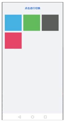
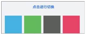
<list class="list">
<list-item type="box" class="list-item bg-blue"></list-item>
<list-item type="box" class="list-item bg-green"></list-item>
<list-item type="box" class="list-item bg-gray"></list-item>
<list-item type="box" class="list-item bg-red"></list-item>
</list>
</div>
</template>
<style lang="sass">
.container {
flex-direction: column;
padding-bottom: 50px;
}
.bg-green {
background-color: #64bb5c;
}
.bg-blue {
background-color: #46b1e3;
}
.bg-gray {
background-color: #5d5e5d;
}
.bg-red {
background-color: #e64566;
}
.orientation-btn {
color: #0a59f7;
font-size: 32px;
font-weight: 500;
}
.list {
margin-left: 32px;
margin-right: 32px;
margin-top: 30px;
height: 500px;
}
.list-item {
height: 200px;
margin-right: 20px;
margin-bottom: 20px;
}
.btn-container{
height: 100px;
align-items: center;
justify-content: center;
}
@media screen and (max-width: 599) {
.list{
columns: 3;
}
}
@media screen and (min-width: 600) {
.list{
columns: 4;
}
}
</style>
<script>
const orientationMap = {
portrait: 'portrait',
landscape: 'landscape'
}
import configuration from '@system.configuration';
module.exports = {
public: {
orientation: orientationMap.portrait
},
onInit: function () {
this.$page.setTitleBar({ text: this.$t('message.framework.screenSwitch.barTitle') });
},
switchOrientation() {
if (this.orientation === orientationMap.portrait) {
this.orientation = orientationMap.landscape;
} else {
this.orientation = orientationMap.portrait;
}
configuration.setScreenOrientation({
orientation: this.orientation,
})
}
}
</script>
竖屏时效果:
横屏时效果:
更多关于HarmonyOS鸿蒙Next中【快应用】响应式布局适配横竖屏或折叠屏的实战教程也可以访问 https://www.itying.com/category-93-b0.html

更多关于HarmonyOS鸿蒙Next中【快应用】响应式布局适配横竖屏或折叠屏的实战系列教程也可以访问 https://www.itying.com/category-93-b0.html
在HarmonyOS鸿蒙Next中,快应用通过响应式布局适配横竖屏或折叠屏。开发者可使用@media媒体查询,根据屏幕方向(orientation)或设备类型(如折叠屏)动态调整布局。同时,鸿蒙提供display和flex布局,支持自适应调整。通过onConfigurationChange监听设备配置变化,实时更新UI,确保在不同屏幕尺寸和形态下提供一致的用户体验。