


有没有HarmonyOS鸿蒙Next大佬会这个组件的
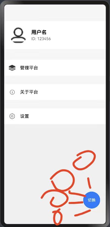
有没有HarmonyOS鸿蒙Next大佬会这个组件的 想做如图的这种导航栏,但是尝试了很久没搞出来,想请问有没有大佬会写这个的
更多关于有没有HarmonyOS鸿蒙Next大佬会这个组件的的实战教程也可以访问 https://www.itying.com/category-93-b0.html
6 回复

用 Stack 组件,切换按钮放在中间,再遍历几个按钮添加几个按钮,控制好添加的按钮弹出弧度就可以了。
ForEach(this.subButtons, (item: ButtonItem, index: number) => {
  Column() {
    Text(item.name)
      .fontSize(12)
      .fontColor('#FFFFFF')
      .margin({ bottom: 4 })
    Circle()
      .width(40)
      .height(40)
      .fill(item.color)
  }
  .position({
    x: this.isExpanded ? this.calculatePosition(index, this.subButtons.length).x : 0,
    y: this.isExpanded ? this.calculatePosition(index, this.subButtons.length).y : 0
  })
  .opacity(this.isExpanded ? 1 : 0)
  .scale({
    x: this.isExpanded ? 1 : 0,
    y: this.isExpanded ? 1 : 0
  })
  .animation({
    duration: 300,
    curve: Curve.EaseInOut
  })
  .onClick(() => {
    console.info(`点击了${item.name}`);
  })
})
更多关于有没有HarmonyOS鸿蒙Next大佬会这个组件的的实战系列教程也可以访问 https://www.itying.com/category-93-b0.html


HarmonyOS Next中的组件开发主要基于ArkUI框架,使用TypeScript或JavaScript进行开发。组件可以通过声明式UI和状态管理来实现交互功能。开发者可以使用@Component装饰器定义组件,并通过@State、@Prop等装饰器管理组件状态。具体组件开发流程可参考官方文档中的ArkUI组件开发指南。

要实现图中所示的HarmonyOS Next导航栏,可以使用ArkUI的Tabs组件结合自定义样式。以下是核心实现代码:
@Entry
@Component
struct NavExample {
  @State currentIndex: number = 0
  private tabs: string[] = ['首页', '分类', '发现', '购物车', '我的']

  build() {
    Column() {
      // 内容区
      Text(this.tabs[this.currentIndex])
        .fontSize(30)
        .margin(20)

      // 底部导航栏
      Row() {
        ForEach(this.tabs, (item: string, index: number) => {
          Column() {
            Text(item)
              .fontSize(12)
              .margin({top: 4})
              .fontColor(this.currentIndex === index ? '#FF0000' : '#999999')
          }
          .width('20%')
          .height(56)
          .justifyContent(FlexAlign.Center)
          .onClick(() => {
            this.currentIndex = index
          })
        })
      }
      .width('100%')
      .height(56)
      .backgroundColor('#FFFFFF')
      .border({width: 1, color: '#EEEEEE'})
    }
    .width('100%')
    .height('100%')
  }

  private getIconRes(index: number): string {
    const icons = [
      'app.media.home',
      'app.media.category',
      'app.media.discover',
      'app.media.cart',
      'app.media.profile'
    ]
    return icons[index]
  }
}
关键点说明:
- 使用Row+ForEach实现5个均等分列的导航项
- 每个导航项包含图标(Image)和文字(Text)
- 通过currentIndex控制选中状态
- 图标资源需要提前放在resources/base/media目录下
- 点击事件通过onClick切换currentIndex
如需更复杂效果,可以:
- 添加动画过渡效果
- 使用自定义弹窗组件
- 结合Navigation实现页面路由
注意:实际开发时需要替换示例中的图标资源路径,并确保图片资源已正确放置在项目中。