


HarmonyOS鸿蒙NEXT应用元服务常见列表操作多类型列表项场景
HarmonyOS鸿蒙NEXT应用元服务常见列表操作多类型列表项场景 场景描述
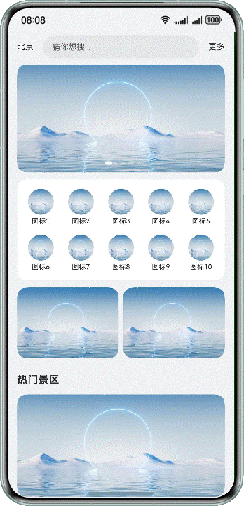
List组件作为整个首页长列表的容器,通过ListItem对不同模块进行视图界面定制,常用于门户首页、商城首页等多类型视图展示的列表信息流场景。
本场景以应用首页为例,将除页面顶部搜索框区域的其它内容,放在List组件内部,进行整体页面的构建。进入页面后,下滑刷新模拟网络请求;滑动页面列表内容,景区标题吸顶;滑动到页面底部,上滑模拟请求添加数据。
实现原理
根据列表内部各部分视图对应数据类型的区别,渲染不同的ListItem子组件。
Refresh组件可以进行页面下拉操作并显示刷新动效,List组件配合使用Swiper、Grid等基础组件用于页面的整体构建,再通过List组件的sticky属性、onReachEnd()事件和Refresh组件的onRefreshing()事件,实现下滑模拟刷新、上滑模拟添加数据及列表标题吸顶的效果。
开发步骤
顶部搜索框区域
.Row() {
  Text('Beijing')
    // ...
  TextInput({ placeholder: 'guess you want to search...' })
    // ...
  Text('more')
    // ...
}
实现效果:

在List的第一个ListItem分组中,使用Swiper组件构建页面轮播图内容。
.List({ space: 12 }) {
  // Swiper
  ListItem() {
    Swiper() {
      ForEach(this.swiperContent, (item: SwiperType) => {
        Stack({ alignContent: Alignment.BottomStart }) {
          Image($r(item.pic))
        }
      }, (item: SwiperType) => JSON.stringify(item))
    }
    // ...
    .autoPlay(true) // Set the sub-component to play automatically
    .duration(1000) // Set the animation duration of the sub-component switchover
    .curve(Curve.Linear) // Set the animation curve to uniform speed
    .indicator(
      new DotIndicator()
        .selectedColor(Color.White)
    )
    .itemSpace(10) // Set the space between sub-components
    // ...
  }
  // ...
}
实现效果:

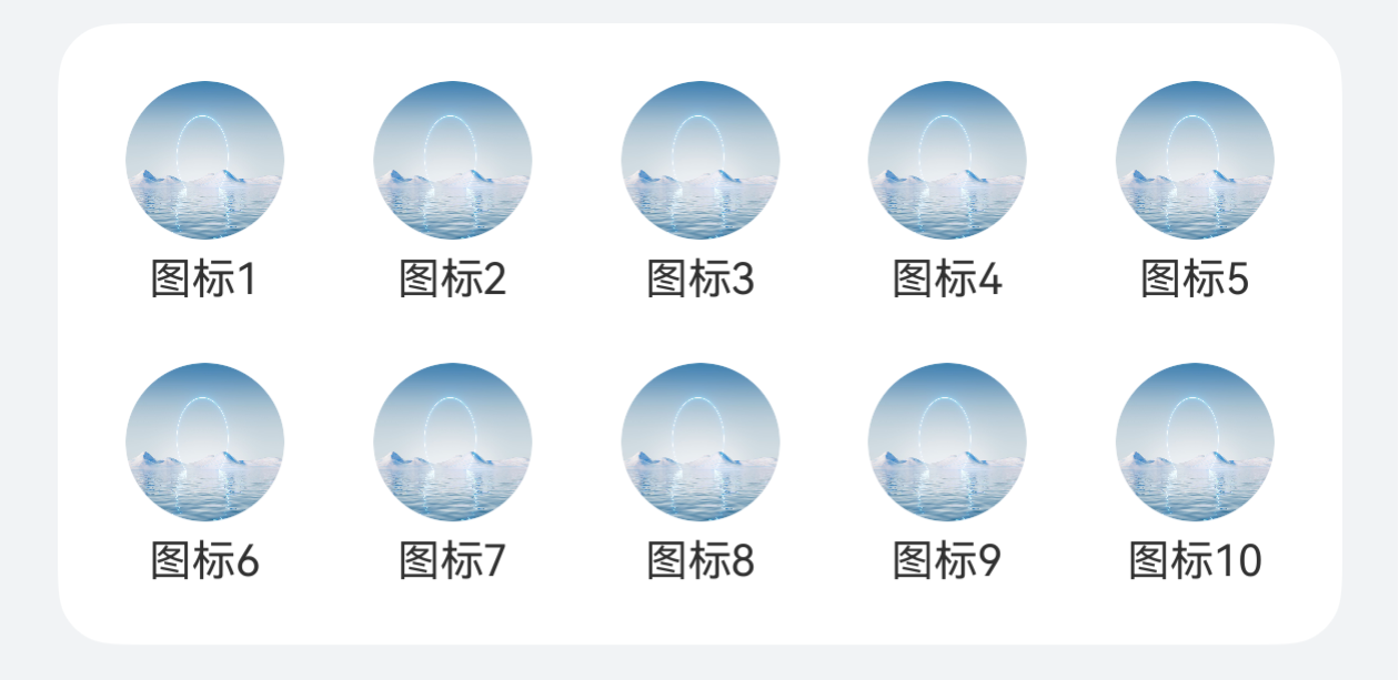
在List的第二个ListItem分组中,使用Grid组件构建页面网格区域。
.List({ space: 12 }) {
  // Swiper
  ListItem() {
    // ...
  }
  // Grid
  ListItem() {
    Grid() {
      ForEach(this.gridTitle, (item: Resource) => {
        GridItem() {
          Column() {
            Image($r('app.media.pic1'))
              // ...
            Text(item)
              // ...
          }
        }
      }, (item: Resource) => JSON.stringify(item))
    }
    .rowsGap(16) // Set the line spacing
    .columnsGap(19) // Set the column spacing
    .columnsTemplate('1fr 1fr 1fr 1fr 1fr') // Set the proportion of each column
    // ...
  }
  // ...
}
实现效果:
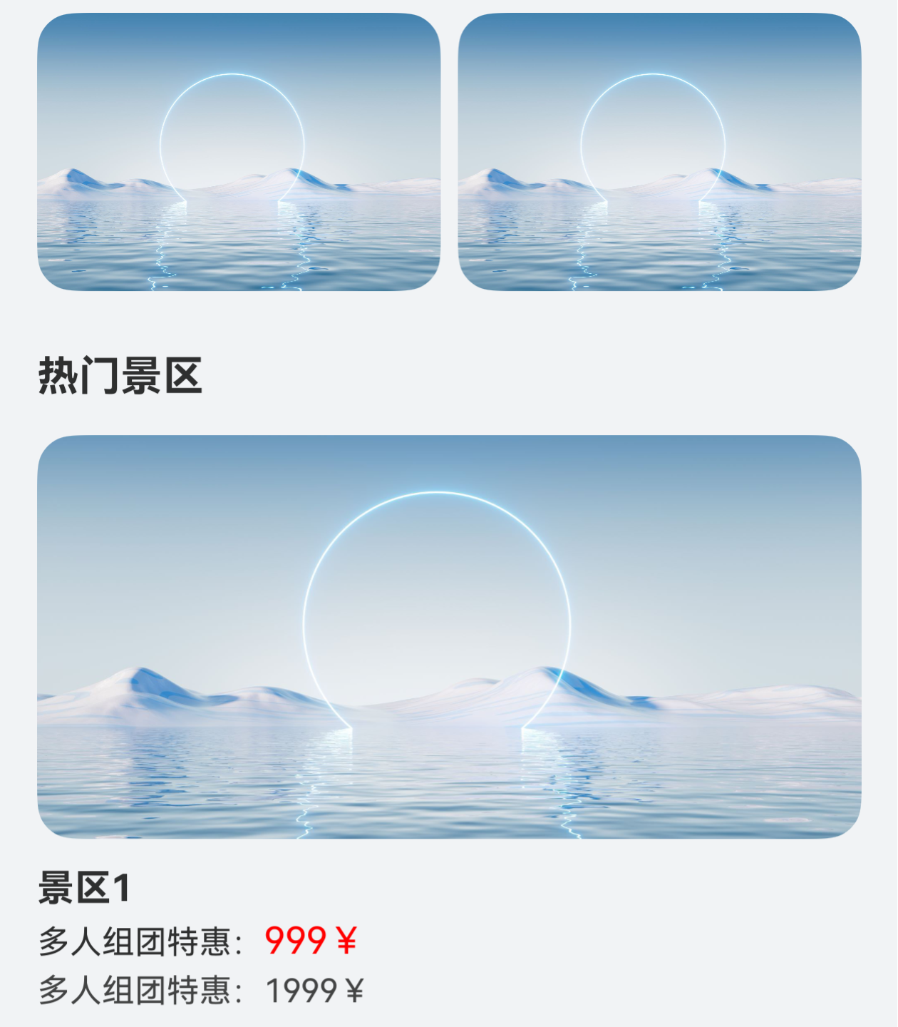
推荐内容及列表内容的构建。
// Scenic spot list content details
@Builder
.scenicSpotDetailBuilder(title: Resource) {
  Column() {
    Image($r('app.media.pic1'))
      // ...
    Column() {
      Text(title)
        // ...
      Text() {
        Span('Multi person group discount:')
          // ...
        Span('999¥')
          // ...
      }
      .margin({ top: 4, bottom: 4 })

      Text() {
        Span('Multi person group discount:')
        Span('1999¥')
      }
      // ...
    }
    // ...
  }
}
HomePage.ets
.List({ space: 12 }) {
  // Swiper
  ListItem() {
    // ...
  }
  // Grid
  ListItem() {
    // ...
  }
  // Customize display area.
  ListItem() {
    Row() {
      Image($r('app.media.pic1'))
        // ...
      Image($r('app.media.pic1'))
        // ...
    }
    // ...
  }

  // Scenic spot classification list.
  ForEach(this.scenicSpotTitle, (item: Resource) => {
    ListItemGroup({ header: this.scenicSpotHeader(item) }) {
      ForEach(this.scenicSpotArray, (scenicSpotItem: Resource) => {
        ListItem() {
          this.scenicSpotDetailBuilder(scenicSpotItem);
        }
      }, (scenicSpotItem: Resource) => JSON.stringify(scenicSpotItem))
    }
    .borderRadius(this.borderRadiusVal)
  }, (item: Resource) => JSON.stringify(item))

  // ...
}
实现效果:
将构建好的页面内容,放在Refresh组件内部,并给List和Refresh组件添加对应的onReachEnd()和onRefreshing()回调,实现下拉模拟刷新和上滑添加列表数据的效果。
// Top search box.
.Row() {
  // ...
}

// Pull down refresh component.
.Refresh({ refreshing: $$this.isRefreshing }) {
  // List as a long list layout.
  List({ space: 12 }) {
    // Swiper
    ListItem() {
      // ...
    }
    // Grid
    ListItem() {
      // ...
    }
    // Customize display area.
    ListItem() {
      // ...
    }

    // Scenic spot classification list.
    ForEach(this.scenicSpotTitle, (item: Resource) => {
      // ...
    }, (item: Resource) => JSON.stringify(item))

    // Customize bottom loading for more.
    ListItem() {
      Row() {
        if (!this.noMoreData) {
          LoadingProgress()
            // ...
        }
        Text(this.noMoreData ? $r('app.string.no_more_data') : $r('app.string.loading_more'))
      }
      // ...
    }
    // ...
  }
  // ...
  .onReachEnd(() => { // Callback triggered when the list is added to the end position
    if (this.scenicSpotArray.length >= 20) {
      // When the list data is greater than or equal to 20, noMoreData is set to true
      this.noMoreData = true;
      return;
    }
    setTimeout(() => {
      this.scenicSpotArray.push('scenic area' + (this.scenicSpotArray.length + 1));
    }, 500)
  })
}
// Pull down refresh, simulate network request.
.onRefreshing(() => {
  this.isRefreshing = true; // Enter the refresh state
  setTimeout(() => {
    // Set the landscapeSpotArray to the initial value
    this.scenicSpotArray =
      this.scenicSpotArray = ['scenic area 1', 'scenic area 2', 'scenic area 3', 'scenic area 4', 'scenic area 5'];
    this.noMoreData = false;
    this.isRefreshing = false;
  }, 2000)
})
实现效果
本文主要引用整理于鸿蒙官方文档
更多关于HarmonyOS鸿蒙NEXT应用元服务常见列表操作多类型列表项场景的实战教程也可以访问 https://www.itying.com/category-93-b0.html

鸿蒙NEXT多类型列表项场景可通过LazyForEach+ListItemGroup实现。ListContainer组件支持混合布局不同类型子项,需在onBindViewHolder中根据itemType返回对应UI模板。使用@Builder构建差异化的子项布局,通过模型类的type字段区分数据类型。List组件的多类型功能依托于HarmonyOS的声明式UI范式,在ArkUI中通过条件渲染实现不同子项样式切换。性能优化方面建议使用cachedCount属性预加载项。
更多关于HarmonyOS鸿蒙NEXT应用元服务常见列表操作多类型列表项场景的实战系列教程也可以访问 https://www.itying.com/category-93-b0.html
在HarmonyOS NEXT中实现多类型列表项场景,可以通过List组件结合多种子组件来构建复杂界面。以下是关键实现要点:
- 组件结构:
- 使用List作为容器组件,内部通过ListItemGroup和ListItem实现分组和不同类型项的展示
- 结合Swiper实现轮播图效果
- 使用Grid构建网格布局区域
- 通过Refresh组件实现下拉刷新功能
- 核心功能实现:
- 吸顶效果:为ListItemGroup设置sticky属性
- 下拉刷新:使用Refresh组件的onRefreshing回调
- 上拉加载:监听List的onReachEnd事件
- 多类型项:通过@Builder构建不同样式的列表项
- 性能优化技巧:
- 对于长列表使用LazyForEach优化渲染性能
- 为图片等资源设置合适的缓存策略
- 避免在列表项中使用过于复杂的布局嵌套
- 开发注意事项:
- 确保每种列表项类型有唯一的key
- 合理设置ListItem的复用策略
- 处理好异步数据加载时的状态管理
这种架构方式可以很好地支持门户首页、商城等需要展示多种内容类型的场景,同时保持流畅的交互体验。