


效果图(竖横屏前后对比):
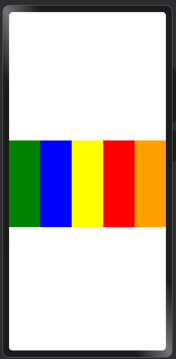
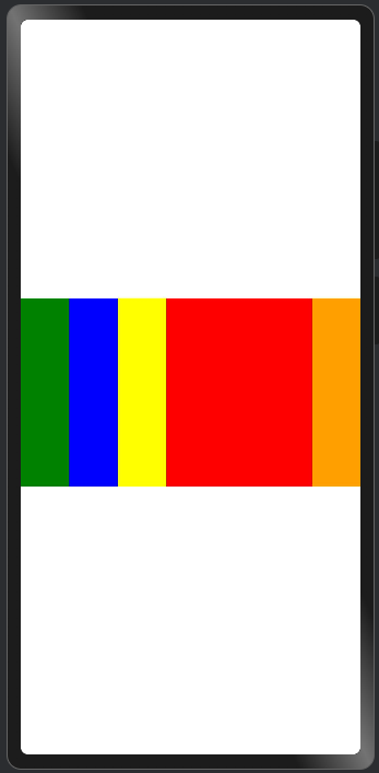
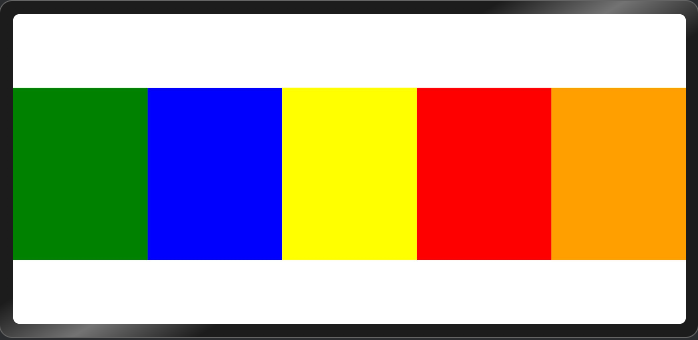
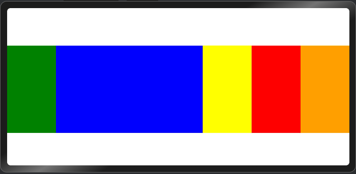
改进自:如何实现手风琴动画。
关键代码:
Column()
  .width(this.activeIndex === ri.index ? '60%' : '20%')
  .animation({ duration: 300, curve: Curve.Ease }) // 增加宽度变化时的动画
  .onTouch((e: TouchEvent) => {
    if (e.type === TouchType.Down) {
      // 点击即展开自己
      this.activeIndex = ri.index;
    } else if (e.type === TouchType.Up) {
      // 松手后 300 ms 收起
      setTimeout(() => (this.activeIndex = -1), 300);
    }
  })
完整代码:
@Entry
@ComponentV2
struct AccordionView {
  @Local activeIndex: number = -1;
  private readonly colors: ResourceColor[] = [
    Color.Green, Color.Blue, Color.Yellow, Color.Red, Color.Orange
  ];

  build() {
    Flex({ alignItems: ItemAlign.Center }) {
      Repeat(this.colors)
        .each((ri: RepeatItem<ResourceColor>) => {
          Column()
            .width(this.activeIndex === ri.index ? '60%' : '20%')
            .height(200)
            .backgroundColor(ri.item)
            .animation({ duration: 300, curve: Curve.Ease }) // 增加宽度变化时的动画
            .onTouch((e: TouchEvent) => {
              if (e.type === TouchType.Down) {
                // 点击即展开自己
                this.activeIndex = ri.index;
              } else if (e.type === TouchType.Up) {
                // 松手后 300 ms 收起
                setTimeout(() => (this.activeIndex = -1), 300);
              }
            });
        })
    }
    .width('100%')
    .height('100%')
  }
}
更多关于HarmonyOS 鸿蒙Next中如何实现手风琴动画?的实战系列教程也可以访问 https://www.itying.com/category-93-b0.html

在HarmonyOS Next中实现手风琴动画,可以使用ArkUI的动画能力。通过属性动画(例如animateTo)或显式动画(如springMotion),结合状态变量控制组件尺寸变化。关键步骤包括:定义可折叠/展开的组件(如Column或Row),绑定动画参数(如height或flexGrow),使用状态管理(@State)触发动画。具体实现涉及在组件上设置动画属性和过渡效果。
在HarmonyOS Next中,使用@ComponentV2和Repeat实现手风琴动画,核心在于结合状态管理、条件渲染和动画API。以下是关键步骤:
-
定义数据结构与状态:使用
@State装饰器管理当前展开项的索引,以及手风琴项的数据列表。 -
构建子项组件:使用
@ComponentV2创建可复用的手风琴子项组件。每个子项接收标题、内容、索引及当前展开索引作为参数。 -
实现展开/收起逻辑:在子项组件的标题区域添加点击事件,点击时更新父组件的
@State变量(当前展开索引)。通过比较子项索引与当前展开索引,决定内容的显示状态。 -
应用动画效果:利用ArkUI的显式动画API(如
animateTo)平滑过渡内容区域的高度或不透明度。例如,在内容显示/隐藏时,通过动画改变height或scaleY属性。 -
使用Repeat渲染列表:在父组件中,使用
Repeat迭代数据数组,动态生成多个手风琴子项,确保性能与代码简洁。
示例代码框架:
// 父组件
@Entry
@ComponentV2
struct AccordionExample {
  @State currentIndex: number = -1
  private data: Array<{title: string, content: string}> = [...]

  build() {
    Column() {
      Repeat(this.data, (item, index) => {
        AccordionItem({
          title: item.title,
          content: item.content,
          index: index,
          currentIndex: $currentIndex
        })
        .onClick(() => {
          // 点击时切换展开状态
          animateTo({ duration: 300 }, () => {
            this.currentIndex = this.currentIndex === index ? -1 : index
          })
        })
      })
    }
  }
}

// 子项组件
@ComponentV2
struct AccordionItem {
  // 参数定义
  ...

  build() {
    Column() {
      // 标题区域
      Text(this.title)
      // 条件渲染内容区域,并应用高度动画
      if (this.index === this.currentIndex) {
        Text(this.content)
          .transition({ type: TransitionType.Height, options: { duration: 300 } })
      }
    }
  }
}
通过以上步骤,即可实现一个交互流畅、性能高效的手风琴动画组件。注意合理管理状态更新与动画时序,以提升用户体验。