


HarmonyOS 鸿蒙Next中如何给图片设置一个渐变遮罩
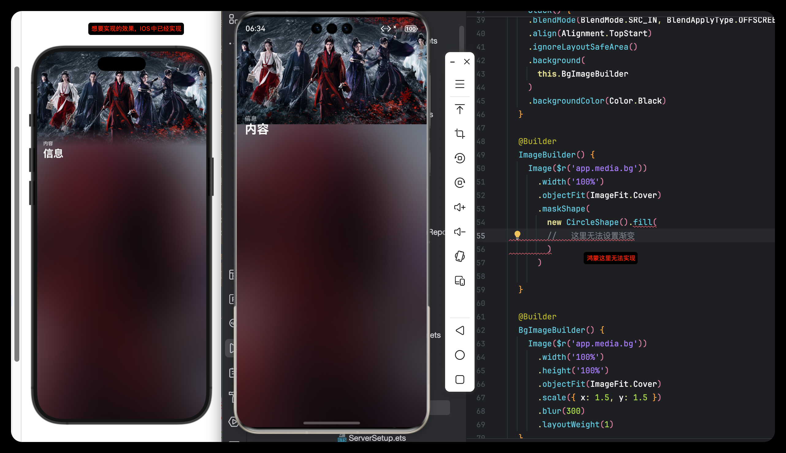
HarmonyOS 鸿蒙Next中如何给图片设置一个渐变遮罩 【问题描述】:鸿蒙如何给图片设置一个渐变遮罩,像iOS一样的效果
【问题现象】:
【版本信息】:
【复现代码】:
【尝试解决方案】:
使用Stack + linearGradient尝试,但效果并不理想,做不到IOS那样自然过渡
@Entry
@Component
struct Index {
  build() {
    Stack({ alignContent: Alignment.Bottom }) {
      Image($r('app.media.startIcon'))
        .width('100%')
        .height('100%')

      Rect({ width: '100%', height: '60%' })
        .fill(Color.Transparent)
        .opacity(0.96)
        .linearGradient({
          direction: GradientDirection.Bottom, // 渐变方向
          colors: [
            [0xFF9999, 0.0], // 浅
            [0x990000, 1.0]// 深
          ]
        })
    }
    .height('100%')
    .width('100%')
  }
}
更多关于HarmonyOS 鸿蒙Next中如何给图片设置一个渐变遮罩的实战教程也可以访问 https://www.itying.com/category-93-b0.html

解决方案:
可通过图像效果混合模式实现
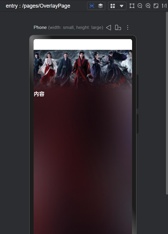
预览图:
示例代码:
@Entry
@Component
struct Index {
  build() {
    Column() {
      Column() {
        Column()
          .width('100%')
          .height('100%')
          .linearGradient({
            direction: GradientDirection.Bottom,
            colors: [['#000000', 0.5], ['#00000000', 1]],
          })
          .blendMode(BlendMode.DST_IN, BlendApplyType.OFFSCREEN)

      }
      .width('100%')
      .height(150)
      .justifyContent(FlexAlign.SpaceBetween)
      .backgroundImageSize(ImageSize.FILL)
      .backgroundImage($r('app.media.ic_cover'))
      .blendMode(BlendMode.SRC_OVER, BlendApplyType.OFFSCREEN)

      Row() {
        Text('内容')
          .fontSize(20)
          .fontWeight(FontWeight.Bold)
          .fontColor(Color.White)
      }.width('100%')
    }
    .width('100%')
    .height('100%')
    .backgroundImageSize(ImageSize.FILL)
    .backgroundImage($r('app.media.ic_bg'))
  }
}
更多关于HarmonyOS 鸿蒙Next中如何给图片设置一个渐变遮罩的实战系列教程也可以访问 https://www.itying.com/category-93-b0.html

在HarmonyOS Next中,可通过Image组件结合Stack与LinearGradient实现图片渐变遮罩。
使用Stack布局叠加Image和Rectangle,在Rectangle中设置LinearGradient作为遮罩层,调整gradient的colors与direction控制渐变效果。
示例代码片段:
Stack() {
  Image($r('app.media.img'))
  Rectangle()
    .linearGradient({
      angle: 90,
      colors: [['#00000000', '#ff000000']]
    })
}
通过colors数组定义透明度与颜色渐变。
在HarmonyOS Next中,要实现类似iOS风格的图片渐变遮罩,使用Stack + linearGradient的思路是正确的,但需要调整实现细节以获得更自然的过渡效果。
你的代码主要问题在于:
Rect的填充色为透明,导致渐变效果无法正确叠加在图片上。- 渐变颜色值使用了不透明的RGB格式,但起始透明度设置不当。
- 渐变方向与遮罩的常见需求(通常是从下到上的半透明渐变)可能不匹配。
以下是优化后的实现方案:
@Entry
@Component
struct GradientMaskDemo {
  build() {
    Stack({ alignContent: Alignment.Bottom }) {
      // 1. 底层:原始图片
      Image($r('app.media.startIcon'))
        .width('100%')
        .height('100%')
        .objectFit(ImageFit.Cover)

      // 2. 上层:渐变遮罩层
      Column() {
        // 使用空的Column作为渐变容器
      }
      .width('100%')
      .height('60%') // 遮罩高度,可根据需要调整
      .background(
        // 关键:使用linearGradient作为背景
        new LinearGradient({
          angle: 180, // 渐变角度(0-360),180表示从上到下
          colors: [
            [0x000000, 0.0],   // 完全透明黑色(顶部)
            [0x000000, 0.4],   // 40%透明度黑色(中间)
            [0x000000, 0.8]    // 80%透明度黑色(底部)
          ]
        })
      )
    }
    .width('100%')
    .height('100%')
  }
}
关键改进点:
- 使用
background()方法:直接将LinearGradient对象作为Column的背景,这是更标准的做法。 - 调整渐变参数:
angle: 180:创建从上到下的渐变(与iOS常见效果一致)。- 颜色数组使用相同的色值(黑色),但不同的透明度,这样能创建更自然的遮罩效果。
- 透明度从0.0(完全透明)渐变到0.8(较深遮罩),中间可添加过渡节点。
- 移除不必要的属性:不再需要
.fill()和.opacity(),渐变透明度已在colors数组中定义。
效果说明:
这个实现会在图片底部创建一个高度为60%的渐变遮罩层,从上到下逐渐变深,模拟iOS常见的图片底部渐变效果。你可以通过调整height百分比和colors数组中的透明度值来精确控制遮罩的范围和强度。
如果需要从下到上的渐变(如底部工具栏背景),只需将angle改为0,并调整透明度顺序即可。