


HarmonyOS 鸿蒙Next中如何适配深色模式 (Dark Mode)?
HarmonyOS 鸿蒙Next中如何适配深色模式 (Dark Mode)? 问题描述:如何让应用根据系统设置自动切换背景色?
3 回复

回答内容:使用resourceManager获取,或者监听配置变化。资源加载会自动根据目录匹配,但代码中控制需用resourceManager.ColorMode。
示例代码:
import { resourceManager } from '@kit.LocalizationKit';
import ThemeManager from '../utils/ThemeManager';

@Entry
@Component
struct DarkModePage {
  @State isDark: boolean = false;
  @State bgColor: ResourceColor = '#FFFFFF'
  @State textColor: ResourceColor = '#000000'

  aboutToAppear(): void {
    // 获取当前配置
    // let config = this.getUIContext().getConfiguration();
    const config = resourceManager.ColorMode;
    // 判断是否为深色模式
    this.isDark = config.DARK ===resourceManager.ColorMode.DARK;

    this.updateTheme();

    // 添加主题变更监听器
    ThemeManager.addThemeChangeListener(this.onThemeChanged.bind(this));
  }

  aboutToDisappear(): void {
    // 移除主题变更监听器
    ThemeManager.removeThemeChangeListener(this.onThemeChanged.bind(this));
  }

  // 主题变更回调
  private onThemeChanged = (theme: string) => {
    this.isDark = theme === 'dark';
    this.updateTheme();
  }

  updateTheme() {
    if (this.isDark) {
      this.bgColor = '#121212';
      this.textColor = '#FFFFFF';
    } else {
      this.bgColor = '#FFFFFF';
      this.textColor = '#000000';
    }
  }

  // 切换主题
  toggleTheme() {
    ThemeManager.toggleTheme();
  }

  build() {
    Column() {
      Text('切换主题测试')
        .fontSize(20)
        .fontColor(this.textColor)

      Button('切换主题')
        .margin({ top: 20 })
        .onClick(() => {
          this.toggleTheme();
        })
    }
    .width('100%')
    .height('100%')
    .backgroundColor(this.bgColor)
    .justifyContent(FlexAlign.Center)
    .alignItems(HorizontalAlign.Center)
  }
}

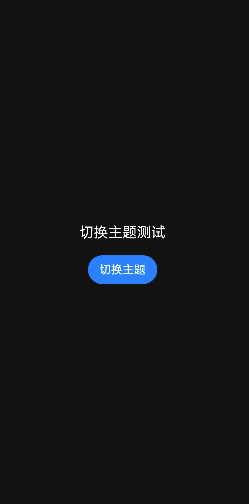
效果:系统切换深色模式后,应用背景变黑,文字变白。
更多关于HarmonyOS 鸿蒙Next中如何适配深色模式 (Dark Mode)?的实战系列教程也可以访问 https://www.itying.com/category-93-b0.html

在HarmonyOS Next中适配深色模式,主要通过AppStorage和ResourceManager实现。
- 使用
AppStorage.setOrCreate('darkMode', false)全局管理深色模式状态。 - 在UI组件中通过
@StorageLink('darkMode')绑定状态,或使用ResourceManager获取当前系统主题。 - 在
resources目录下分别创建theme.json(浅色)和theme-dark.json(深色)文件,定义颜色等资源。 - 应用会根据系统主题或手动设置的状态自动加载对应的资源文件。

在HarmonyOS Next中,适配深色模式的核心是使用资源限定词和响应式UI状态管理。系统会自动根据主题设置匹配对应的资源。
关键步骤如下:
-
定义颜色资源:在
resources/base/element/目录下的color.json文件中,为同一颜色值分别定义浅色和深色模式下的资源。// 浅色模式 (默认) { "color": [ { "name": "background_color", "value": "#FFFFFF" } ] }// 深色模式:在`resources/dark/element/`目录下创建同名文件 { "color": [ { "name": "background_color", "value": "#000000" } ] } -
在布局或样式中引用资源:在UI组件中直接引用定义好的颜色资源名,系统会根据当前模式自动切换。
// 示例:设置页面背景色 @Entry @Component struct Index { build() { Column() { // 内容区域 } .width('100%') .height('100%') .backgroundColor($r('app.color.background_color')) // 关键:引用资源 } } -
监听系统主题变化(可选):如果应用需要执行更复杂的逻辑(如动态加载不同图片),可以监听系统颜色模式的变化。
import { Configuration } from '@ohos.app.ability.Configuration';

// 在Ability或UI组件中监听
onConfigurationUpdate(config: Configuration) {
  if (config.colorMode === Configuration.ColorMode.COLOR_MODE_DARK) {
    // 系统切换至深色模式
  } else {
    // 系统切换至浅色模式
  }
}
要点总结:
- 系统自动匹配
resources/dark/(深色)和resources/base/(默认/浅色)目录下的资源。 - 核心是使用资源引用(如
$r('app.color.xxx'))而非硬编码颜色值。 - 对于图片等媒体资源,同样可通过
dark目录进行区分管理。
通过以上方式,应用即可无缝跟随系统深色/浅色模式设置自动切换界面主题。