


HarmonyOS鸿蒙Next中如何自定义实现卡片展开/收起动态效果?
HarmonyOS鸿蒙Next中如何自定义实现卡片展开/收起动态效果? 如何自定义实现卡片展开/收起动态效果?

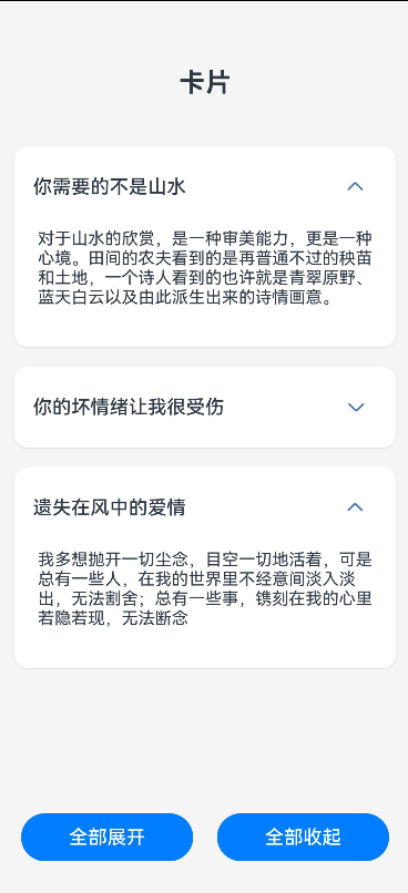
实现效果
实现思路
第一步:创建基础的布局页面。
第二步:添加状态变量以此来控制每一个卡片展开/收起状态,通过数组数量来进行处理。
第三步:添加基本动画效果,让展开/收起更加丝滑
应用场景
在一些新闻资讯流或者设置页面都比较常见。
完整代码
// 定义卡片数据接口
interface CardInfo {
  title: string
  content: string
}

@Entry
@Component
struct ToggleCard {
  // 使用数组管理多个卡片的展开状态
  @State cardsExpanded: boolean[] = [false, false, false]

  // 卡片数据
  @State cardsData: CardInfo[] = [
    {
      title: '你需要的不是山水',
      content: '对于山水的欣赏,是一种审美能力,更是一种心境。田间的农夫看到的是再普通不过的秧苗和土地,一个诗人看到的也许就是青翠原野、蓝天白云以及由此派生出来的诗情画意。',
    },
    {
      title: '你的坏情绪让我很受伤',
      content: '对你影响不好,我只想对你说我陪了你十三年,心里的伤口就没有愈合过,孩子大了,为了孩子做回父亲的形象吧。你不要让孩子将来输在你的身上',
    },
    {
      title: '遗失在风中的爱情',
      content: '我多想抛开一切尘念,目空一切地活着,可是总有一些人,在我的世界里不经意间淡入淡出,无法割舍;总有一些事,镌刻在我的心里若隐若现,无法断念',
    }
  ]

  toggleCard(index: number) {
    animateTo({
      duration: 400,
      curve: Curve.EaseOut,
      onFinish: () => {

      }
    }, () => {
      let newExpandedState = [...this.cardsExpanded]
      newExpandedState[index] = !newExpandedState[index]
      this.cardsExpanded = newExpandedState
    })
  }

  build() {
    Column({ space: 20 }) {
      Text('卡片')
        .fontSize(22)
        .fontWeight(FontWeight.Bold)
        .margin({ top: 20 })

      Scroll() {
        Column({ space: 16 }) {
          ForEach(this.cardsData, (card: CardInfo, index: number) => {
            Column() {
              Row() {
                Text(card.title)
                  .fontSize(16)
                  .fontWeight(FontWeight.Medium)

                Blank()

                Button() {
                  Image($r('sys.media.ohos_ic_public_arrow_down'))
                    .width(24)
                    .height(24)
                    .fillColor('#3F72AF')
                    .rotate({ angle: this.cardsExpanded[index] ? 180 : 0 })
                    .animation({
                      duration: 300,
                      curve: Curve.FastOutSlowIn
                    })
                }
                .width(36)
                .height(36)
                .backgroundColor(Color.Transparent)
                .onClick(() => this.toggleCard(index))
              }
              .width('100%')
              .justifyContent(FlexAlign.SpaceBetween)
              .alignItems(VerticalAlign.Center)

              if (this.cardsExpanded[index]) {
                Column({ space: 8 }) {
                  Text(card.content)
                    .fontSize(14)
                    .layoutWeight(1)
                }
                .animation({
                  duration: 300,
                  curve: Curve.EaseOut
                })
                .height(100)
                .width('100%')
              }
            }
            .padding(16)
            .borderRadius(12)
            .backgroundColor(Color.White)
            .width('100%')
            .shadow({
              radius: 4,
              color: 'rgba(0, 0, 0, 0.1)',
              offsetX: 0,
              offsetY: 2
            })
          })


          Blank()
            .height(20)
        }
        .alignItems(HorizontalAlign.Center)
      }
      .align(Alignment.Top)
      .padding(20)
      .layoutWeight(1)


      Row({ space: 20 }) {
        Button('全部展开')
          .width('40%')
          .onClick(() => {
            animateTo({
              duration: 300
            }, () => {
              this.cardsExpanded = this.cardsData.map((_: CardInfo) => true)
            })
          })

        Button('全部收起')
          .width('40%')
          .onClick(() => {
            animateTo({
              duration: 300
            }, () => {
              this.cardsExpanded = this.cardsData.map((_: CardInfo) => false)
            })
          })
      }
      .margin({ bottom: 30 })
    }
    .width('100%')
    .height('100%')
    .backgroundColor('#F5F5F5')
    .alignItems(HorizontalAlign.Center)
    .expandSafeArea()
  }
}
更多关于HarmonyOS鸿蒙Next中如何自定义实现卡片展开/收起动态效果?的实战系列教程也可以访问 https://www.itying.com/category-93-b0.html

在HarmonyOS Next中,自定义卡片展开/收起效果主要通过ArkUI的显式动画(如animateTo)和状态管理实现。使用条件渲染控制布局变化,结合height、opacity等属性过渡。关键步骤包括:定义展开状态变量,在animateTo中修改该变量触发UI更新,并设置animation参数控制动效时长与曲线。可搭配Column容器与属性动画实现平滑的高度变换。
在HarmonyOS Next中,自定义卡片展开/收起动态效果的核心是使用ArkUI的显式动画(如animateTo)配合布局属性的变化(如height、clip、scale等)。以下是关键实现步骤:
-
状态与布局定义:使用
@State装饰器控制卡片的展开状态(如isExpanded: boolean)。在布局中,通常需要动态改变组件的高度、缩放或裁剪区域。例如,将内容区域包裹在Flex、Stack或Column中,并绑定height或clip属性。 -
动画触发与属性绑定:通过点击事件切换
isExpanded状态,并在animateTo中执行属性变化。例如:animateTo({ duration: 300, curve: Curve.EaseInOut }, () => { this.isExpanded = !this.isExpanded; // 触发高度等属性变化 }) -
动态样式计算:根据
isExpanded状态,计算卡片内容的高度或缩放比例。例如:// 使用条件表达式或方法返回样式值 .height(this.isExpanded ? '100%' : '80vp') .clip({ x: 0, y: 0, width: '100%', height: this.isExpanded ? 'auto' : '120vp' }) -
优化性能与交互:对于复杂动画,建议使用
transition属性或PropertyAnimation精细化控制属性变化。避免在动画中频繁计算布局,可提前测量内容高度。
注意:HarmonyOS Next的ArkUI强调声明式UI,动画应优先通过状态驱动样式变更实现,而非直接操作组件。