


HarmonyOS鸿蒙Next中如何利用Gauge组件实现健康心率区间数据可视化?
HarmonyOS鸿蒙Next中如何利用Gauge组件实现健康心率区间数据可视化? 如何利用Gauge组件实现健康心率区间数据可视化?

最近正在看运动类图表相关的组件,楼主对这个Gauge组件的讲解比较详细,多谢~
更多关于HarmonyOS鸿蒙Next中如何利用Gauge组件实现健康心率区间数据可视化?的实战系列教程也可以访问 https://www.itying.com/category-93-b0.html

我们在 HarmonyOS 应用开发中,Gauge 组件是数据可视化的核心组件之一,以环形图表形式直观展示进度、占比、数值范围等信息,广泛应用于设备状态监控、健康数据展示、任务进度跟踪等场景。这里就给大家一个如何利用Gauge组件实现健康心率区间数据可视化的基本实现示例。
一、功能核心点
多色分段量规:按数值区间展示不同颜色(如健康心率区间、电量等级);
渐变环形量规:单色 / 多色渐变效果,提升 UI 视觉质感;
自定义交互量规:支持数值动态增减、指针样式替换;
隐私保护量规:隐私模式下隐藏真实数据,仅展示占位样式;
定制说明区:添加数值文本、辅助说明、图标等内容,丰富信息展示。
二、关键代码实现
- 多色分段与渐变效果
颜色配置:colors属性支持三种类型 —— 单一颜色(单色环)、LinearGradient(渐变环)、数组(分段渐变环),数组元素格式为[颜色值, 占比],总占比建议为 100;
区间划分:示例中按心率范围分为低(0-30)、中(31-70)、高(71-100)三个区间,分别对应绿、黄、红三种颜色,直观区分数值等级;
视觉优化:trackShadow添加阴影效果,strokeWidth调整环形厚度,提升组件立体感。
      Text("多色分段量规:健康心率监测")
        .fontSize(14)
        .margin({ left: 15, bottom: 8 })
        .textAlign(TextAlign.Start)
        .width("100%");
      Gauge({
        value: this.currentValue,
        min: this.minValue,
        max: this.maxValue
      }) {
        this.gaugeContentBuilder(this.currentValue);
      }
      .width("80%")
      .height(280)
      .startAngle(210) // 起始角度(时钟0点为0度,顺时针为正)
      .endAngle(150) // 终止角度,形成半环形
      .colors([
        [new LinearGradient([{ color: "#4CD964", offset: 0 }, { color: "#2DC848", offset: 1 }]), 30], // 低区间(0-30)
        [new LinearGradient([{ color: "#FFE04B", offset: 0 }, { color: "#FFC107", offset: 1 }]), 40], // 中区间(31-70)
        [new LinearGradient([{ color: "#FF6B6B", offset: 0 }, { color: "#FF4444", offset: 1 }]), 30]  // 高区间(71-100)
      ])
      .strokeWidth(20) // 环形厚度
      .trackShadow({ radius: 8, offsetX: 0, offsetY: 4 }) // 阴影效果
      .description(this.descriptionBuilder()) // 底部说明区
      .privacySensitive(this.isPrivacyMode) // 隐私模式控制
      .margin({ bottom: 40 });
- 动态交互与状态控制
数值动态更新:通过@State变量currentValue绑定Gauge的value属性,点击按钮修改数值时,量规指针实时联动;
隐私模式:privacySensitive(true)开启隐私保护后,指针指向 0 位置,数值和说明区被遮罩,仅显示灰色量程,适配隐私数据展示场景;
指针自定义:API 11 + 支持通过indicator属性设置自定义指针,需传入 SVG 格式图标(示例中可替换$r(‘app.media.indicator’)为自定义资源),space属性控制指针与圆环的间距。
 Text("交互控制")
        .fontSize(14)
        .margin({ left: 15, bottom: 10 })
        .textAlign(TextAlign.Start)
        .width("100%");
      Row({ space: 20 }) {
        // 数值增减按钮
        Button("数值-")
          .width(80)
          .height(40)
          .backgroundColor("#F5F5F5")
          .fontColor("#333333")
          .borderRadius(8)
          .onClick(() => {
            if (this.currentValue > this.minValue) {
              this.currentValue--;
            }
          });

        Button("数值+")
          .width(80)
          .height(40)
          .backgroundColor("#3498DB")
          .fontColor("#FFFFFF")
          .borderRadius(8)
          .onClick(() => {
            if (this.currentValue < this.maxValue) {
              this.currentValue++;
            }
          });
三、完整代码
@Entry
@Component
struct GaugeComprehensiveDemo {
// 响应式状态:动态控制量规数值、隐私模式、指针类型
[@State](/user/State) currentValue: number = 68;
[@State](/user/State) isPrivacyMode: boolean = false;
[@State](/user/State) useCustomIndicator: boolean = false;
// 量规基础配置
private readonly minValue: number = 0;
private readonly maxValue: number = 100;
// 自定义说明区构建器(API 11+)
@Builder descriptionBuilder() {
Text("心率监测")
.fontSize(14)
.fontColor("#666666")
.fontWeight(FontWeight.Medium)
.textAlign(TextAlign.Center)
}
// 自定义内容区构建器(API 12+)
@Builder gaugeContentBuilder(value: number) {
Column({ space: 8 }) {
Text(`${value}`)
.fontSize(36)
.fontWeight(FontWeight.Bold)
.fontColor("#2D3748")
.textAlign(TextAlign.Center);
Text("正常范围:60-100")
.fontSize(12)
.fontColor("#999999")
.textAlign(TextAlign.Center);
}
.width("100%")
.height("100%")
.justifyContent(FlexAlign.Center);
}
build() {
Column() {
// 功能标题
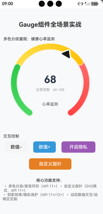
Text("Gauge组件全场景实战")
.fontSize(22)
.fontWeight(FontWeight.Bold)
.margin({ top: 30, bottom: 30 });
// 1. 多色分段量规(心率区间示例)
Text("多色分段量规:健康心率监测")
.fontSize(14)
.margin({ left: 15, bottom: 8 })
.textAlign(TextAlign.Start)
.width("100%");
Gauge({
value: this.currentValue,
min: this.minValue,
max: this.maxValue
}) {
this.gaugeContentBuilder(this.currentValue);
}
.width("80%")
.height(280)
.startAngle(210) // 起始角度(时钟0点为0度,顺时针为正)
.endAngle(150) // 终止角度,形成半环形
.colors([
[new LinearGradient([{ color: "#4CD964", offset: 0 }, { color: "#2DC848", offset: 1 }]), 30], // 低区间(0-30)
[new LinearGradient([{ color: "#FFE04B", offset: 0 }, { color: "#FFC107", offset: 1 }]), 40], // 中区间(31-70)
[new LinearGradient([{ color: "#FF6B6B", offset: 0 }, { color: "#FF4444", offset: 1 }]), 30] // 高区间(71-100)
])
.strokeWidth(20) // 环形厚度
.trackShadow({ radius: 8, offsetX: 0, offsetY: 4 }) // 阴影效果
.description(this.descriptionBuilder()) // 底部说明区
.privacySensitive(this.isPrivacyMode) // 隐私模式控制
.margin({ bottom: 40 });
// 2. 交互控制区
Text("交互控制")
.fontSize(14)
.margin({ left: 15, bottom: 10 })
.textAlign(TextAlign.Start)
.width("100%");
Row({ space: 20 }) {
// 数值增减按钮
Button("数值-")
.width(80)
.height(40)
.backgroundColor("#F5F5F5")
.fontColor("#333333")
.borderRadius(8)
.onClick(() => {
if (this.currentValue > this.minValue) {
this.currentValue--;
}
});
Button("数值+")
.width(80)
.height(40)
.backgroundColor("#3498DB")
.fontColor("#FFFFFF")
.borderRadius(8)
.onClick(() => {
if (this.currentValue < this.maxValue) {
this.currentValue++;
}
});
// 隐私模式切换
Button(this.isPrivacyMode ? "关闭隐私" : "开启隐私")
.width(120)
.height(40)
.backgroundColor(this.isPrivacyMode ? "#F5F5F5" : "#9B59B6")
.fontColor(this.isPrivacyMode ? "#333333" : "#FFFFFF")
.borderRadius(8)
.onClick(() => {
this.isPrivacyMode = !this.isPrivacyMode;
});
}
.margin({ bottom: 20 });
// 3. 指针样式切换
Button(this.useCustomIndicator ? "默认指针" : "自定义指针")
.width(150)
.height(40)
.backgroundColor("#E67E22")
.fontColor("#FFFFFF")
.borderRadius(8)
.onClick(() => {
this.useCustomIndicator = !this.useCustomIndicator;
})
.margin({ bottom: 30 });
// 4. 功能说明
Text("核心功能支持:")
.fontSize(14)
.fontWeight(FontWeight.Medium)
.margin({ bottom: 5 });
Text("• 多色分段/渐变环形(API 11+)• 自定义指针(SVG格式,API 11+)")
.fontSize(13)
.fontColor("#666666");
Text("• 阴影效果/隐私保护(API 11+/12+)• 动态数值交互/说明区定制")
.fontSize(13)
.fontColor("#666666");
}
.width("100%")
.height("100%")
.backgroundColor("#F8F9FA")
.padding(15);
}
}
四、效果展示

在HarmonyOS鸿蒙Next中,使用Gauge组件实现健康心率区间可视化,主要通过ArkTS定义组件属性。设置Gauge的value值绑定实时心率数据,利用colors属性配置不同数值区间对应的颜色(如绿色表示正常,红色表示过高)。通过修改Gauge的strokeWidth和shadow属性调整视觉效果,结合Text组件显示具体数值。数据更新时调用状态管理方法刷新UI。

在HarmonyOS Next中,利用Gauge组件实现健康心率区间数据可视化,核心在于配置其GaugeOptions,特别是ranges属性。以下是关键步骤和代码示例:
- 定义心率区间与颜色:首先,明确你的健康心率区间(如热身、燃脂、有氧、无氧),并为每个区间分配颜色。
- 配置GaugeOptions:在
GaugeOptions中,通过ranges数组定义这些区间。每个区间需设置start(起始值)、end(结束值)和color(颜色)。 - 设置当前值:通过
Gauge组件的value属性绑定实时或模拟的心率数据。 - 自定义样式(可选):可调整表盘样式,如修改
strokeWidth(线条宽度)或startAngle/endAngle(起始/结束角度)。
示例代码(ArkTS):
import { Gauge, GaugeOptions } from '@kit.ArkUI';

@Entry
@Component
struct HeartRateGauge {
  private value: number = 128; // 当前心率值,示例数据
  private options: GaugeOptions = {
    ranges: [
      { start: 60, end: 100, color: '#00FF00' },   // 热身区间,绿色
      { start: 100, end: 120, color: '#FFFF00' },  // 燃脂区间,黄色
      { start: 120, end: 140, color: '#FFA500' },  // 有氧区间,橙色
      { start: 140, end: 180, color: '#FF0000' }   // 无氧区间,红色
    ],
    strokeWidth: 20, // 表盘线条宽度
    startAngle: 180, // 起始角度(度)
    endAngle: 360    // 结束角度(度)
  };

  build() {
    Column() {
      Gauge({
        value: this.value,
        options: this.options
      })
        .width(300)
        .height(300)
    }
    .width('100%')
    .height('100%')
  }
}
关键点:
ranges中的区间应连续且不重叠,以确保可视化连贯性。- 当前心率值(
value)落在哪个区间,表盘对应段即显示该区间颜色,直观展示所处健康区间。 - 可通过
startAngle和endAngle调整表盘弧度,例如设置为半圆形或全圆形。
此方法直接利用Gauge内置能力,无需复杂计算或自定义绘制,即可清晰呈现心率数据所在的健康区间。