


HarmonyOS 鸿蒙Next中实现自定义好看的毛玻璃效果
HarmonyOS 鸿蒙Next中实现自定义好看的毛玻璃效果 如何实现一个图片背景,上面是半透明的“磨砂玻璃”卡片这种好看的效果呢?
4 回复


使用场景
针对那种沉浸式设置页,比如系统设置或天气应用,使用半透明面板提升视觉高级感。
实现思路
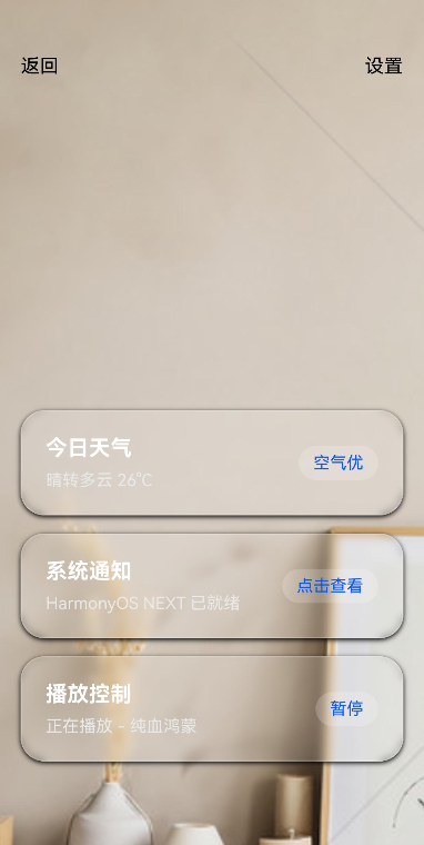
第一步:分层布局架构,底层使用一个全屏的 Stack 或 Image/Video 组件作为背景,顶层主界面内容。
第二步:利用 ArkUI 的 BackdropBlur,封装一个 GlassPanel 自定义组件,统一管理模糊半径和混合模式。
第三步:窗口背景透明化。
实现效果
完整实现代码
@Entry
@Component
struct GlassEffectDemo {
  @State message: string = 'Glassmorphism';
  // 控制模糊半径的动态变量
  @State blurRadius: number = 20;

  build() {
    Stack({ alignContent: Alignment.BottomStart }) {

      Image($r('app.media.2'))
        .width('100%')
        .height('100%')
        .objectFit(ImageFit.Cover)


      //顶部的导航和底部的卡片
      Column() {
        // 顶部导航栏模拟
        Row() {
          Text("返回")
            .fontColor(Color.Black)
            .onClick(() => {
              // 动态模糊度
              this.blurRadius = this.blurRadius === 20 ? 0 : 20;
            })

          Blank()

          Text("设置")
            .fontColor(Color.Black)
        }
        .width('100%')
        .padding({ left: 20, right: 20, top: 50 }) // 适配状态栏高度
        .height(60)

        Blank()

        // 底部玻璃卡片列表
        Column() {
          this.GlassCard("今日天气", "晴转多云 26°C", "空气优")
          this.GlassCard("系统通知", "HarmonyOS NEXT 已就绪", "点击查看")
          this.GlassCard("播放控制", "正在播放 - 纯血鸿蒙", "暂停")
        }
        .width('100%')
        .padding(20)
        .margin({ bottom: 40 })
      }
      .width('100%')
      .height('100%')
    }
    .width('100%')
    .height('100%')
  }

  // ==========================================
  // 毛玻璃卡片组件
  // ==========================================
  @Builder
  GlassCard(title: string, subtitle: string, action: string) {
    Row() {
      Column({ space: 8 }) {
        Text(title)
          .fontSize(18)
          .fontWeight(FontWeight.Bold)
          .fontColor(Color.White)

        Text(subtitle)
          .fontSize(14)
          .fontColor('#E9E9E9')
      }
      .alignItems(HorizontalAlign.Start)

      Blank()

      Text(action)
        .fontSize(14)
        .fontColor('#0A59F7')
        .padding({ left: 12, right: 12, top: 6, bottom: 6 })
        .backgroundColor('#30FFFFFF') // 按钮自身的半透明
        .borderRadius(16)
    }
    .width('100%')
    .padding(20)
    .backdropBlur(this.blurRadius)
    .backgroundColor('rgba(255, 255, 255, 0.15)') // 必须有半透明背景色,否则模糊效果不明显
    .border({
      width: 1,
      color: 'rgba(255, 255, 255, 0.2)'
    })
    .borderRadius(20)
    .margin({ bottom: 15 })
    .shadow({ radius: 10, color: '#000000', offsetX: 0, offsetY: 4 }) // 添加阴影增强层次感
  }
}

在HarmonyOS Next中,可通过EffectComponent组件实现毛玻璃效果。使用BlurStyle枚举设置模糊样式,如BlurStyle.Thin。通过blurRadius属性调整模糊半径,backdropBlurStyle控制背景模糊。示例代码:EffectComponent({ blurStyle: BlurStyle.Thin, blurRadius: 10 })。
在HarmonyOS Next中实现毛玻璃(磨砂玻璃)效果,核心是使用Filter的BackdropBlur滤镜,并结合半透明背景。以下是关键实现步骤和代码示例:
1. 核心原理
使用Stack组件叠加布局,底层为图片,上层为应用了背景模糊滤镜的半透明容器。
2. 实现代码
import { Stack, Image, Column } from '@kit.ArkUI';

@Entry
@Component
struct FrostedGlassDemo {
  build() {
    Stack() {
      // 底层背景图片
      Image($r('app.media.background'))
        .width('100%')
        .height('100%')
        .objectFit(ImageFit.Cover)

      // 毛玻璃效果层
      Column() {
        // 您的卡片内容
        Text('Hello HarmonyOS Next')
          .fontSize(20)
          .fontColor(Color.White)
      }
      .width('80%')
      .height(200)
      .backgroundColor('#40FFFFFF') // 半透明白色背景
      .backdropBlur(10) // 关键:背景模糊滤镜
      .borderRadius(16)
      .padding(20)
    }
    .width('100%')
    .height('100%')
  }
}
3. 关键属性说明
backdropBlur(radius: number):对组件后方内容进行高斯模糊,数值越大越模糊backgroundColor:需使用带透明度的颜色(如#40FFFFFF),才能透出底层模糊效果- 建议配合
borderRadius使用以获得圆角玻璃效果
4. 高级技巧
- 调节透明度:修改
backgroundColor的Alpha通道值(如#20FFFFFF为更透明) - 性能优化:模糊半径不宜过大(通常5-15之间),避免过度渲染开销
- 动态效果:可通过状态变量动态改变模糊半径实现交互效果
此方案直接利用HarmonyOS Next的原生滤镜能力,无需第三方库,渲染性能较好。