


HarmonyOS鸿蒙Next中如何实现Tab栏弧形切角
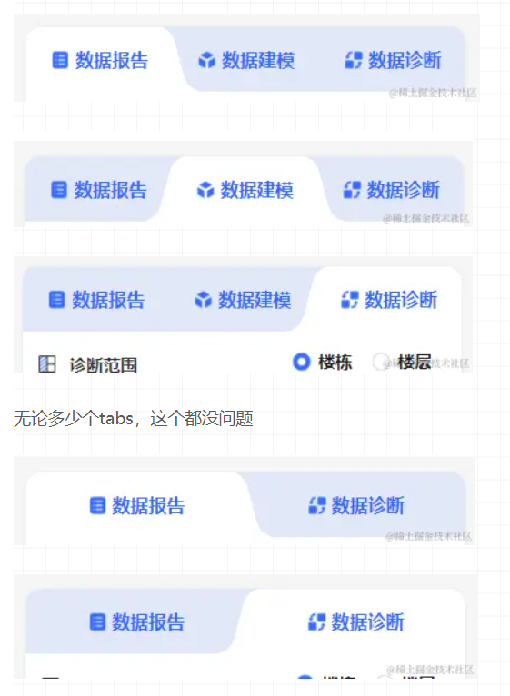
HarmonyOS鸿蒙Next中如何实现Tab栏弧形切角 想实现一个自定义tab,带有弧形的切角,有大佬可以提供思路或者demo吗,效果如图
更多关于HarmonyOS鸿蒙Next中如何实现Tab栏弧形切角的实战教程也可以访问 https://www.itying.com/category-93-b0.html

【解决方案】
开发者您好,可参考以下方案:
方案一:自定义TabBar,可以将每一个页签拟作一个矩形Row组件(或其他),并为它设置圆角样式,可参考代码:
@Entry
@Component
struct Index {
  @State fontColor: string = '#182431';
  @State selectedFontColor: string = '#007DFF';
  @State currentIndex: number = 0;
  @State selectedIndex: number = 0;
  private controller: TabsController = new TabsController();
  borderVal: number = 12;

  getBorderRadiuses(actIndex: number, pos: number): BorderRadiuses {
    if (pos === actIndex) {
      if (0 < actIndex && actIndex < 4) {
        return { topLeft: this.borderVal, topRight: this.borderVal };
      } else if (0 === actIndex) {
        return { topLeft: this.borderVal, topRight: this.borderVal };
      } else if (actIndex === 3) {
        return { topLeft: this.borderVal, topRight: this.borderVal };
      }
    } else {
      if (pos === actIndex - 1) {
        return { bottomRight: this.borderVal };
      } else if (pos === actIndex + 1) {
        return { bottomLeft: this.borderVal };
      } else {
        return {};
      }
    }
    return {};
  }

  @Builder
  tabBuilder(index: number, name: string) {
    Column() {
      Row() {
        Image($r('app.media.startIcon')).width(16);
        Text(name)
          .fontColor(this.selectedIndex === index ? this.selectedFontColor : this.fontColor)
          .fontSize(16)
          .fontWeight(this.selectedIndex === index ? 500 : 400)
          .lineHeight(22);
      }
      .backgroundColor(this.selectedIndex === index ? Color.White : '#E1E8F8')
      .borderRadius(this.getBorderRadiuses(this.selectedIndex, index))
      .justifyContent(FlexAlign.Center)
      .width('100%')
      .height('100%');
    }
    .backgroundColor(this.selectedIndex === index ? '#E1E8F8' : Color.White)
    .justifyContent(FlexAlign.Center)
    .width('100%')
    .height('100%');
  }

  build() {
    Column() {
      Tabs({ barPosition: BarPosition.Start, index: this.currentIndex, controller: this.controller }) {
        TabContent() {
          Column().width('100%').height('100%').backgroundColor('#00CB87');
        }.tabBar(this.tabBuilder(0, 'green'));

        TabContent() {
          Column().width('100%').height('100%').backgroundColor('#007DFF');
        }.tabBar(this.tabBuilder(1, 'blue'));

        TabContent() {
          Column().width('100%').height('100%').backgroundColor('#FFBF00');
        }.tabBar(this.tabBuilder(2, 'yellow'));

        TabContent() {
          Column().width('100%').height('100%').backgroundColor('#E67C92');
        }.tabBar(this.tabBuilder(3, 'pink'));
      }
      .vertical(false)
      .barMode(BarMode.Fixed)
      .borderRadius({ topLeft: this.borderVal, topRight: this.borderVal })
      .clip(true)
      .barHeight(56)
      .animationDuration(400)
      .onChange((index: number) => {
        // currentIndex控制TabContent显示页签
        this.currentIndex = index;
        this.selectedIndex = index;
      })
      .onAnimationStart((index: number, targetIndex: number, event: TabsAnimationEvent) => {
        if (index === targetIndex) {
          return;
        }
        // selectedIndex控制自定义TabBar内Image和Text颜色切换
        this.selectedIndex = targetIndex;
      })
      .width(360)
      .height(296)
      .backgroundColor('#f1f3f5');
    }
    .width('100%')
    .height('100%');
  }
}
方案二:可以参考舵式导航的样式进行绘制,舵式导航 方案三:利用Stack组件为TabBar设置背景图,点击不同页签展示不同背景图
更多关于HarmonyOS鸿蒙Next中如何实现Tab栏弧形切角的实战系列教程也可以访问 https://www.itying.com/category-93-b0.html


在HarmonyOS Next中实现Tab栏弧形切角,可通过ArkUI的Shape组件或自定义绘制实现。使用Shape组件时,设置其type为Arc,并调整radius属性控制弧度。结合Stack布局将Shape置于Tab栏底部,通过调整位置与尺寸匹配切角效果。也可通过CanvasRenderingContext2D的arc方法进行自定义绘制,精确控制弧形路径与样式。需注意组件层级与布局适配。

在HarmonyOS Next中实现Tab栏弧形切角,可以通过自定义Shape组件或结合Canvas绘制来实现。以下是两种常用方法:
方法一:使用Shape组件绘制弧形背景
通过Shape的Arc能力绘制顶部弧形,结合Stack布局实现Tab栏。
// 自定义弧形Tab组件示例
@Entry
@Component
struct ArcTabExample {
  build() {
    Column() {
      // 顶部弧形背景
      Stack({ alignContent: Alignment.TopStart }) {
        // 绘制弧形区域
        Shape() {
          Path()
            .width('100%')
            .height(60)
            .commands('M0 20 A20 20 0 0 1 20 0 L100% 20 100% 100% 0 100% Z')
        }
        .fill('#007DFF')
        .width('100%')
        .height(80)

        // Tab内容
        Row() {
          TabContent('首页', 0)
          TabContent('发现', 1)
          TabContent('我的', 2)
        }
        .width('100%')
        .height(60)
        .justifyContent(FlexAlign.SpaceAround)
        .padding({ top: 10 })
      }
    }
  }
}

@Component
struct TabContent {
  @State isActive: boolean = false

  build() {
    Column() {
      Text(this.tabName)
        .fontColor(this.isActive ? '#FFFFFF' : '#A0FFFFFF')
        .fontSize(16)
      if (this.isActive) {
        // 选中指示器
        Circle({ width: 6, height: 6 })
          .fill('#FFFFFF')
          .margin({ top: 4 })
      }
    }
    .onClick(() => {
      this.isActive = !this.isActive
    })
  }
}
方法二:使用SVG路径精确控制弧形
通过SVG路径字符串定义更复杂的弧形切角:
Shape() {
  Path()
    .commands(`
      M0 30
      Q0 0, 30 0
      L${this.screenWidth - 30} 0
      Q${this.screenWidth} 0, ${this.screenWidth} 30
      L${this.screenWidth} 100%
      L0 100%
      Z
    `)
}
.fill('#007DFF')
.width('100%')
.height(80)
关键点说明:
- Path命令:使用
M(移动起点)、Q(二次贝塞尔曲线)、L(直线)等SVG命令构建路径 - 弧形控制:通过贝塞尔曲线或圆弧命令
A实现平滑弧形 - 布局配合:结合
Stack层叠布局确保内容在弧形背景上方正确显示 - 响应式:使用
display.getDefaultDisplaySync().width获取屏幕宽度实现自适应
扩展建议:
- 对于动态Tab数量,可封装为可配置组件
- 使用
@State管理选中状态,结合@Watch响应状态变化 - 考虑添加动画过渡效果提升体验
这种方法避免了依赖第三方库,直接使用HarmonyOS原生图形能力,性能更优且符合系统设计规范。