


HarmonyOS鸿蒙Next中Polygon绘制的图形就不能设置圆角和渐变色背景吗
HarmonyOS鸿蒙Next中Polygon绘制的图形就不能设置圆角和渐变色背景吗 Polygon绘制的图形就不能设置圆角和渐变色背景吗?
Polygon()
  .height('90lpx')
  .width('500lpx')
  .fill('#f00')
  .points([[0,0],['500lpx',0],['485lpx','90lpx'],[0,'90lpx']])
就这么个东西。怎么设置圆角和渐变色都不管用。试过好多方法了。还是不行。是不是这玩意就是没办法设置这些东西呢。
那我想实现个有一边倾斜的进度条有啥好办法没。

就大概这样。会变长变短。左边是直的。右边这是倾斜的边。还有圆角和渐变色。
更多关于HarmonyOS鸿蒙Next中Polygon绘制的图形就不能设置圆角和渐变色背景吗的实战教程也可以访问 https://www.itying.com/category-93-b0.html

实现步骤:
- 使用 maskShape 为组件添加指定形状的遮罩,maskShape 支持 CircleShape | EllipseShape | PathShape | RectShape。
- 使用 PathShape,通过 commands 设置符合 SVG 路径描述规范的字符串来定义形状,单位为 px。
- Shape 组件内嵌套 Path 绘制描边(白色边框),maskShape 绘制填充(白色遮罩)。
- 通过 onAreaChange 监听组件尺寸变化,动态调用 vp2px 进行单位转换并重新生成 SVG 路径,适配不同宽高。
- 使用二次贝塞尔曲线(Q 命令)实现四角圆角过渡,斜边处通过 edgeOffset 偏移量配合斜率确保圆角过渡自然。
- 结合 linearGradient 实现渐变填充效果。
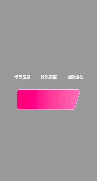
效果演示:
/**
 * @fileName : MaskShapeSvg.ets
 * @author : @cxy github.com/iHongRen/harmony-study-demo
 * @date : 2026/4/23
 * @description : PathShape 实现带斜切、圆角、渐变的图形
 */

import { PathShape } from "@kit.ArkUI"

@Component
export struct MaskShapeSvg {
  @State commands: string = ''
  @State shapeWidth: number = 250
  @State shapeHeight: number = 80
  @State shapeBorderWidth: number = 2
  @State isShowBorder: boolean = true

  build() {
    Column({ space: 30 }) {
      Row({ space: 20 }) {
        Text('修改宽度')
          .fontColor('#fff')
          .padding(10)
          .onClick(() => {
            this.shapeWidth += 10
          })

        Text('修改高度')
          .fontColor('#fff')
          .padding(10)
          .onClick(() => {
            this.shapeHeight += 10
          })

        Text('显隐边框')
          .fontColor('#fff')
          .padding(10)
          .onClick(() => {
            this.isShowBorder = !this.isShowBorder
          })
      }
      .width('100%')
      .justifyContent(FlexAlign.Center)

      Shape() {
        if (this.isShowBorder) {
          Path()
            .width('100%')
            .height('100%')
            .stroke(Color.White)
            .strokeWidth(this.shapeBorderWidth)
            .commands(this.commands)
            .fill(Color.Transparent)
        }
      }
      .maskShape(new PathShape().commands(this.commands).fill(Color.White))
      .width(this.shapeWidth)
      .height(this.shapeHeight)
      .onAreaChange((oldValue: Area, newValue: Area) => {
        const width = newValue.width as number
        const height = newValue.height as number
        this.updateCommands(width, height)
      })
      .linearGradient({
        direction: GradientDirection.Right,
        colors: [['#f11a76', 0], ['#ff7cb5', 1]]
      })
    }
    .backgroundColor('#999')
    .width('100%')
    .height('100%')
    .alignItems(HorizontalAlign.Center)
    .justifyContent(FlexAlign.Center)
  }

  updateCommands(width: number, height: number) {
    this.commands = this.generateSvgPath(width, height)
  }

  /**
   * 带斜切和圆角的 SVG 路径字符串
   * @param width
   * @param height
   * @returns
   */
  generateSvgPath(width: number, height: number): string {
    const ctx = this.getUIContext()

    // 基础几何参数:通过这些变量可以控制整个形状的大小、位置和圆角
    const x = ctx.vp2px(0) // 左侧基准坐标
    const y = ctx.vp2px(0) // 顶部基准坐标
    const w = ctx.vp2px(width) // 顶部宽度(从左边界到右上圆角顶点的距离)
    const h = ctx.vp2px(height) // 整体高度
    const slant = ctx.vp2px(22) // 右侧斜边相对于顶部的水平偏移量

    // 四个角的圆角半径定义
    const rTopLeft = ctx.vp2px(10)
    const rTopRight = ctx.vp2px(10)
    const rBottomRight = ctx.vp2px(10)
    const rBottomLeft = ctx.vp2px(10)

    // 派生计算变量
    const rightTop = x + w // 右上角顶点 X 坐标
    const rightBottom = rightTop - slant // 右下角顶点 X 坐标
    const bottomY = y + h // 底部 Y 坐标
    const edgeOffset = ctx.vp2px(2) // 斜边圆角终点的水平偏移量,用于配合斜率确保过渡自然

    // 使用模板字符串构建 SVG 路径命令
    // M: 移动到起点 (左上圆角结束点)
    // L: 画直线到右上圆角起点
    // Q: 二次贝塞尔曲线实现圆角
    // Z: 闭合路径
    const rawCommands = `M ${x + rTopLeft} ${y}
                     L ${rightTop - rTopRight} ${y}
                     Q ${rightTop} ${y} ${rightTop - edgeOffset} ${y + rTopRight}
                     L ${rightBottom + edgeOffset} ${bottomY - rBottomRight}
                     Q ${rightBottom} ${bottomY} ${rightBottom - rBottomRight} ${bottomY}
                     L ${x + rBottomLeft} ${bottomY}
                     Q ${x} ${bottomY} ${x} ${bottomY - rBottomLeft}
                     L ${x} ${y + rTopLeft}
                     Q ${x} ${y} ${x + rTopLeft} ${y} Z`

    return rawCommands
  }
}
更多关于HarmonyOS鸿蒙Next中Polygon绘制的图形就不能设置圆角和渐变色背景吗的实战系列教程也可以访问 https://www.itying.com/category-93-b0.html


Polygon 这类“按点绘制的矢量图形”,在 ArkUI 里很多通用的组件样式属性(比如 .borderRadius() 这种圆角裁剪)并不会作用到它的填充区域;渐变也不是所有图形都支持用普通的 .backgroundColor(渐变) 来套上去。所以你现在“圆角/渐变都不生效”基本不是你写法问题,而是 Polygon 本身不走普通组件的背景/圆角渲染链路。
要实现你图里这种“左直右斜 + 圆角 + 渐变 + 可变长度”的进度条,推荐下面两种做法:
方案 A(最推荐):用 Path 画一条带圆角的斜边形状,再用渐变填充
思路:不用 Polygon.points,改用 Path 自己画轮廓;圆角用 arcTo/quadraticBezierTo 做出来;填充用渐变画刷(如果你环境支持 fill(LinearGradient) / fillBrush 这类接口)。
优点:形状可控、圆角真实、长度变化只要改一个 width 即可。
方案 B(更简单、效果也不错):矩形做渐变+圆角,再“斜切”一个遮罩/叠加块
思路:
- 底层用
Rect(或Row/Stack)做一个圆角渐变条; - 右侧用一个同背景色的“斜四边形”盖住一块,视觉上形成斜边;
- 进度变化时,只改主条宽度即可。
优点:实现简单,基本不依赖 Path 的复杂绘制;缺点:严格来说不是“真实的斜边圆角”,但做 UI 进度条通常够用。
示意结构:
Stack- 渐变圆角矩形(进度条主体)
- 右侧斜切遮罩(跟父背景同色)


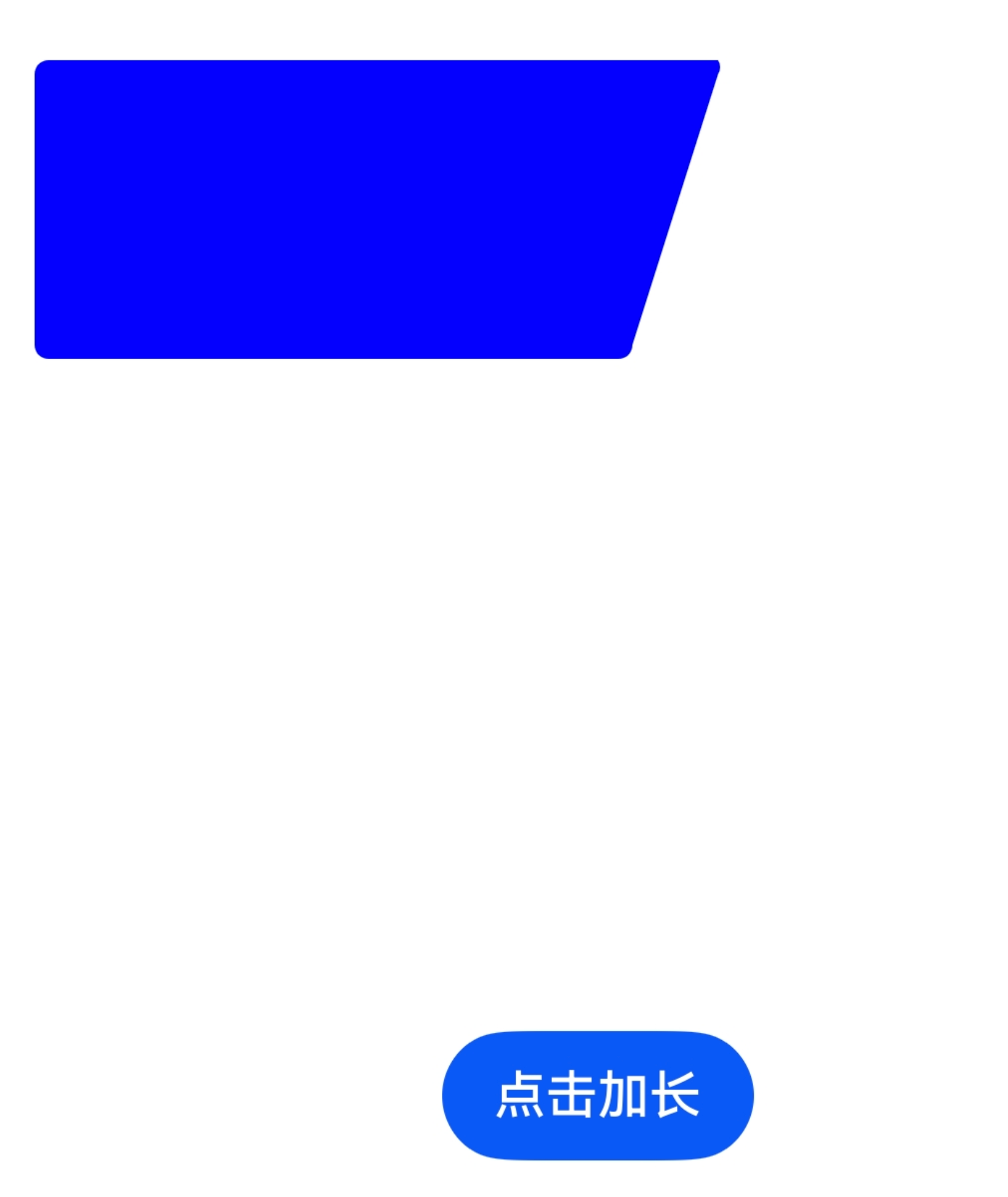
可以参考下这段代码,是把一个封闭区域裁剪出来一个梯形
import { PathShape } from '@kit.ArkUI';

@Entry
@Component
struct CustomPathPage {
  @State currentWidth: number = 500
  private maxWidth: number = 700
  private step: number = 20

  build() {
    Column() {
      Row() {
        Column()
          .width(this.currentWidth)
          .height(300)
          .backgroundColor(Color.Blue)
          .clipShape(new PathShape({ commands: this.getPath() }))
      }.margin({ left: 20 })

      Button('点击加长')
        .onClick(() => {
          if (this.currentWidth < this.maxWidth) {
            this.currentWidth = Math.min(this.currentWidth + this.step, this.maxWidth)
          }
        })
    }
    .height('100%')
    .width('100%')
    .justifyContent(FlexAlign.Center)
    .alignItems(HorizontalAlign.Center)
  }

  private getPath(): string {
    const w = this.currentWidth
    const h = 300
    const r = 14
    const offset = 100

    return `
    M ${r} 0
    A ${r} ${r} 0 0 0 0 ${r}
    L 0 ${h - r}
    A ${r} ${r} 0 0 0 ${r} ${h}
    L ${w - offset - r} ${h}
    A ${r} ${r} 0 0 0 ${w - offset} ${h - r}
    L ${w - r} ${r}
    A ${r} ${r} 0 0 0 ${w - r} 0
    Z`
  }
}


尊敬的开发者,您好,
Polygon绘制的图形目前的确不支持设置圆角和渐变色背景。您可以使用Canvas来实现,您可以看下如下代码是否可以满足您的需求?
示例代码如下:
interface RectSize {
  width: number,
  height: number
}

interface RectPosition {
  x: number,
  y: number
}

interface PositionData {
  postion: RectPosition,
  size: RectSize,
}

@Entry
@Component
struct CanvasRadiusRect {
  @State widthSize: number = 20;
  @State heightSize: number = 75;
  private settings: RenderingContextSettings = new RenderingContextSettings(true);
  private context: CanvasRenderingContext2D = new CanvasRenderingContext2D(this.settings);
  private positionList: PositionData[] = [
    {
      postion: { x: 8, y: 20 },
      size: { width: 20, height: 75 }
    }
  ];
  process(){
    if(this.widthSize <= 130){
      this.widthSize = this.widthSize + 10
    }

  }
  drawRect(rectPosition: RectPosition, radius: number = 10) {
    // 圆角弧度
    // 左上角坐标x
    let x = rectPosition.x;
    // 左上角坐标y
    let y = rectPosition.y;
    // 短边宽
    let width = this.widthSize;
    // 长边宽
    let width2 = this.widthSize + 10
    // 矩形高
    let height = this.heightSize;

    this.context.beginPath();
    // 整个画板
    // 矩形
    this.context.reset()
    this.context.moveTo(x, y);
    this.context.lineTo(x + width2 - radius, y);
    this.context.arcTo(x + width2, y, x + width2, y + radius*1.5, radius);
    this.context.lineTo(x + width, y + height - radius*0.5);
    this.context.arcTo(x + width, y + height, x + width - radius*0.5, y + height, radius);
    this.context.lineTo(x , y + height);
    this.context.lineTo(x, y);
    const grad = this.context.createLinearGradient(x, y, x+width, y+height);
    grad.addColorStop(0.0, '#f56c6c'); // 红色起点
    grad.addColorStop(1.0, '#ff00a3fc'); // 白色中点

    this.context.fillStyle = grad;
    this.context.fill();
    this.context.closePath();
  }

  build() {
    Column() {
      Canvas(this.context)
        .width('50%')
        .height('50%')
        .onReady(() => {
          this.drawRect(this.positionList[0]?.postion);
        });
      Button('点击')
        .onClick(()=>{
          this.process()
          this.drawRect(this.positionList[0]?.postion);
        })
    }
    .height('100%')
    .width('100%');
  }
}
如果还是不满足您的需求,麻烦您提供如下信息吧:
请问您是在什么样的业务场景中使用该能力,交互流程是怎样的,在哪一个环节遇到了问题?方便说明能力不满足可能带来的影响:什么时间用到?是否高频?有无三方库可以做到?若提供该能力,是否会造成大工作量返工?请您注意提供的内容不要包含您或第三方的非公开信息,如给您带来不便,敬请谅解。


在HarmonyOS鸿蒙Next中,Polygon(多边形)组件支持通过fill属性设置渐变色背景(如LinearGradient),但直接设置圆角不适用多边形几何特性。若需圆角效果,应使用Path组件绘制圆角多边形路径,或改用RoundedRect结合裁剪实现。渐变与圆角可同时通过自定义Path实现。
@State progress: number = 50; // 进度百分比

build() {
  Stack() {
    // 底层背景
    Row()
      .width('100%')
      .height('90lpx')
      .linearGradient({
        angle: 0,
        colors: [['#ff0000', 0], ['#0000ff', 1]]
      })
      .borderRadius({ topLeft: '45lpx', bottomLeft: '45lpx', topRight: 0, bottomRight: 0 })
      .clip(new Path().commands([
        [0, 0],
        ['500lpx', 0],
        ['485lpx', '90lpx'],
        [0, '90lpx']
      ]))
    // 上层进度
    Row()
      .width(`${this.progress}%`)
      .height('100%')
      .linearGradient({
        angle: 180,
        colors: [['#00ff00', 0], ['#ffff00', 1]]
      })
      .borderRadius({ topLeft: '45lpx', bottomLeft: '45lpx' })
      .align(Alignment.Start)
  }
  .width('500lpx')
  .height('90lpx')
  .clip(new Path().commands([
    [0, 0],
    ['500lpx', 0],
    ['485lpx', '90lpx'],
    [0, '90lpx']
  ]))
}
核心思路:用Path.clip剪裁出倾斜形状,内部Row设置渐变和左侧圆角,通过Stack层叠实现进度效果。顶部clip保证整体形状,左侧圆角自然呈现。