


HarmonyOS鸿蒙Next中Flutter框架多设备开发指导-自适应导航场景
HarmonyOS鸿蒙Next中Flutter框架多设备开发指导-自适应导航场景
1.1 场景概述
在移动应用开发中,不同设备的屏幕形态各异,例如刘海屏、全面屏、折叠屏等,系统状态栏、导航栏、软键盘等元素亦会占据屏幕空间。内容流与导航常随宽度在底栏 Tab与侧栏 Tab、多列宫格之间切换;若列数计算与列表项宽度、侧栏占位未对齐,易出现卡片过宽/过窄或导航重复。本文将详细介绍本示例中以窗口宽度阈值划分列数、FlatList 多列与 TabButtom 两种排版(底栏 / 侧栏)及 GridRow 大屏分栏的适配方法,以及实现原理与具体场景案例。本文对应工程内自适应导航示例页。
1.1.1 使用场景
用户在内容分发类首页中,需要在手机上以底部导航 + 多列列表高效浏览,并在宽屏上切换为侧边导航 + 主内容区以提升空间利用;同时列表列数应随宽度变化,避免卡片过密或过稀。自适应导航适配验证(导航形态与内容列数协同自适应),指的是页面可根据窗口宽度在底栏与侧栏之间切换,并同步调整 FlatList 列数、列表项宽度与边距策略,保证导航与内容区域层次清晰、交互一致。下列表格展示不同横向断点下的逻辑与布局。
| 横向断点 | sm | md | lg | xl |
|---|---|---|---|---|
| 展示逻辑 | 窄屏以底栏导航 + 列表为主;getColumns() 随宽度在 2 / 3 列间切换(阈值 600、840) | 同左,列表按 3 列展示 | 宽屏切换为 GridRow 12 列 分栏;主内容列为 lg:11,满足条件时显示侧栏导航 | 同 lg,列表为 4 列 |
| 展示布局 |  |
 |
 |
 |
1.1.2 常见问题
自适应导航与宫格列若未统筹,容易出现以下问题:
• 窄屏与宽屏分支结构不一致
• currentBp 与 GridRow 注释状态不一致,导致条件渲染的侧栏 TabButtom 在窄屏分支无法变为 ‘lg’
• 列数变化后 FlatList 使用 key={columns-${getColumns()}} 强制重建,避免列数缓存错位
1.1.3 多设备适配
• 适配点 1:getColumns() 仅依赖 screenViewWidth:≥840 → 4;≥600 → 3;否则 2。filledData 在 ImageData.length % getColumns() !== 0 时用占位项补齐最后一行。
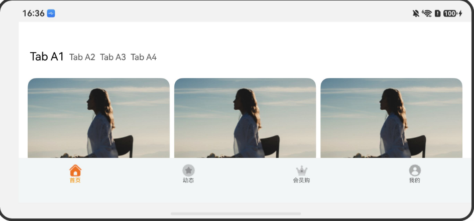
图 1-0:手机竖屏下底栏导航与列表布局。

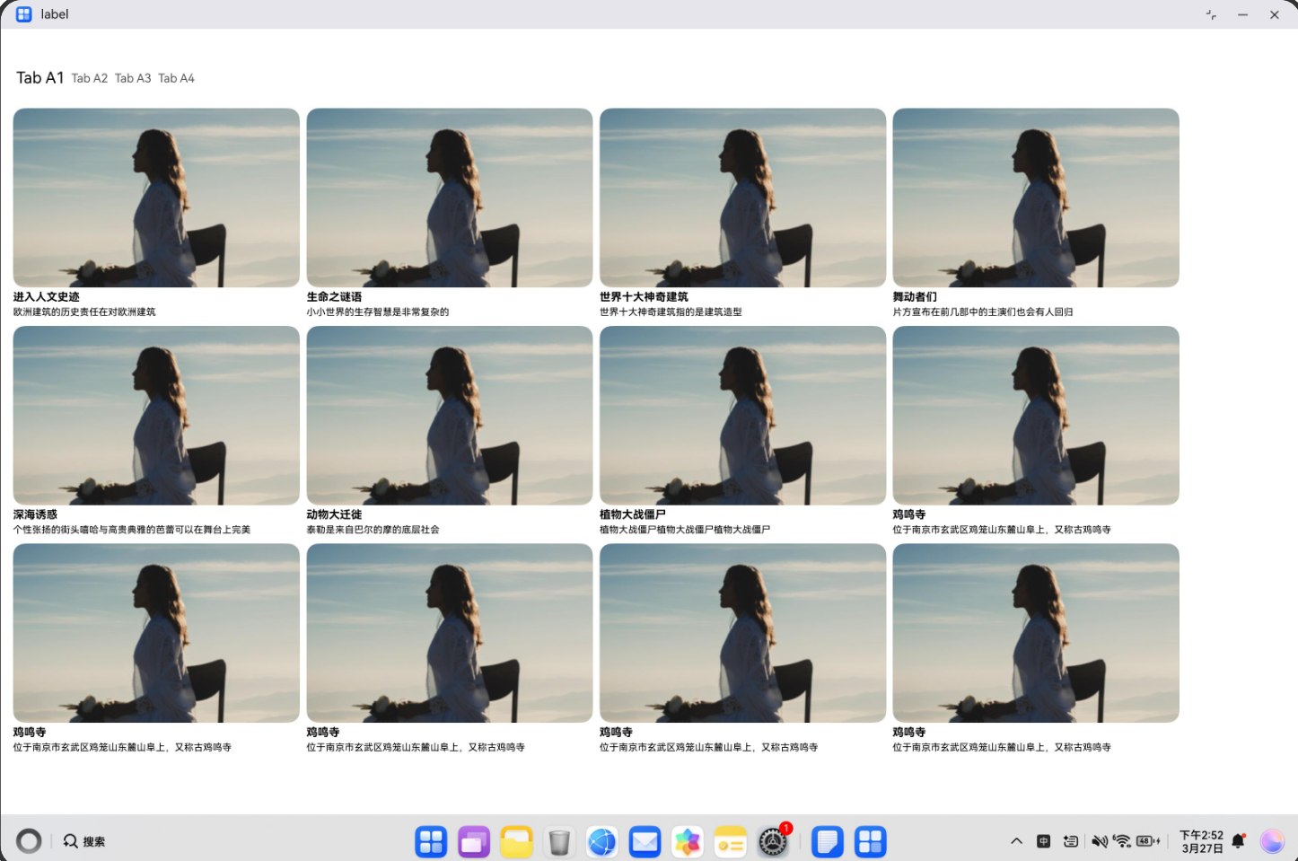
图 1-1:md 档列表与导航示意。

图 1-1a:手机横屏下列表与导航示意。
• 适配点 2:TabButtom 中 useBreakpointValue 配置 paddingBottom:base/sm 30,md 34,lg/xl 50;type===2 使用 bottomWrap**(横向);type===1 使用 bottomWrapLg(纵向** height: ‘100%’)。
图 2-1:PC / 特大宽下 GridRow + 侧栏 + 主区 整体。
1.2 开发指导
1.2.1 Flutter开发
1.2.1.1 关键能力
断点监听
通过 BreakpointManager 监听窗口尺寸变化:
static bool addBreakpointCallback(Function(BreakpointData) callback) {
  return _breakpointManager.addBreakpointCallback(callback);
}
窗口信息获取
使用 MediaQuery 获取当前窗口尺寸,结合断点管理器获取断点信息:
static WindowInfo getWindowInfo(BuildContext context) {
  final mediaQuery = MediaQuery.of(context);
  final size = mediaQuery.size;
  final hadssWidthBreakpoint = _breakpointManager.getWindowWidthBreakpoint();
  final hadssHeightBreakpoint = _breakpointManager.getWindowHeightBreakpoint();

  return WindowInfo.fromSizeWithBreakpoint(
    size.width,
    size.height,
    localWidthBreakpoint,
    localHeightBreakpoint,
  );
}
响应式布局决策
根据断点动态构建不同的导航组件:
@override
Widget build(BuildContext context) {
  final windowInfo = BreakpointSystem.getWindowInfo(context);
  final bp = windowInfo.widthBreakpoint;

  final useBottom = (bp == WidthBreakpoint.xs ||
  bp == WidthBreakpoint.sm ||
  bp == WidthBreakpoint.md);
  final useRail = (bp == WidthBreakpoint.lg);
  final useSidebar = (bp == WidthBreakpoint.xl);

  return Scaffold(
    body: Row(
      children: [
        if (useRail) _buildNavigationRail(context),
        if (useSidebar) _buildSidebar(context),
        Expanded(child: _buildMainContent(context)),
      ],
    ),
    bottomNavigationBar: useBottom ? _buildBottomNavigationBar(context) : null,
  );
}
1.2.1.2 指导案例
初始化断点系统
在应用启动时初始化断点管理器:
void main() async {
  WidgetsFlutterBinding.ensureInitialized();
  await BreakpointSystem.init();
  runApp(const MyApp());
}
构建自适应导航界面
- 创建 ViewModel
定义导航数据模型,支持两级菜单:
class TabViewModel {
  late final TabDataModel _tabMap;

  TabViewModel() {
    final Map<String, List<String>> tabMap = {};
      tabMap['TabA'] = ["Tab A1", "Tab A2", "Tab A3"];
      tabMap['TabB'] = ["Tab B1", "Tab B2", "Tab B3"];
      // ...
      _tabMap = TabDataModel(tabMap);
    }

    TabDataModel getTabMap() => _tabMap;
}
- 创建自适应容器视图
class AdaptiveContainerView extends StatefulWidget {
  @override
  Widget build(BuildContext context) {
    final windowInfo = BreakpointSystem.getWindowInfo(context);

    // 根据断点决定导航形式
    final useBottom = windowInfo.widthBreakpoint.index <= WidthBreakpoint.md.index;
    final useRail = windowInfo.widthBreakpoint == WidthBreakpoint.lg;
    final useSidebar = windowInfo.widthBreakpoint == WidthBreakpoint.xl;

    return Scaffold(
      body: Row(
        children: [
          if (useRail) _buildNavigationRail(), // LG 断点
          if (useSidebar) _buildSidebar(), // XL 断点
          Expanded(child: _buildMainContent()),
        ],
      ),
      bottomNavigationBar: useBottom ? _buildBottomNavigationBar() : null, // XS/SM/MD 断点
    );
  }
}
- 实现底部导航栏(移动端)
Widget _buildBottomNavigationBar(BuildContext context) {
  final tabMap = _tabViewModel.getTabMap().getTabMap();
  final firstLevelTabs = tabMap.keys.toList();
  final mediaQuery = MediaQuery.of(context);
  final bottomPadding = mediaQuery.padding.bottom; // 适配安全区域

  return Container(
    height: 56 + bottomPadding,
    child: Row(
      children: List.generate(firstLevelTabs.length, (index) {
        return Expanded(
          child: GestureDetector(
            onTap: () => setState(() => _currentIndex = index),
            child: Column(
              children: [
                Icon(_getTabIcon(index, _currentIndex == index)),
                Text(firstLevelTabs[index]),
              ],
            ),
          ),
        );
      }),
    ),
  );
}
- 实现侧边导航栏(平板/桌面端)
// LG 断点:窄侧边栏
Widget _buildNavigationRail(BuildContext context) {
  return NavigationRail(
    selectedIndex: _currentIndex,
    onDestinationSelected: (i) => setState(() => _currentIndex = i),
    labelType: NavigationRailLabelType.all,
    destinations: List.generate(tabs.length, (i) {
      return NavigationRailDestination(
        icon: Icon(_getTabIcon(i, false)),
        selectedIcon: Icon(_getTabIcon(i, true)),
        label: Text(tabs[i]),
      );
    }),
  );
}

// XL 断点:宽侧边栏(支持展开二级菜单)
Widget _buildSidebar(BuildContext context) {
  final width = BreakpointSystem.getNavigationPaneWidth(context);

  return Container(
    width: width,
      child: ListView(
        children: List.generate(firstLevelTabs.length, (i) {
        return ExpansionTile(
          leading: Icon(_getTabIcon(i)),
          title: Text(firstLevelTabs[i]),
          children: secondLevelTabs.map((tab) {
            return ListTile(
              title: Text(tab),
              onTap: () => setState(() => _secondIndex = tab),
            );
          }).toList(),
        );
      }),
    ),
  );
}
响应式参数配置
使用 BreakpointSystem 提供的工具方法获取响应式参数:
// 获取网格列数
final columns = BreakpointSystem.getGridColumns(context);
// XS/SM -> 2列, MD -> 3列, LG/XL -> 4列

// 获取卡片间距
final spacing = BreakpointSystem.getCardSpacing(context);
// XS/SM -> 6dp, MD -> 12dp, LG/XL -> 16dp

// 获取响应式边距
final padding = BreakpointSystem.getResponsivePadding(context);
// Mobile -> 8dp, Tablet -> 16dp, Wide -> 24dp, UltraWide -> 32dp

// 获取字体缩放倍数
final fontScale = BreakpointSystem.getFontScale(context);
// Mobile -> 1.0, Wide -> 1.1, UltraWide -> 1.2

// 获取导航面板宽度
final navWidth = BreakpointSystem.getNavigationPaneWidth(context);
// Mobile -> 200, Tablet -> 240, Wide -> 280, UltraWide -> 320
安全区域适配
使用 SafeArea 和 MediaQuery.padding 处理系统状态栏和导航栏:
return Scaffold(
  body: SafeArea( // 自动避让系统UI
    child: Row(
      children: [
        if (showSidebar) _buildSidebar(),
        Expanded(child: _buildContent()),
        ],
      ),
    ),
    bottomNavigationBar: Container(
      height: 56 + MediaQuery.of(context).padding.bottom, // 底部安全区域
    child: _buildBottomNav(),
  ),
);
1.2.1.3 示例代码
自适应导航的Sample示例代码地址:example ,开发者可以通过该地址查看完整的自适应导航示例代码,并根据自己的需求进行修改和扩展。
更多关于HarmonyOS鸿蒙Next中Flutter框架多设备开发指导-自适应导航场景的实战教程也可以访问 https://www.itying.com/category-92-b0.html

在HarmonyOS Next中,使用Flutter开发自适应导航场景,可依赖Flutter的LayoutBuilder、MediaQuery检测设备类型与窗口尺寸,配合OrientationBuilder切换导航样式。多设备协同导航需通过鸿蒙分布式能力(如分布式路由API)动态调整页面栈,利用Flutter的Navigator 2.0管理路由状态,避免硬编码设备ID。
更多关于HarmonyOS鸿蒙Next中Flutter框架多设备开发指导-自适应导航场景的实战系列教程也可以访问 https://www.itying.com/category-92-b0.html

自适应导航的核心在于断点驱动的布局切换:通过 BreakpointManager 监听窗口宽度,将屏幕分为 xs/sm/md/lg/xl 五档。窄屏(xs~md)走底部导航栏(BottomNavigationBar);lg 断点改用紧凑侧边栏(NavigationRail);xl 断点则展开为可折叠的宽侧边栏。内容区统一用 GridView.builder,由 BreakpointSystem.getGridColumns 按断点返回动态列数(如 2/3/4 列),并配合响应式间距与字体缩放。安全区域适配借助 SafeArea 与 MediaQuery.padding,自动避让刘海、圆角及系统栏,确保导航与内容不被遮挡。