


Flutter动画滑动弹出插件animated_slideover的使用
Flutter动画滑动弹出插件animated_slideover的使用
关于AnimatedSlideOver

“通过我们的Flutter包轻松创建动态和响应式的滑动侧边栏。受Tailwind CSS流动性的启发,此小部件专为您的Flutter应用轻松集成而设计。”
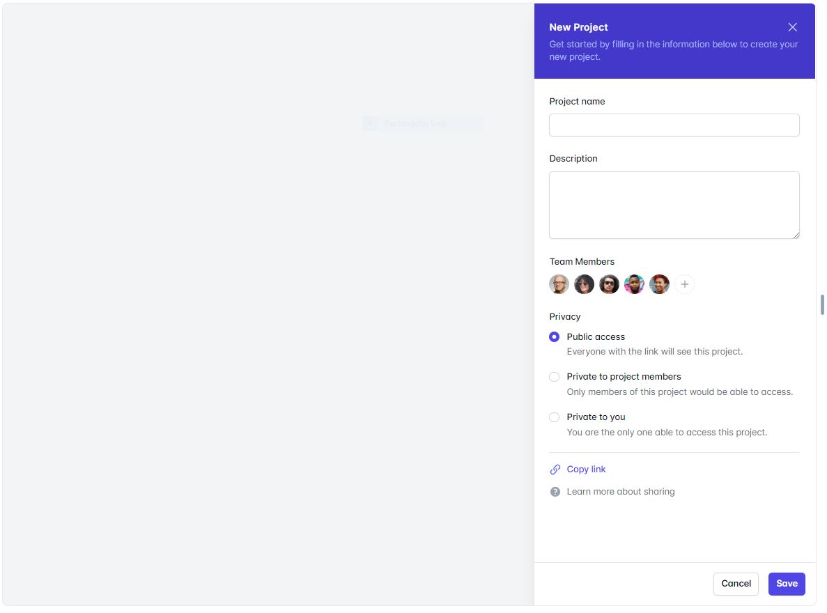
Tailwind的组件
使用方法
import 'package:animated_slideover/animated_slideover.dart';

class TestScreen extends StatefulWidget {
  const TestScreen({Key? key}) : super(key: key);

  [@override](/user/override)
  State<TestScreen> createState() => _TestScreenState();
}

class _TestScreenState extends State<TestScreen> {

  Widget hehe(){
    return AppAnimatedSideBar
      (
        onDispose: (){

        },

        buttonsWidgetList: [
          ElevatedButton(
            onPressed: () {
              Navigator.pop(context);
            },
            style: ButtonStyle(
              backgroundColor:
              MaterialStateProperty.all(
                  Colors.white), // 背景颜色
              foregroundColor:
              MaterialStateProperty.all(
                  Colors.black), // 文本颜色
              side: MaterialStateProperty.all(const BorderSide(
                  color: Colors.grey,
                  width:
                  0.5)), // 边框颜色和宽度
              shape: MaterialStateProperty.all(
                  RoundedRectangleBorder(
                      borderRadius:
                      BorderRadius.circular(
                          8.0))), // 圆角
              padding: MaterialStateProperty.all(
                  const EdgeInsets.all(
                      16.0)), // 按钮内容周围的填充
            ),
            child: const Text(
              'Cancel',
              style: TextStyle(
                  fontWeight: FontWeight.w400),
            ),
          ),
          const SizedBox(
            width: 10,
          ),
          ElevatedButton(
            onPressed: () {
              // 处理按钮点击事件

            },
            style: ButtonStyle(
              backgroundColor:
              MaterialStateProperty.all(const Color(0xFF4338ca)), // 背景颜色
              foregroundColor:
              MaterialStateProperty.all(
                  Colors.white), // 文本颜色
              side: MaterialStateProperty.all(const BorderSide(
                  color: Colors.grey,
                  width:
                  0.5)), // 边框颜色和宽度
              shape: MaterialStateProperty.all(
                  RoundedRectangleBorder(
                      borderRadius:
                      BorderRadius.circular(
                          8.0))), // 圆角
              padding: MaterialStateProperty.all(
                  const EdgeInsets.all(
                      16.0)), // 按钮内容周围的填充
            ),
            child: const Text(
              'Save',
              style: TextStyle(
                  fontWeight: FontWeight.w400,
                  color: Colors.white),
            ),
          )
        ],


        subtileText: Text(
          '通过我们的Flutter包轻松创建动态和响应式的滑动侧边栏。受Tailwind CSS流动性的启发,此小部件专为您的Flutter应用轻松集成而设计。',
          style: TextStyle(
            fontSize: 15,
            color: Colors.white.withOpacity(0.8),
          ),
        ),

        contentWidgetList: const [
          Padding(
            padding: EdgeInsets.all(10.0),
            child: Column(
              crossAxisAlignment: CrossAxisAlignment.start,
              children: [
                Text('您的内容小部件列表')
              ],
            ),
          )
        ],

        titleText: const Text(
          'Animated SlideOver',
          style: TextStyle(
            fontSize: 20,
            color: Colors.white,
          ),
        ),

        headerBgColor: const Color(0xFF4338ca),

        headerIcon: IconButton(
            onPressed: () {
              Navigator.pop(context);
            },
            icon: const Icon(
              Icons.close,
              color: Colors.white,
            )));
  }

  [@override](/user/override)
  Widget build(BuildContext context) {
    return Scaffold(
      body: GestureDetector(
        onTap: (){

          showDialog(
            context: context,
            builder: (BuildContext context) {
              return hehe();
            },
          );

        },
        child: Container(
          decoration: BoxDecoration(
            image: DecorationImage(
              image: NetworkImage('https://images.pexels.com/photos/640781/pexels-photo-640781.jpeg?auto=compress&cs=tinysrgb&w=1260&h=750&dpr=1'),
              fit: BoxFit.cover,
            ),
          ),
        ),
      )
    );
  }
}
属性说明
| 属性名 | 类型 | 描述 |
|---|---|---|
onDispose |
function |
当侧边栏被关闭或销毁时调用的回调函数。 |
headerIcon |
IconButton |
代表头部图标的IconButton小部件。通常用于关闭侧边栏。 |
buttonsWidgetList |
List<Widget>? |
一个表示按钮或操作的小部件列表,将在侧边栏中显示。 |
headerBgColor |
Color? |
头部部分的背景颜色。如果没有提供,则使用默认背景颜色。 |
subtileText |
Text? |
显示在标题下方的子标题文本小部件,提供额外信息。 |
titleText |
Text? |
显示在动画侧边栏顶部的标题文本小部件。 |
contentWidgetList |
List<Widget> |
表示要在动画侧边栏内显示的内容的小部件列表。 |
示例代码
import 'package:animated_slideover/animated_slideover.dart';
import 'package:flutter/material.dart';

void main() {
  runApp(const MyApp());
}

class MyApp extends StatelessWidget {
  const MyApp({super.key});

  // 这个小部件是你的应用程序的根。
  [@override](/user/override)
  Widget build(BuildContext context) {
    return MaterialApp(
      debugShowCheckedModeBanner: false,
      title: 'Animated Slideover',
      theme: ThemeData(
        colorScheme: ColorScheme.fromSeed(seedColor: Colors.deepPurple),
        useMaterial3: true,
      ),
      home: const TestScreen(),
    );
  }
}

class TestScreen extends StatefulWidget {
  const TestScreen({Key? key}) : super(key: key);

  [@override](/user/override)
  State<TestScreen> createState() => _TestScreenState();
}

class _TestScreenState extends State<TestScreen> {

  Widget hehe(){
    return AppAnimatedSideBar
      (
        buttonsWidgetList: [
          ElevatedButton(
            onPressed: () {
              Navigator.pop(context);
            },
            style: ButtonStyle(
              backgroundColor:
              MaterialStateProperty.all(
                  Colors.white), // 背景颜色
              foregroundColor:
              MaterialStateProperty.all(
                  Colors.black), // 文本颜色
              side: MaterialStateProperty.all(const BorderSide(
                  color: Colors.grey,
                  width:
                  0.5)), // 边框颜色和宽度
              shape: MaterialStateProperty.all(
                  RoundedRectangleBorder(
                      borderRadius:
                      BorderRadius.circular(
                          8.0))), // 圆角
              padding: MaterialStateProperty.all(
                  const EdgeInsets.all(
                      16.0)), // 按钮内容周围的填充
            ),
            child: const Text(
              'Cancel',
              style: TextStyle(
                  fontWeight: FontWeight.w400),
            ),
          ),
          const SizedBox(
            width: 10,
          ),
          ElevatedButton(
            onPressed: () {
              // 处理按钮点击事件

            },
            style: ButtonStyle(
              backgroundColor:
              MaterialStateProperty.all(const Color(0xFF4338ca)), // 背景颜色
              foregroundColor:
              MaterialStateProperty.all(
                  Colors.white), // 文本颜色
              side: MaterialStateProperty.all(const BorderSide(
                  color: Colors.grey,
                  width:
                  0.5)), // 边框颜色和宽度
              shape: MaterialStateProperty.all(
                  RoundedRectangleBorder(
                      borderRadius:
                      BorderRadius.circular(
                          8.0))), // 圆角
              padding: MaterialStateProperty.all(
                  const EdgeInsets.all(
                      16.0)), // 按钮内容周围的填充
            ),
            child: const Text(
              'Save',
              style: TextStyle(
                  fontWeight: FontWeight.w400,
                  color: Colors.white),
            ),
          )
        ],


        subtileText: Text(
          '通过我们的Flutter包轻松创建动态和响应式的滑动侧边栏。受Tailwind CSS流动性的启发,此小部件专为您的Flutter应用轻松集成而设计。',
          style: TextStyle(
            fontSize: 15,
            color: Colors.white.withOpacity(0.8),
          ),
        ),

        contentWidgetList: const [
          Padding(
            padding: EdgeInsets.all(10.0),
            child: Column(
              crossAxisAlignment: CrossAxisAlignment.start,
              children: [
                Text('您的内容小部件列表')
              ],
            ),
          )
        ],

        titleText: const Text(
          'Animated SlideOver',
          style: TextStyle(
            fontSize: 20,
            color: Colors.white,
          ),
        ),

        headerBgColor: const Color(0xFF4338ca),

        headerIcon: IconButton(
            onPressed: () {
              Navigator.pop(context);
            },
            icon: const Icon(
              Icons.close,
              color: Colors.white,
            )));
  }

  [@override](/user/override)
  Widget build(BuildContext context) {
    return Scaffold(
        body: GestureDetector(
          onTap: (){

            showDialog(
              context: context,
              builder: (BuildContext context) {
                return hehe();
              },
            );

          },
          child: Container(
            decoration: const BoxDecoration(
              image: DecorationImage(
                image: NetworkImage('https://images.pexels.com/photos/640781/pexels-photo-640781.jpeg?auto=compress&cs=tinysrgb&w=1260&h=750&dpr=1'),
                fit: BoxFit.cover,
              ),
            ),
          ),
        )
    );
  }
}
更多关于Flutter动画滑动弹出插件animated_slideover的使用的实战教程也可以访问 https://www.itying.com/category-92-b0.html
1 回复

更多关于Flutter动画滑动弹出插件animated_slideover的使用的实战系列教程也可以访问 https://www.itying.com/category-92-b0.html
当然,以下是如何在Flutter项目中使用animated_slideover插件来实现动画滑动弹出效果的代码示例。animated_slideover插件可以帮助你在Flutter应用中实现侧边滑动弹出菜单或面板。
首先,你需要在pubspec.yaml文件中添加animated_slideover依赖:
dependencies:
  flutter:
    sdk: flutter
  animated_slideover: ^latest_version  # 请替换为最新的版本号
然后运行flutter pub get来安装依赖。
接下来是一个完整的示例代码,展示如何使用animated_slideover插件:
import 'package:flutter/material.dart';
import 'package:animated_slideover/animated_slideover.dart';

void main() {
  runApp(MyApp());
}

class MyApp extends StatelessWidget {
  @override
  Widget build(BuildContext context) {
    return MaterialApp(
      title: 'Animated Slideover Example',
      theme: ThemeData(
        primarySwatch: Colors.blue,
      ),
      home: SlideOverExample(),
    );
  }
}

class SlideOverExample extends StatefulWidget {
  @override
  _SlideOverExampleState createState() => _SlideOverExampleState();
}

class _SlideOverExampleState extends State<SlideOverExample> with SingleTickerProviderStateMixin {
  late final SlideOverController slideOverController;

  @override
  void initState() {
    super.initState();
    slideOverController = SlideOverController();
  }

  @override
  Widget build(BuildContext context) {
    return Scaffold(
      appBar: AppBar(
        title: Text('Animated Slideover Example'),
      ),
      body: Stack(
        children: [
          // Main content
          Center(
            child: ElevatedButton(
              onPressed: () => slideOverController.show(),
              child: Text('Show Slide Over'),
            ),
          ),
          // SlideOver content
          AnimatedSlideOver(
            controller: slideOverController,
            slideOverBuilder: (context, state) {
              return SlideOverContent(
                onClose: () => slideOverController.close(),
                child: Padding(
                  padding: const EdgeInsets.all(16.0),
                  child: Column(
                    mainAxisAlignment: MainAxisAlignment.center,
                    children: [
                      Text('Slide Over Content'),
                      ElevatedButton(
                        onPressed: () => slideOverController.close(),
                        child: Text('Close'),
                      ),
                    ],
                  ),
                ),
              );
            },
          ),
        ],
      ),
    );
  }
}

class SlideOverContent extends StatelessWidget {
  final VoidCallback onClose;
  final Widget child;

  const SlideOverContent({
    required this.onClose,
    required this.child,
    Key? key,
  }) : super(key: key);

  @override
  Widget build(BuildContext context) {
    return Container(
      decoration: BoxDecoration(
        color: Colors.white,
        borderRadius: BorderRadius.circular(16),
        boxShadow: [
          BoxShadow(
            color: Colors.black.withOpacity(0.2),
            spreadRadius: 5,
            blurRadius: 7,
            offset: Offset(0, 3), // changes position of shadow
          ),
        ],
      ),
      child: Column(
        crossAxisAlignment: CrossAxisAlignment.start,
        children: [
          AppBar(
            elevation: 0,
            leading: IconButton(
              icon: Icon(Icons.close),
              onPressed: onClose,
            ),
            title: Text('Slide Over'),
            backgroundColor: Colors.transparent,
          ),
          Expanded(child: child),
        ],
      ),
    );
  }
}
代码说明:
- 添加依赖:在
pubspec.yaml中添加animated_slideover依赖。 - 初始化控制器:在
_SlideOverExampleState中初始化SlideOverController。 - 构建UI:
- 使用
Stack来叠加主内容和滑动弹出内容。 - 主内容包含一个按钮,用于显示滑动弹出内容。
- 使用
AnimatedSlideOver来包裹滑动弹出内容的构建器。 SlideOverContent是一个自定义的Widget,包含关闭按钮和弹出内容。
- 使用
运行这个代码,当你点击“Show Slide Over”按钮时,将会显示一个带有动画效果的滑动弹出内容。点击关闭按钮或滑动弹出内容的关闭按钮时,弹出内容将会消失。