


Flutter模态进度提示插件modal_progress_hud的使用
Flutter模态进度提示插件modal_progress_hud的使用
modal_progress_hud 是一个简单的包装器小部件,用于启用模态进度HUD(模态进度指示器,HUD = Heads Up Display)。
示例
使用
首先,在 pubspec.yaml 文件中添加该包:
dependencies:
  modal_progress_hud: ^0.1.3
接下来,将库导入到你的小部件中:
import 'package:modal_progress_hud/modal_progress_hud.dart';
现在,只需将你的小部件作为子组件包裹在 ModalProgressHUD 中,并提供一个布尔值来控制模态进度指示器的显示与隐藏。通常,这个布尔值会保存在本地状态中。
bool _saving = false;

[@override](/user/override)
Widget build(BuildContext context) {
  return Scaffold(
     body: ModalProgressHUD(
       child: Container(
         child: Form(...),
       ),
       inAsyncCall: _saving,
     ),
  );
}
选项
ModalProgressHUD 构造函数中可以自定义以下参数:
ModalProgressHUD(
  @required inAsyncCall: bool,
  @required child: Widget,
  opacity: double,
  color: Color,
  progressIndicator: CircularProgressIndicator,
  offset: double,
  dismissible: bool,
);
示例代码
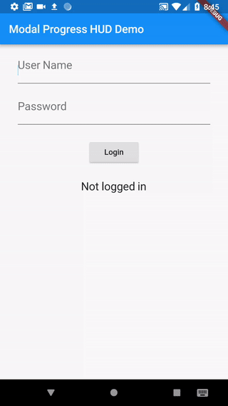
以下是一个完整的示例应用,演示了如何使用 modal_progress_hud 插件。
class SettingsPage extends StatefulWidget {
  [@override](/user/override)
  _SettingsPageState createState() => new _SettingsPageState();
}

class _SettingsPageState extends State<SettingsPage> {
  bool _saving = false;

  void _submit() {
    setState(() {
      _saving = true;
    });

    // 模拟服务调用
    print('提交到后端...');
    new Future.delayed(new Duration(seconds: 4), () {
      setState(() {
        _saving = false;
      });
    });
  }

  Widget _buildWidget() {
    return new Form(
      child: new Column(
        children: [
          new SwitchListTile(
            title: const Text('卧室'),
            value: _bedroom,
            onChanged: (bool value) {
              setState(() {
                _bedroom = value;
              });
            },
            secondary: const Icon(Icons.hotel),
          ),
          new RaisedButton(
            onPressed: _submit,
            child: new Text('保存'),
          ),
        ],
      ),
    );
  }

  [@override](/user/override)
  Widget build(BuildContext context) {
    return new Scaffold(
      appBar: new AppBar(
        title: new Text('Flutter 进度指示器演示'),
        backgroundColor: Colors.blue,
      ),
      body: ModalProgressHUD(
        child: _buildWidget(),
        inAsyncCall: _saving,
      ),
    );
  }
}
更多关于Flutter模态进度提示插件modal_progress_hud的使用的实战教程也可以访问 https://www.itying.com/category-92-b0.html

更多关于Flutter模态进度提示插件modal_progress_hud的使用的实战系列教程也可以访问 https://www.itying.com/category-92-b0.html
modal_progress_hud 是一个用于在 Flutter 应用中显示模态进度提示的插件。它可以在执行耗时操作时显示一个加载指示器(如旋转的圆圈),并阻止用户与应用程序的其他部分进行交互,直到操作完成。
安装
首先,你需要在 pubspec.yaml 文件中添加 modal_progress_hud 插件的依赖:
dependencies:
  flutter:
    sdk: flutter
  modal_progress_hud: ^0.1.3
然后运行 flutter pub get 来安装依赖。
使用
ModalProgressHUD 是一个包裹你应用界面的 widget,它可以根据需要显示或隐藏加载指示器。
基本用法
import 'package:flutter/material.dart';
import 'package:modal_progress_hud/modal_progress_hud.dart';

void main() => runApp(MyApp());

class MyApp extends StatelessWidget {
  @override
  Widget build(BuildContext context) {
    return MaterialApp(
      home: Scaffold(
        appBar: AppBar(
          title: Text('Modal Progress HUD Example'),
        ),
        body: MyHomePage(),
      ),
    );
  }
}

class MyHomePage extends StatefulWidget {
  @override
  _MyHomePageState createState() => _MyHomePageState();
}

class _MyHomePageState extends State<MyHomePage> {
  bool _isInAsyncCall = false;

  void _showProgressHud() async {
    setState(() {
      _isInAsyncCall = true;
    });

    // 模拟一个耗时操作
    await Future.delayed(Duration(seconds: 3));

    setState(() {
      _isInAsyncCall = false;
    });
  }

  @override
  Widget build(BuildContext context) {
    return ModalProgressHUD(
      inAsyncCall: _isInAsyncCall,
      child: Center(
        child: Column(
          mainAxisAlignment: MainAxisAlignment.center,
          children: <Widget>[
            Text('Press the button to show progress HUD'),
            SizedBox(height: 20),
            ElevatedButton(
              onPressed: _showProgressHud,
              child: Text('Show Progress HUD'),
            ),
          ],
        ),
      ),
    );
  }
}
参数说明
inAsyncCall: 布尔值,控制是否显示加载指示器。如果为true,则显示加载指示器并阻止用户交互;如果为false,则不显示加载指示器。child: 需要被包裹的 widget。opacity: 加载指示器背景的透明度,默认值为0.3。color: 加载指示器背景的颜色,默认值为Colors.grey。progressIndicator: 自定义的加载指示器,默认是一个CircularProgressIndicator。dismissible: 布尔值,控制用户是否可以通过点击背景来关闭加载指示器,默认值为false。
自定义加载指示器
你可以通过 progressIndicator 参数来自定义加载指示器。例如,使用一个自定义的旋转图标:
ModalProgressHUD(
  inAsyncCall: _isInAsyncCall,
  progressIndicator: Icon(Icons.autorenew, color: Colors.blue, size: 50),
  child: Center(
    child: Column(
      mainAxisAlignment: MainAxisAlignment.center,
      children: <Widget>[
        Text('Press the button to show progress HUD'),
        SizedBox(height: 20),
        ElevatedButton(
          onPressed: _showProgressHud,
          child: Text('Show Progress HUD'),
        ),
      ],
    ),
  ),
);