


HarmonyOS鸿蒙Next中能否实现一个渐变圆角呢
HarmonyOS鸿蒙Next中能否实现一个渐变圆角呢 我现在想实现一个带渐变的圆角组件使用了
.borderImage({
  source: {
    direction: GradientDirection.Left,
    colors: [['#3D424D', 0.0], ['#1D1F26', 1.0]],
  },
  slice: {
    top: 10,
    bottom: 10,
    left: 10,
    right: 10
  },
  width: 2,
})
确实可以实现渐变的边框,但是加上圆角就会导致四个角的渐变被切掉一部分,这有办法解决么
.padding(30)
.width('100%')
.borderRadius(18)
.linearGradient({
  direction: GradientDirection.Right,
  repeating: true,
  colors: [['#373B42', 0.0], ['#272A2F', 1.0]]
})
.borderImage({
  source: {
    direction: GradientDirection.Right,
    colors: [['#3D424D', 0.0], ['#1D1F26', 1.0]],
  },
  slice: {
    top: 10,
    bottom: 10,
    left: 10,
    right: 10
  },
  width: 2,
})
.clip(true)
更多关于HarmonyOS鸿蒙Next中能否实现一个渐变圆角呢的实战教程也可以访问 https://www.itying.com/category-93-b0.html

// xxx.ets
@Entry
@Component
struct Index {
build() {
Row() {
Column() {
Column({ space: 5 }) {
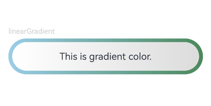
Text('linearGradient').fontSize(12).width('90%').fontColor(0xCCCCCC)
Row(){
Text('This is gradient color.')
.textAlign(TextAlign.Center)
.width('96%')
.height('80%')
.borderRadius(30)
.linearGradient({
direction: GradientDirection.Left, // 渐变方向
repeating: true, // 渐变颜色是否重复
colors: [[0xDCDCDC, 0.0], [0xFFFFFF, 1.0]] // 数组末尾元素占比小于1时满足重复着色效果
})
}
.width('90%')
.height(60)
.borderRadius(30)
.linearGradient({
angle: 90,
colors: [[0x87CEEB, 0.0], [0x2E8B57, 1.0]]
})
.justifyContent(FlexAlign.Center)
}
}
.width('100%')
}
.height('100%')
}
}
参考地址
https://developer.huawei.com/consumer/cn/forum/topic/0201145977930246208?fid=26
更多关于HarmonyOS鸿蒙Next中能否实现一个渐变圆角呢的实战系列教程也可以访问 https://www.itying.com/category-93-b0.html

@Component
struct GradientRoundedComponent {
  build() {
    // 外层:处理渐变边框
    Column() {
      // 内层:处理内容和圆角
      Column() {
        // 这里是你的内容
        Text('渐变圆角组件')
          .fontSize(16)
          .fontColor(Color.White)
      }
      .width('100%')
      .height('100%')
      .linearGradient({
        direction: GradientDirection.Right,
        repeating: true,
        colors: [['#373B42', 0.0], ['#272A2F', 1.0]]
      })
      .borderRadius(18)
    }
    .padding(2) // 边框宽度
    .width(100)
    .height(100)
    .linearGradient({
      direction: GradientDirection.Right,
      colors: [['#3D424D', 0.0], ['#1D1F26', 1.0]]
    })
    .borderRadius(20)
  }
}

在HarmonyOS鸿蒙Next中,可以通过ArkTS的UI组件实现渐变圆角。使用borderRadius设置圆角,结合linearGradient或sweepGradient定义渐变背景。例如,在Column或Text组件中,通过background属性应用LinearGradient,并指定radius属性实现圆角效果。代码示例如下:
Column() {
  Text('渐变圆角')
    .width(100)
    .height(100)
    .borderRadius(20)
    .background(
      LinearGradient({
        angle: 0,
        colors: ['#FF0000', '#00FF00']
      })
    )
}
这样即可创建具有渐变背景的圆角元素。

在HarmonyOS Next中,要实现一个同时具备渐变和圆角的边框,确实会遇到你提到的问题:直接组合使用 borderImage 和 borderRadius 会导致圆角处的渐变被裁剪。
这是因为 borderImage 的绘制机制和 borderRadius 的裁剪机制存在冲突。borderImage 会按照 slice 参数将图片(或渐变)分割为九宫格并填充边框区域,而 borderRadius 则会对整个组件的边界进行圆角裁剪,这会导致四个角区域的渐变内容被切掉。
解决方案:使用 overlay 修饰符叠加一个独立的圆角渐变层
一个更可靠且效果更好的方案是放弃直接使用 borderImage 来绘制渐变边框,而是采用分层绘制的思路:
- 底层:使用
linearGradient绘制一个充满整个组件背景的渐变。 - 上层:使用
overlay修饰符,叠加一个尺寸略小、带有圆角的纯色矩形。这个矩形会遮住底层渐变的中心部分,只让四周露出一圈,从而模拟出渐变边框的效果。
这种方法可以完美控制“边框”的宽度、颜色渐变和圆角半径。
代码示例:
@Component
struct GradientBorderComponent {
  build() {
    Column() {
      // 你的内容放在这里
      Text('渐变圆角边框')
        .fontSize(16)
        .fontColor(Color.White)
    }
    .padding(20) // 内边距,确保内容不被“边框”遮挡
    .width('100%')
    .height(100)
    // 第1层:绘制完整的渐变背景
    .background(
      LinearGradient.create({
        angle: 90, // 渐变角度,例如90度表示从上到下
        colors: [['#3D424D', 0.0], ['#1D1F26', 1.0]]
      })
    )
    // 第2层:叠加一个带圆角的遮罩层,露出四周作为“边框”
    .overlay(
      Row()
        .width('100%')
        .height('100%')
        .backgroundColor(Color.White) // 此颜色为你的内容区域背景色
        .borderRadius(18) // 这里控制最终的圆角大小
        .margin(2) // 这个值控制“边框”的宽度。例如2,则露出底层2px的渐变作为边框
    )
  }
}
原理解释:
background设置的LinearGradient会填充整个组件矩形区域。overlay修饰符添加的视图会覆盖在原有视图之上。- 我们让这个覆盖层(
Row)具有圆角(borderRadius(18)),并设置一个margin(2)。这个margin使得覆盖层在各个方向上都比父容器小2px,于是底层渐变在四周露出了2px宽的一圈。 - 最终视觉效果就是一个具有
18px圆角、2px宽渐变色的边框。覆盖层的backgroundColor应设置为你的内容区域实际背景色。
优势:
- 圆角完美:渐变边框能完全贴合圆角。
- 灵活可控:通过调整
margin值轻松改变边框宽度,通过调整LinearGradient参数改变渐变样式。 - 性能考虑:相较于复杂的
borderImage切片计算,此方法通常更高效。
你可以根据实际需求调整渐变方向 (angle)、颜色、圆角半径 (borderRadius) 和边框宽度 (margin)。这是目前在ArkUI中实现渐变圆角边框最常用且稳定的方法。