


HarmonyOS 鸿蒙Next中如何创建和使用自定义组件?
HarmonyOS 鸿蒙Next中如何创建和使用自定义组件? 在开发中,我们发现很多UI在不同页面中重复使用,比如一个带图标的按钮卡片。每次都写一遍相同的代码很麻烦,而且维护起来也很困难。我应该如何将这些可复用的UI封装成自定义组件?自定义组件如何接收参数?如何向外发送事件?

实现思路
1. 组件设计思路:
单一职责:每个组件应该只负责一个特定的功能或UI展示
高内聚低耦合:组件内部逻辑紧密相关,对外依赖最小化
可复用性:设计时要考虑在不同场景下的复用需求
2. 参数传递策略:
基础数据:通过构造函数参数传递,如cardData
事件回调:通过函数类型参数传递,如onClick1
复杂UI:使用@BuilderParam定义插槽,允许父组件传入自定义UI
3. 状态管理原则:
组件内部状态使用@State装饰器管理
外部传入的数据不要在组件内部直接修改
通过事件回调的方式通知父组件状态变化
4. 样式和交互设计:
使用stateStyles实现按压效果
合理使用阴影、圆角等视觉元素
添加适当的动画和过渡效果
使用场景
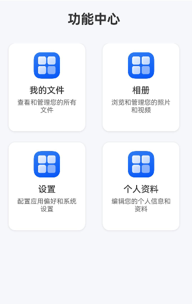
设想一个应用中有多个功能模块入口,每个入口都是一个包含图标、标题和描述的卡片:
首页:显示"我的文件"、“相册”、"设置"等功能卡片
个人中心:显示"个人资料"、“安全设置”、"帮助反馈"等功能卡片
这些卡片样式相同,只是内容不同,非常适合封装成自定义组件。
实现效果
完整代码
FunctionCard.ets : 核心封装的自定义组件
// 定义卡片数据接口
export interface CardData {
  icon: Resource;
  title: string;
  description: string;
}

// 定义点击事件回调类型
type CardClickCallback = (cardData: CardData) => void;

@Component
export struct FunctionCard {
  // 1. 接收外部传入的卡片数据
  @Prop cardData: CardData = {
    title:"",
    description:"",
    icon:$r("app.media.startIcon")
  };

  // 2. 接收点击事件回调函数
  private onClick1?: CardClickCallback;

  // 3. 定义状态变量
  [@State](/user/State) isPressed: boolean = false;

  // 构造函数
  constructor(cardData: CardData, onClick?: CardClickCallback) {
    super();
    this.cardData = cardData;
    this.onClick1 = onClick;
  }

  build() {
    Column() {
      // 图标区域
      Image(this.cardData.icon)
        .width(48)
        .height(48)
        .objectFit(ImageFit.Contain)
        .margin({ bottom: 12 })

      // 标题
      Text(this.cardData.title)
        .fontSize(16)
        .fontWeight(FontWeight.Medium)
        .fontColor('#333333')
        .margin({ bottom: 6 })

      // 描述
      Text(this.cardData.description)
        .fontSize(12)
        .fontColor('#666666')
        .textAlign(TextAlign.Center)
        .maxLines(2)
        .textOverflow({ overflow: TextOverflow.Ellipsis })
    }
    .width(140)
    .height(160)
    .padding(16)
    .backgroundColor('#FFFFFF')
    .borderRadius(12)
    .shadow({
      radius: 8,
      color: '#1F000000',
      offsetX: 0,
      offsetY: 2
    })
    // 4. 添加点击效果
    .stateStyles({
      normal: {
        .scale({ x: 1.0, y: 1.0 })
        .backgroundColor('#FFFFFF')
      },
      pressed: {
        .scale({ x: 0.95, y: 0.95 })
        .backgroundColor('#F5F5F5')
      }
    })
    .onClick(() => {
      // 5. 触发点击事件回调
      if (this.onClick1) {
        this.onClick1(this.cardData);
      }
    })
    .onTouch((event: TouchEvent) => {
      // 处理按压状态
      if (event.type === TouchType.Down) {
        this.isPressed = true;
      } else if (event.type === TouchType.Up || event.type === TouchType.Cancel) {
        this.isPressed = false;
      }
    })
  }
}
Index.ets
import { FunctionCard, CardData } from './FunctionCard';

@Entry
@Component
struct Index {
  // 定义功能卡片数据
  private functionCards: CardData[] = [
    {
      icon: $r('app.media.startIcon'),
      title: '我的文件',
      description: '查看和管理您的所有文件'
    },
    {
      icon: $r('app.media.startIcon'),
      title: '相册',
      description: '浏览和管理您的照片和视频'
    },
    {
      icon: $r('app.media.startIcon'),
      title: '设置',
      description: '配置应用偏好和系统设置'
    },
    {
      icon: $r('app.media.startIcon'),
      title: '个人资料',
      description: '编辑您的个人信息和资料'
    }
  ];

  // 处理卡片点击事件
  private handleCardClick(cardData: CardData) {
    console.info(`点击了卡片: ${cardData.title}`);
    // 这里可以添加页面跳转或其他业务逻辑
    // 例如:router.pushUrl({ url: `pages/${cardData.title}Page` });
  }

  build() {
    Column() {
      // 页面标题
      Text('功能中心')
        .fontSize(24)
        .fontWeight(FontWeight.Bold)
        .margin({ top: 20, bottom: 30 })
        .fontColor('#333333')

      // 功能卡片网格
      Grid() {
        ForEach(this.functionCards, (cardData: CardData) => {
          GridItem() {
            // 6. 使用自定义组件
            FunctionCard({
              cardData: cardData,
              onClick1: (data: CardData) => {
                this.handleCardClick(data);
              }
            })
          }
        }, (cardData: CardData) => cardData.title)
      }
      .columnsTemplate('1fr 1fr')
      .rowsGap(20)
      .columnsGap(20)
      .width('90%')
      .height('auto')
      .margin({ bottom: 30 })

      // 底部说明
      Text('点击任意功能卡片进入对应页面')
        .fontSize(14)
        .fontColor('#999999')
        .margin({ bottom: 20 })
    }
    .width('100%')
    .height('100%')
    .backgroundColor('#F5F7FA')
    .justifyContent(FlexAlign.Start)
    .alignItems(HorizontalAlign.Center)
  }
}
更多关于HarmonyOS 鸿蒙Next中如何创建和使用自定义组件?的实战系列教程也可以访问 https://www.itying.com/category-93-b0.html

在HarmonyOS Next中,创建自定义组件需使用ArkTS语言。首先,通过@Component装饰器定义组件,在struct中实现build()方法描述UI结构。组件可包含@Prop、@Link等装饰器管理的状态变量。
使用自定义组件时,在父组件的build()方法中直接声明组件标签。可通过属性初始化或状态绑定传递参数。组件支持生命周期回调,如aboutToAppear。
示例代码框架:
@Component
struct CustomComponent {
  build() {
    // UI描述
  }
}
// 使用
CustomComponent()

在HarmonyOS Next中,创建和使用自定义组件是构建可复用UI、提升开发效率的核心。以下是具体方法:
1. 创建自定义组件
创建一个ArkTS文件(如IconButtonCard.ets),使用@Component装饰器定义组件结构。
@Component
export struct IconButtonCard {
  // 组件内部状态
  @State isPressed: boolean = false;

  // 接收外部参数:使用[@Prop](/user/Prop)或[@Link](/user/Link)装饰器
  [@Prop](/user/Prop) iconSrc: Resource; // 图标资源
  [@Prop](/user/Prop) buttonText: string; // 按钮文字

  build() {
    Column() {
      Image(this.iconSrc)
        .width(40)
        .height(40)

      Text(this.buttonText)
        .fontSize(16)
        .opacity(this.isPressed ? 0.6 : 1.0)
    }
    .onClick(() => {
      this.isPressed = !this.isPressed;
      // 可在此触发事件
    })
  }
}
2. 接收参数
- @Prop:单向同步,父组件设置后子组件同步更新,子组件内部修改不会影响父组件。
- @Link:双向同步,父子组件数据联动更新。
- @Provide/@Consume:跨层级数据传递。
- 常规参数:直接通过构造函数传递(需在组件内声明并初始化)。
3. 发送事件
使用自定义事件处理器:
@Component
export struct IconButtonCard {
  // 定义事件回调
  private onButtonClick?: () => void;

  build() {
    Column()
      .onClick(() => {
        this.onButtonClick?.(); // 触发事件
      })
  }

  // 设置事件处理函数的方法
  setOnClick(handler: () => void) {
    this.onButtonClick = handler;
  }
}
更规范的方式是结合@Watch监听状态变化并通知父组件。
4. 使用自定义组件
在父组件中导入并使用:
import { IconButtonCard } from './IconButtonCard';

@Entry
@Component
struct ParentComponent {
  private iconRes: Resource = $r('app.media.icon');

  build() {
    Column() {
      IconButtonCard({
        iconSrc: this.iconRes,
        buttonText: '点击我'
      })
      .setOnClick(() => {
        console.log('卡片被点击');
      })
    }
  }
}
关键点
- 组件化思维:将UI、状态和行为封装在独立组件中。
- 装饰器选择:根据数据流需求选用
[@Prop](/user/Prop)、[@Link](/user/Link)或@State。 - 事件通信:通过回调函数或状态监听实现父子组件通信。
- 复用性:合理设计组件接口,确保适应不同场景。
通过以上方式,你可以有效封装重复UI逻辑,提升代码可维护性和开发效率。