


HarmonyOS 鸿蒙Next中如何使用animation实现tabs标签页效果?
HarmonyOS 鸿蒙Next中如何使用animation实现tabs标签页效果? 如何使用animation实现tabs标签页效果?
2 回复

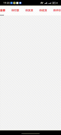
效果
思路
- 循环生成tabs标签,并且绑定点击事件保存选中索引
- 通过Text实现文字选中下划线,通过translate中的x控制位置、通过animation增加过渡效果
完整代码
code很有很大优化空间 这里主要提供一个思路
@Entry
@Component
struct Index {
  @State scrollLeft: number = 0
  @State tabsIndex: number = 0
  @State tabsLeft: number[] = [5, 80, 160, 240, 330]

  build() {
    Column() {
      Row() {
        ForEach(['全部', '待付款', '待发货', '待收货', '待评价'], (item: string, index: number) => {
          Text(item).height('100%')
            .fontColor(Color.Red)
            .fontWeight(this.tabsIndex === index ? 600 : 400)
            .onClick(() => {  // 2 find 🔍
              this.tabsIndex = index
              this.scrollLeft = this.tabsLeft[this.tabsIndex]
            })
        })
        // 文字下方横杠,点击后发生位移
        Text().width(24).height(2).backgroundColor('#191919').borderRadius(100000).position({x: 0,y: '100%'})
          .translate({  x: this.scrollLeft,  y: '-100%' })  // 1 who ✅
          .animation({ duration: 300, curve: Curve.Linear })  // 3 fixed 💕
      }
      .height(60).width('100%').justifyContent(FlexAlign.SpaceBetween).backgroundColor('#fff')
    }.height('100%').width('100%').backgroundColor('#f5f5f5')
  }
}
更多关于HarmonyOS 鸿蒙Next中如何使用animation实现tabs标签页效果?的实战系列教程也可以访问 https://www.itying.com/category-93-b0.html

在HarmonyOS Next中,使用animation实现Tabs标签页切换效果,核心是结合状态管理和属性动画。以下是关键步骤和代码示例:
1. 布局与状态定义
使用TabContent和@State管理当前选中页:
@Entry
@Component
struct TabAnimationSample {
  @State currentIndex: number = 0
  private tabs: string[] = ['页签1', '页签2', '页签3']

  build() {
    Column() {
      // 页签头
      Row({ space: 20 }) {
        ForEach(this.tabs, (item: string, index: number) => {
          Text(item)
            .onClick(() => {
              this.currentIndex = index
            })
        })
      }

      // 内容区
      TabContent({ index: this.currentIndex }) {
        ForEach(this.tabs, (_: string, index: number) => {
          TabContentItem() {
            this.ContentPage(index)
          }
        })
      }
      .animation({ duration: 300, curve: Curve.EaseInOut }) // 关键动画配置
    }
  }

  @Builder
  ContentPage(index: number) {
    Text(`内容页 ${index + 1}`)
      .fontSize(30)
  }
}
2. 动画配置要点
- 位置动画:通过
TabContent的animation属性配置过渡动画 - 自定义动画:可使用显式动画
animateTo实现更复杂效果:
// 点击页签时触发动画
animateTo({ duration: 300, curve: Curve.EaseInOut }, () => {
  this.currentIndex = index
})
3. 进阶效果实现
滑动指示器动画:
@State private indicatorOffset: number = 0

// 计算指示器位置
calculateOffset(index: number) {
  animateTo({ duration: 200 }, () => {
    this.indicatorOffset = index * 100 // 根据实际宽度计算
  })
}
内容渐变效果:
.opacity(this.currentIndex === index ? 1 : 0)
.animation({ duration: 250 })
注意事项
TabContent的animation参数支持所有标准动画曲线- 避免在单个动画中同时修改多个可能冲突的属性
- 复杂动画建议使用
animateTo进行批量属性更新
这种实现方式通过声明式UI自动处理插值计算,相比传统手动计算位移更加简洁高效。