


HarmonyOS 鸿蒙Next中如何实现异形Banner
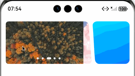
HarmonyOS 鸿蒙Next中如何实现异形Banner 如图, 左右两边都不是正/长方形。

更多关于HarmonyOS 鸿蒙Next中如何实现异形Banner的实战教程也可以访问 https://www.itying.com/category-93-b0.html

实现细节:
1、我们需要对形状进行裁剪,可以使用 maskShape 为组件上添加指定形状的遮罩。
2、maskShape 支持设置 CircleShape | EllipseShape | PathShape | RectShape 来指定遮罩的形状。
3、我们使用 PathShape ,它通过设置路径的绘制指令commands创建。
4、commands(value: ResourceStr):设置符合SVG路径描述规范的命令字符串,单位为px。
5、那么就简化为通过svg实现特殊的形状。需要使用vp2px进行单位转换。
预览效果:
完整demo代码:
/**
 * @fileName : Irrectangele.ets
 * @author : @cxy
 * @date : 2025/12/20
 * @description : 异形banner
 */

import { PathShape } from "@kit.ArkUI"

@Component
export struct Irrectange {
  @State commands: string = ''
  @State irHeight: number = 0
  @State banners: string[] = [
    'https://picsum.photos/300/150?random=1',
    'https://picsum.photos/300/150?random=2',
    'https://picsum.photos/300/150?random=3',
    'https://picsum.photos/300/150?random=4',
    'https://picsum.photos/300/150?random=5'
  ]

  build() {
    Row({ space: 3 }) {
      Swiper() {
        ForEach(this.banners, (item: string) => {
          Image(item)
            .width('100%')
        }, (item: string) => item)
      }
      .interval(5000)
      .loop(true)
      .indicator(
        new DotIndicator()
          .itemWidth(6)
          .itemHeight(6)
          .selectedItemWidth(12)
          .selectedItemHeight(6)
          .color('#eee')
          .selectedColor('#fff')
      )
      .layoutWeight(1)
      .borderRadius(8)
      .maskShape(new PathShape().commands(this.commands).fill(Color.White))
      .onAreaChange((oldValue: Area, newValue: Area) => {
        const ctx = this.getUIContext()
        this.irHeight = newValue.height as number
        const width = ctx.vp2px(newValue.width as number)
        const height = ctx.vp2px(this.irHeight)
        this.updateCommands(width, height)
      })

      Stack() {
        Image($r('app.media.irrect_right'))
          .width('100%')
          .height('100%')
          .resizable({
            slice: {
              top: 30,
              bottom: 30,
              left: 40,
              right: 40
            }
          })
      }
      .width(105)
      .height(this.irHeight)
    }
    .width('100%')
    .padding({ left: 12, right: 12 })
    .margin({ top: 20 })
  }

  updateCommands(width: number, height: number) {
    const ctx = this.getUIContext()
    const radius = ctx.vp2px(12)
    this.commands =
      `M0,0 L${width - ctx.vp2px(20)},0 A${radius},${radius} 0 0,1 ${width -
      ctx.vp2px(8)},${radius} L${width},${height -
        radius} L${width},${height} L0,${height} Z`
  }
}
更多关于HarmonyOS 鸿蒙Next中如何实现异形Banner的实战系列教程也可以访问 https://www.itying.com/category-93-b0.html

在HarmonyOS Next中实现异形Banner,主要使用Canvas组件进行自定义绘制。通过CanvasRenderingContext2D的API(如arc、bezierCurveTo)绘制非矩形路径,并利用clip方法进行裁剪。可将图片或渐变作为填充源。对于轮播效果,结合Swiper组件与Canvas,为每个页面定制异形背景。关键步骤是计算并绘制所需的几何路径。

在HarmonyOS Next中实现异形Banner,核心思路是利用Canvas组件进行自定义绘制,并结合Shape或Path来定义非矩形区域。以下是具体实现方法:
1. 使用Canvas绘制自定义形状
通过CanvasRenderingContext2D的路径API(如moveTo、lineTo、bezierCurveTo)绘制不规则边界,再通过clip方法裁剪内容区域。
// 示例:绘制左右对称的波浪形Banner
@Entry
@Component
struct IrregularBanner {
  private settings: RenderingContextSettings = new RenderingContextSettings(true)
  private context: CanvasRenderingContext2D = new CanvasRenderingContext2D(this.settings)

  build() {
    Column() {
      Canvas(this.context)
        .width('100%')
        .height(200)
        .onReady(() => {
          this.drawBanner()
        })
    }
  }

  private drawBanner() {
    const ctx = this.context
    const width = 360
    const height = 200

    // 创建裁剪路径
    ctx.beginPath()
    ctx.moveTo(0, 20)
    ctx.quadraticCurveTo(width * 0.25, 0, width * 0.5, 20)
    ctx.quadraticCurveTo(width * 0.75, 40, width, 20)
    ctx.lineTo(width, height)
    ctx.lineTo(0, height)
    ctx.closePath()
    ctx.clip() // 应用裁剪

    // 绘制Banner内容(如图片或渐变)
    const gradient = ctx.createLinearGradient(0, 0, width, height)
    gradient.addColorStop(0, '#FF6B8B')
    gradient.addColorStop(1, '#FF8E53')
    ctx.fillStyle = gradient
    ctx.fillRect(0, 0, width, height)
  }
}
2. 使用Shape组件结合蒙版
通过Shape的Path命令定义矢量路径,作为Banner的容器:
@Entry
@Component
struct ShapeBanner {
  build() {
    Column() {
      Shape() {
        Path()
          .width('100%')
          .height(200)
          .commands('M0 20 Q90 0 180 20 Q270 40 360 20 L360 200 L0 200 Z')
      }
      .fillLinearGradient({
        angle: 90,
        colors: [['#FF6B8B', 0.0], ['#FF8E53', 1.0]]
      })
    }
  }
}
3. 实现交互与动画
- 手势滑动:结合
Swiper组件,将Canvas或Shape作为子项。 - 动态效果:使用
animateTo为路径控制点添加动画,实现形状过渡。
注意事项
- 性能优化:复杂路径建议预计算或使用
OffscreenCanvas。 - 响应式适配:通过
display.getDefaultDisplaySync()获取屏幕尺寸动态计算路径。 - 内容叠加:在裁剪区域内使用
Stack组件叠加图片、文字等元素。
以上方案可灵活调整路径参数实现各类异形效果,同时保持手势交互的流畅性。