


HarmonyOS鸿蒙Next中SegmentButtonV2胶囊按钮英文字符串超长变成...省略,这如何全部显示文字
HarmonyOS鸿蒙Next中SegmentButtonV2胶囊按钮英文字符串超长变成…省略,这如何全部显示文字
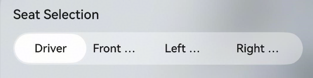
如题,如何才能让文本全部显示出来
更多关于HarmonyOS鸿蒙Next中SegmentButtonV2胶囊按钮英文字符串超长变成...省略,这如何全部显示文字的实战教程也可以访问 https://www.itying.com/category-93-b0.html

【背景知识】
- SegmentButtonV2:分段按钮组件用于创建页签型、单选或多选的胶囊型分段按钮。
- Text:显示一段文本的组件。
- animation:设置组件的属性动画。
【解决方案】
SegmentButton组件无法控制内部文件是否被截断。可以通过下面方案来实现。
-
字数不是很多且可以自由调整文字大小场景下,可以提前计算好文字大小来实现全部显示。示例代码如下:
import display from '@ohos.display'; @Entry @Component struct CustomSegmentButtonPage { @State messageA: string = 'truetruetruetruetruetrue' @State messageB: string = 'false' @State @Watch('change') flag: boolean = true; @State translateX: number = 0 @State customFontSize: number = 0 private minFontSize: number = 12 private maxFontSize: number = 20 private halfWidth: number = display.getDefaultDisplaySync().width / 2 change() { if (this.flag) { this.translateX = 0 } else { this.translateX = px2vp(this.halfWidth) } } aboutToAppear(): void { let length = this.messageA.length > this.messageB.length ? this.messageA.length : this.messageB.length this.customFontSize = Math.floor(px2fp(this.halfWidth / length)) if (this.customFontSize > this.maxFontSize) { this.customFontSize = this.maxFontSize } else if (this.customFontSize < this.minFontSize) { this.customFontSize = this.minFontSize } } build() { Stack() { Row() .width('50%') .height(40) .backgroundColor(Color.Pink) .borderRadius(20) .translate({ x: this.translateX, y: 0 }) .animation({ duration: 500, curve: Curve.Ease, playMode: PlayMode.Normal }) Row() { Button() { Text(this.messageA) .fontWeight(this.flag ? FontWeight.Bold : FontWeight.Normal) .fontSize(this.customFontSize) } .height('100%') .layoutWeight(0.5) .borderRadius(20) .backgroundColor(Color.Transparent) .onClick(() => { this.flag = true }) Button() { Text(this.messageB) .fontWeight(this.flag ? FontWeight.Normal : FontWeight.Bold) .fontSize(this.customFontSize) } .height('100%') .layoutWeight(0.5) .borderRadius(20) .backgroundColor(Color.Transparent) .onClick(() => { this.flag = false }) } .width('100%') .height(40) .justifyContent(FlexAlign.SpaceBetween) .alignItems(VerticalAlign.Center) .backgroundColor(Color.Transparent) .borderRadius(20) } .backgroundColor('#50e0dcdc') .alignContent(Alignment.Start) .width('100%') .height(40) .borderRadius(20) } } -
无法调整字体大小或文字超长场景下,可以使用跑马灯效果展示。示例代码如下:
import display from '@ohos.display';

@Entry
@Component
struct CustomSegmentButtonDemo {
  @State @Watch('change') flag: boolean = true;
  @State translateX: number = 0
  private halfWidth: number = px2vp(display.getDefaultDisplaySync().width) / 2

  change() {
    if (this.flag) {
      this.translateX = 0
    } else {
      this.translateX = this.halfWidth
    }
  }

  build() {
    Stack() {
      Row()
        .width('50%')
        .height(40)
        .backgroundColor(Color.Pink)
        .borderRadius(20)
        .translate({
          x: this.translateX,
          y: 0
        })
        .animation({
          duration: 500,
          curve: Curve.Ease,
          playMode: PlayMode.Normal
        })

      Row() {
        Button() {
          Text("truetruetruetruetruetruetruetruetruetruetruetruetruetruetruetruetrue")
            .textOverflow({ overflow: TextOverflow.MARQUEE })
            .fontWeight(this.flag ? FontWeight.Bold : FontWeight.Normal)
        }
        .height('100%')
        .layoutWeight(0.5)
        .borderRadius(20)
        .backgroundColor(Color.Transparent)
        .onClick(() => {
          this.flag = true
        })

        Button() {
          Text("false").fontWeight(this.flag ? FontWeight.Normal : FontWeight.Bold)
        }
        .height('100%')
        .layoutWeight(0.5)
        .borderRadius(20)
        .backgroundColor(Color.Transparent)
        .onClick(() => {
          this.flag = false
        })

      }
      .width('100%')
      .height(40)
      .justifyContent(FlexAlign.SpaceBetween)
      .alignItems(VerticalAlign.Center)
      .backgroundColor(Color.Transparent)
      .borderRadius(20)
    }
    .backgroundColor('#50e0dcdc')
    .alignContent(Alignment.Start)
    .width('100%')
    .height(40)
    .borderRadius(20)
  }
}
更多关于HarmonyOS鸿蒙Next中SegmentButtonV2胶囊按钮英文字符串超长变成...省略,这如何全部显示文字的实战系列教程也可以访问 https://www.itying.com/category-93-b0.html


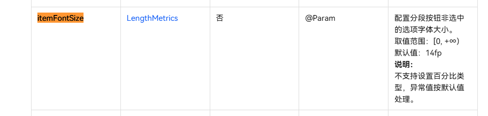
1.楼主想要改变这个组件的文字显示范围的话需要控制文字的字体大小:itemFontSize可以设置文字的字体
CapsuleSegmentButtonV2({
  items: this.textItems,
  selectedIndex: this.textSelectedIndex!!,
  itemFontSize: { value: 10, unit: 1 }
})
参考文档:SegmentButtonV2-按钮与选择-ArkTS组件-ArkUI(方舟UI框架)-应用框架 - 华为HarmonyOS开发者


设置按钮宽度为自适应或固定足够宽度,这样内容不被截断,但是如果你的文字太长确实就没啥好办法了,除非文字滚动展示:
Button() {

  Text('LongEnglishTextWithoutSpace')

    .fontSize(12) // 调整字号

}

.type(ButtonType.Capsule)

.width('80%') // 设置足够宽度

在HarmonyOS Next中,SegmentButtonV2胶囊按钮文字超长显示省略号,可通过设置textOverflow属性为TextOverflow.Clip或TextOverflow.None来禁止截断。同时调整按钮宽度或使用layoutWeight分配空间确保有足够区域显示完整文本。若仍不满足,可考虑自定义组件布局或使用Text组件替代默认文本显示。

在HarmonyOS Next中,当SegmentButtonV2(胶囊按钮)的文本内容过长时,系统默认会将其截断并显示为“…”。要解决此问题并让文本全部显示,核心思路是调整按钮的布局约束或样式,为其提供足够的显示空间。
以下是几种直接有效的解决方案:
-
调整SegmentButtonV2的宽度: 最直接的方法是增加按钮的宽度。你可以在创建
SegmentButtonV2时,通过.width()或.layoutWeight()等布局属性来明确设置或分配更宽的尺寸。SegmentButtonV2({ text: 'YourLongTextHere' }) .width(200) // 设置为一个足够显示全部文本的固定宽度,或使用百分比、扩展布局 -
使用弹性布局并允许内容撑开: 如果按钮处于弹性容器(如
Row、Column或Flex)中,可以为其设置flexShrink(0),防止按钮在空间不足时被压缩,从而确保文本有空间展开。Row() { SegmentButtonV2({ text: 'YourLongTextHere' }) .flexShrink(0) // 禁止收缩 } .width('100%') // 确保容器有足够宽度 -
检查并调整外层容器约束: 确保
SegmentButtonV2的直接父容器(以及更上层的容器)没有施加过小的宽度限制。有时问题根源在于外层布局的约束过紧。 -
考虑动态文本或缩写: 如果界面空间确实有限,无法为长文本提供足够宽度,从用户体验角度,可能需要考虑使用动态截断(在特定位置截断)或更精简的文本内容。
关键点:SegmentButtonV2本身没有直接控制文本截断的属性(如textOverflow)。其显示行为主要由布局尺寸决定。因此,解决此问题的核心是确保组件被分配到的最终渲染宽度足以容纳其文本内容。
请根据你的实际UI布局结构,优先尝试调整按钮宽度或使用flexShrink(0)来解决问题。