


HarmonyOS鸿蒙Next中Flutter框架多设备开发指导-分栏场景
HarmonyOS鸿蒙Next中Flutter框架多设备开发指导-分栏场景
1.1 场景概述
在移动应用开发中,不同设备的屏幕形态各异,例如刘海屏、全面屏、折叠屏等,系统状态栏、导航栏、软键盘等元素亦会占据屏幕空间。宽屏上常采用主从分栏(一侧入口、一侧内容栈),窄屏上回退为单栏全屏栈;若分界阈值与拖拽分割线未处理好,易出现窄屏误用分栏、或宽屏侧栏占比不合理等问题。本文将详细介绍本示例中以窗口宽度与 Animated 比例控制左栏宽度、可拖分割线以及内嵌 createNativeStackNavigator 路由栈的适配方法,以及实现原理与具体场景案例。本文对应工程内分栏示例页。
1.1.1 使用场景
用户在多窗口或横竖屏切换时,需要在窄窗保持单栏连续浏览,并在宽窗快速切换主从内容;分栏页既要保证左侧入口操作顺畅,也要保证右侧内容区不被错误挤压。分栏适配验证(主从区宽度与导航栈协同自适应),指的是页面能够根据窗口宽度自动在单栏路由栈与左侧入口 + 可拖分割线 + 右侧内容栈之间切换,并在拖拽分割线、进入全屏子页、返回出栈等过程中维持布局稳定与交互一致。下列表格展示不同横向断点下的逻辑与布局。
| 横向断点 | sm | md | lg | xl |
|---|---|---|---|---|
| 展示逻辑 | Dimensions.get(‘window’).width ≤ 600:isColumnLayout 为 false,不渲染 columnLayout,整屏 RouteStack | 宽度 > 600:isColumnLayout 为 true 且 allScreen 为 false 时,左侧 MainArea + 宽约 20 的分割条 + 右侧 contentArea 内 RouteStack;左栏宽度为 leftRatio 在 0~1 间插值到 screenWidth×0.4~screenWidth×0.5(Animated 插值 extrapolate: ‘clamp’) | 同左,随窗口变宽分栏可用区域增大;Dimensions.addEventListener(‘change’) 更新 screenWidth | 同 lg;全屏栈模式见下方 allScreen |
| 展示布局 | 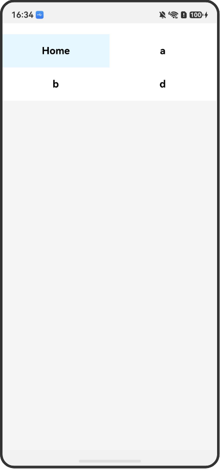 |
 |
 |
 |
1.1.2 常见问题
分栏 + 内嵌栈若未统筹,容易出现以下问题:
- 阈值与业务断点不一致,旋转后应在分栏与单栏间切换却未刷新
- 分割线拖拽未限制比例,侧栏被拖没或占满
- 左栏按钮在极窄侧栏宽度下仍横向排列导致难点击
1.1.3 多设备适配
- 适配点 1:宽度 > 600 且非全屏栈时,PanResponder 在分割条上 onPanResponderMove 按 (leftRatio._value * screenWidth + gesture.dx * 3) / screenWidth 更新 leftRatio,与 screenWidth 变化联动。
图 1-0:手机竖屏下单栏布局示意。

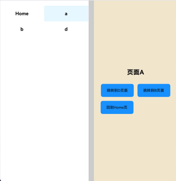
图 1-1:手机横屏下分栏布局示意。
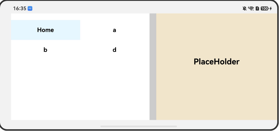
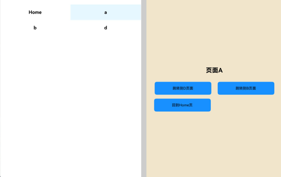
图 1-2:lg 档分栏示意。

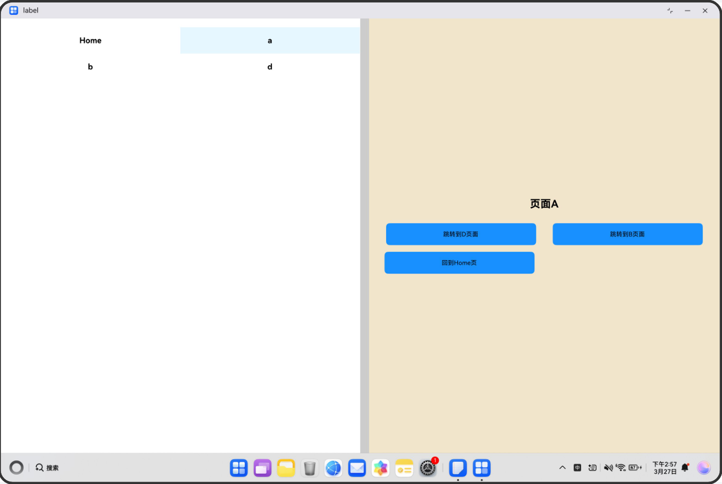
- 适配点 2:内嵌 Stack.Navigator(headerShown: false)承载 PageA~D,与侧栏 initialRoute、handleSideButtonPress 配合切换右侧栈根。
图 2-1:**PC / ** 特大宽下分栏整体。
1.2 开发指导
1.2.1 Flutter开发
1.2.1.1 关键能力
Flutter中go_router库提供声明式路由管理;ShellRoute实现自适应布局壳层;SystemChrome控制屏幕方向和系统UI模式;MediaQuery获取屏幕尺寸和方向信息;GridView和ListView实现响应式导航布局。
1.2.1.2 指导案例
- 引入核心库
在pubspec.yaml中添加go_router依赖,并导入必要的库。
dependencies:
  flutter:
    sdk: flutter
go_router: ^6.5.9
import 'package:flutter/material.dart';
import 'package:flutter/services.dart';
import 'package:go_router/go_router.dart';
- 配置路由表
使用GoRouter创建路由配置,通过ShellRoute实现横竖屏自适应布局。横屏时使用分栏壳_SplitShell,竖屏时使用_PortraitRoot。
final _router = GoRouter(
  initialLocation: '/home',
  routes: [
    ShellRoute(
    builder: (context, state, child) {
      final wide = MediaQuery.of(context).size.width >= 600;
      return wide
      ? _SplitShell(child: child, location: GoRouter.of(context).location)
      : _PortraitRoot(child: child);
    },
    routes: [
      GoRoute(
        path: '/home',
        pageBuilder: (_, s) => _NoSwipePage(key: s.pageKey, child: const HomePage()),
        routes: [
          GoRoute(path: 'a', pageBuilder: (_, s) => _NoSwipePage(key: s.pageKey, child: const APage())),
          GoRoute(path: 'b', pageBuilder: (_, s) => _NoSwipePage(key: s.pageKey, child: const BPage())),
          GoRoute(path: 'd', pageBuilder: (_, s) {
            final forceLandscape = _getQueryParam(s.location, 'landscape') == 'true';
            return _NoSwipePage(key: s.pageKey, child: DPage(forceLandscape: forceLandscape));
          }),
        ],
      ),
    ],
    ),
  ],
);
- 实现分栏布局壳
创建_SplitShell状态组件,管理左右分栏比例(0.4-0.5),支持拖拽调整宽度。根据路由路径自动切换全屏模式(D页面全屏,其他页面分栏)。
class _SplitShellState extends State<_SplitShell> {
  double _ratio = 0.4;
  double _lastRatio = 0.4;

  void _setFull(bool enter) {
    setState(() {
    _ratio = enter ? 0 : _lastRatio;
    });
  }

  @override
  Widget build(BuildContext context) {
    final total = MediaQuery.of(context).size.width;
    final navW = total * _ratio;
    final path = Uri.parse(widget.location).path;
    final bool isD = path.startsWith('/home/d');

    // 自动处理全屏逻辑
    if (isD && _ratio != 0) _setFull(true);
    if (!isD && _ratio == 0) _setFull(false);

    return Row(
      children: [
        if (_ratio != 0) SizedBox(width: navW, child: _buildNav(context)),
        Expanded(child: widget.child),
      ],
    );
  }
}
- 实现响应式导航
根据分栏比例动态切换导航布局:比例≥0.5时使用双列网格,否则使用单列列表。导航项使用ListTile实现点击跳转。
Widget _buildNav(BuildContext context) {
  final navItems = [
    _tile(context, 'Home', '/home'),
    _tile(context, 'To A', '/home/a'),
    _tile(context, 'To B', '/home/b'),
    _tile(context, 'To D', '/home/d'),
  ];

  return Material(
    child: Column(
      children: [
        IconButton(
          icon: Icon(_ratio == 0 ? Icons.last_page : Icons.first_page),
          onPressed: () => _setFull(_ratio != 0),
        ),
        Expanded(
          child: _ratio >= 0.5
          ? GridView.count(crossAxisCount: 2, children: navItems)
          : ListView(children: navItems),
        ),
      ],
    ),
  );
}
- 实现页面组件
创建_handleExit方法,处理退出按钮点击事件。如果当前处于全屏状态,先退出全屏再返回上一页。
class DPage extends StatefulWidget {
  final bool forceLandscape;
  const DPage({super.key, required this.forceLandscape});

  @override
  State<DPage> createState() => _DPageState();
}

class _DPageState extends State<DPage> {
  @override
  void initState() {
    super.initState();
    SystemChrome.setEnabledSystemUIMode(SystemUiMode.immersive);
    SystemChrome.setPreferredOrientations(widget.forceLandscape
      ? [DeviceOrientation.landscapeLeft, DeviceOrientation.landscapeRight]
      : [DeviceOrientation.portraitUp, DeviceOrientation.portraitDown]);
  }

  @override
  void dispose() {
    SystemChrome.setEnabledSystemUIMode(SystemUiMode.edgeToEdge);
    SystemChrome.setPreferredOrientations(DeviceOrientation.values);
    super.dispose();
  }

  @override
  Widget build(BuildContext context) {
    return Scaffold(
      backgroundColor: Colors.blue,
      body: const Center(child: FlutterLogo(size: 200)),
    );
  }
}
- 构建应用入口
使用MaterialApp.router配置路由,禁用调试横幅,设置Material3主题。
class ColumnLayout extends StatelessWidget {
  const ColumnLayout({super.key});
  @override
  Widget build(BuildContext context) {
    return MaterialApp.router(
    routerConfig: _router,
    debugShowCheckedModeBanner: false,
    theme: ThemeData(useMaterial3: true, colorSchemeSeed: Colors.indigo),
    );
  }
}
1.2.1.3 示例代码
相机的Sample示例代码地址:example,开发者可以通过该地址查看完整的示例代码,并根据自己的需求进行修改和扩展。
更多关于HarmonyOS鸿蒙Next中Flutter框架多设备开发指导-分栏场景的实战教程也可以访问 https://www.itying.com/category-92-b0.html

在HarmonyOS Next中,Flutter框架支持多设备分栏场景,可通过LayoutBuilder或MediaQuery动态适配不同屏幕宽度。使用RenderBox获取设备尺寸后,结合Row或Flex实现左导航、右内容的分栏布局。分栏断点可参考平板与折叠屏特性,利用PlatformView嵌入原生ArkUI组件以增强兼容性。
更多关于HarmonyOS鸿蒙Next中Flutter框架多设备开发指导-分栏场景的实战系列教程也可以访问 https://www.itying.com/category-92-b0.html

在HarmonyOS Next的Flutter框架中,实现分栏场景的核心在于监听窗口宽度变化以动态切换布局,并结合动画与拖拽手势优化主从区域的比例控制。
核心逻辑:
- 断点适配:以600vp为界,宽度≤600vp时,使用单栏路由栈;宽度>600vp时,启用分栏布局(左栏+分割线+右栏路由栈),判断条件为
MediaQuery.of(context).size.width > 600 && !allScreen。 - 比例控制与动画:通过
AnimationController驱动右栏宽度在screenWidth * 0.5到screenWidth * 0.6间插值,对应左栏比例0.4~0.5,使用extrapolate: 'clamp'限制范围,避免过度拉伸。 - 分割线拖拽:使用
PanResponder,在onPanResponderMove中更新左栏比例:(leftRatio._value * screenWidth + dx * 3) / screenWidth,乘3是为了让拖拽更灵敏。 - 内嵌路由栈:右侧使用
createNativeStackNavigator或Flutter的Navigator,当侧栏按钮点击时,通过navigator.push切换页面,并保证新页面仍处右栏。 - 状态同步:监听
Dimensions.addEventListener('change'),在窗口尺寸变化时重新计算布局参数,确保旋转或分屏时正确刷新。
关键代码片段:
// 监听窗口宽度
const width = Dimensions.get('window').width;
const isColumnLayout = width > 600 && !allScreen;

// 左栏比例动画
const leftWidth = screenWidth * leftRatio.interpolate({
  inputRange: [0, 1],
  outputRange: [screenWidth * 0.4, screenWidth * 0.5],
  extrapolate: 'clamp'
});

// 分割线拖拽更新比例
onPanResponderMove: (gesture) => {
  leftRatio.setValue((leftRatio._value * screenWidth + gesture.dx * 3) / screenWidth);
}
注意:在侧栏宽度极窄时,应将其导航项改为纵向列表(如ListView)而非横向排列,避免点击困难。